The network for creativity
Join 1.25M professional creatives like you
Connect with clients, get discovered, and run your business 100% commission-free
Creatives on Contra have earned over $150M and we are just getting started
Back to feedPost
Taste Test
I'm experimenting with two responsive designs for mobile bottom navigation and would love to hear your thoughts.
Which approach would you prefer? 👇
A — Multi-row Grid
Navigation items wrap into multiple rows to accommodate smaller screens.
B — Horizontally Scrollable Bar
A single-row navigation bar that users can scroll horizontally to access more options.
Which feels more intuitive, accessible, and user-friendly?
Vote for A or B and let me know why in the comments. I'd love to hear your perspective! 🚀

2 voted
50%
2 voted
50%
4 votes
Closed

Multi-row Grid is more practical I like it great job 🎉🎉🔥🔥

Thanks for your feedback 😊.
Pardon❤️

Voted Scrollable Bar. A grid eats vertical space and moves the thumb zone, while a scroll bar keeps one familiar row. Just add a fade on the right edge so people know there is more.
Got it 👍, you have touched some of the important aspects of usability. Thanks for the feedback 🙌

Multi-row grid. With a scrollable bar, the options off screen basically don't exist for most people.
Got it 👍. Thanks for your feedback 😊.
The network for creativity
Join 1.25M professional creatives like you
Connect with clients, get discovered, and run your business 100% commission-free
Creatives on Contra have earned over $150M and we are just getting started











Related posts

looking for a great designer

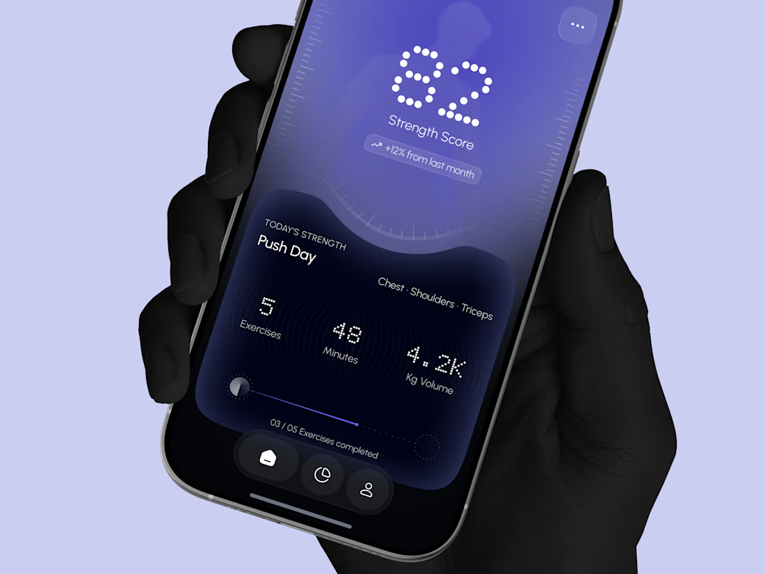
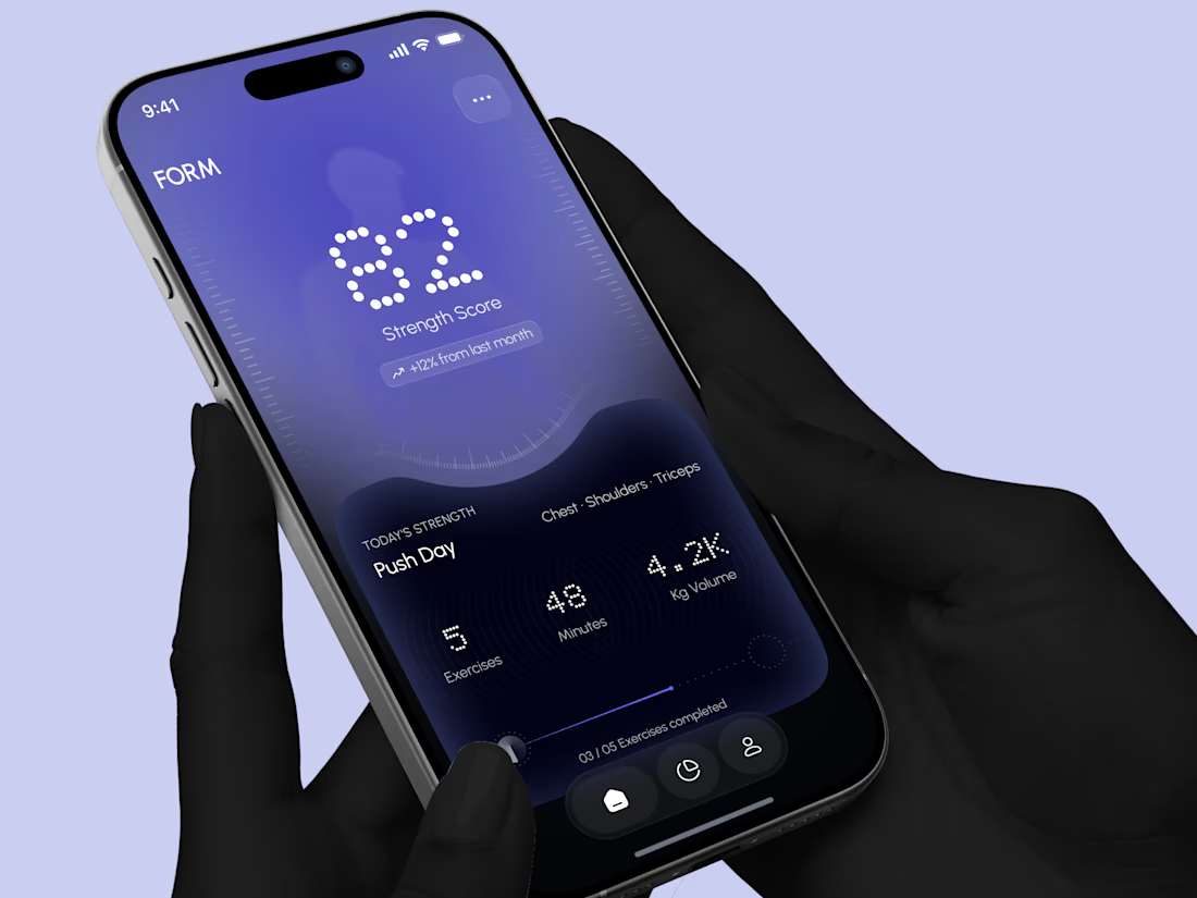
Designed a modern Strength Training Mobile App.
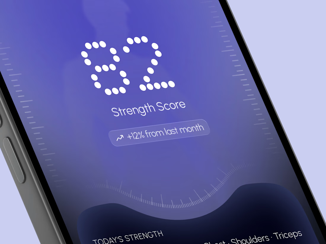
A deep indigo and violet gradient with a soft body silhouette and dotted display numbers for a bold and focused first impression.
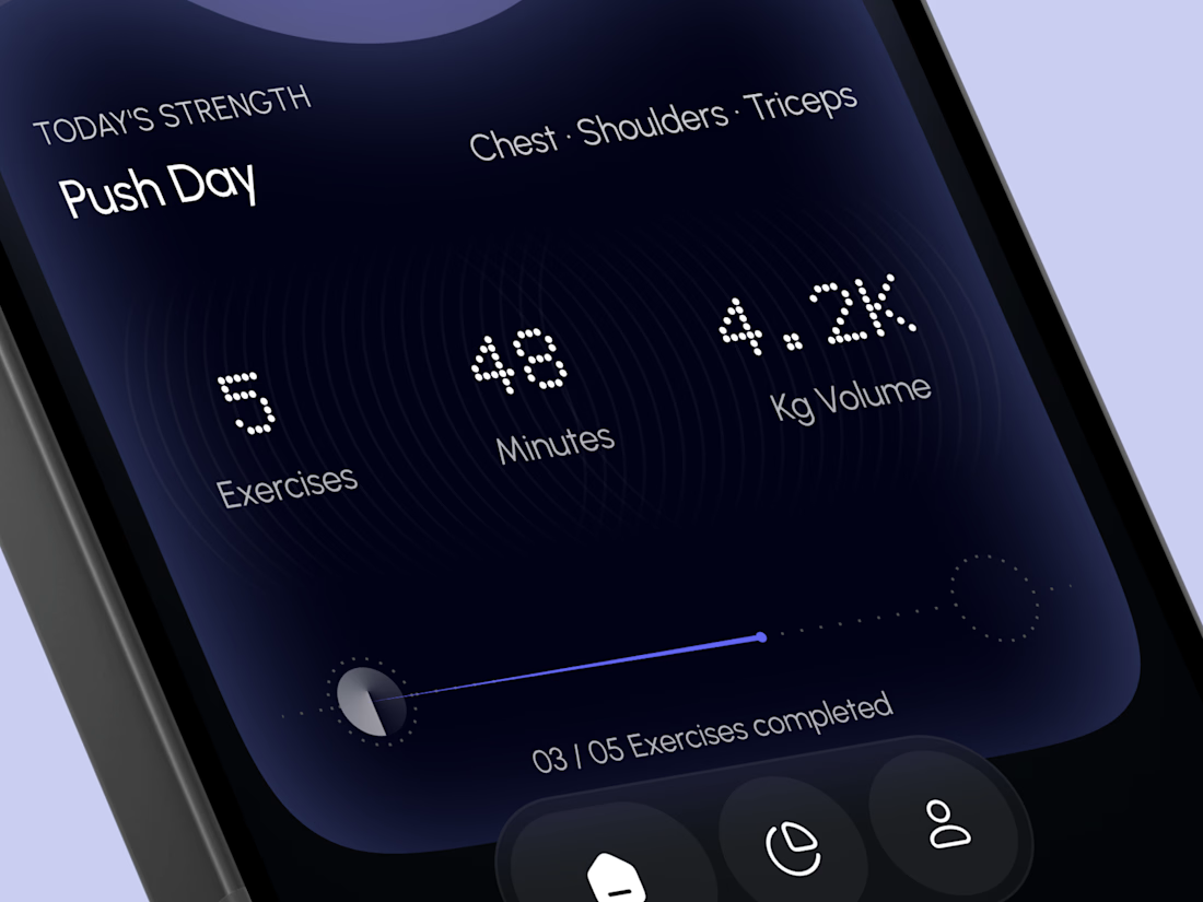
A glowing strength score, a clear workout card with exercises, minutes, and volume, plus a simple progress bar make every training session easy to follow. A curved dark panel, fine tick marks, and a floating tab bar keep the whole app sleek, modern, and easy to use.



High end execution



Green is working better here

