The network for creativity
Join 1.25M professional creatives like you
Connect with clients, get discovered, and run your business 100% commission-free
Creatives on Contra have earned over $150M and we are just getting started
Back to feedPost

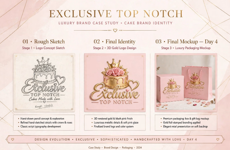
I help luxury cake brands look as expensive as their cakes taste. 👑 EXCLUSIVE TOP NOTCH From Sketch to Shelf Client came with just a name. I built a full luxury identity: ✏️ 01 Rough Sketch Concept & typography exploration✨ 02 Final Identity - 3D Gold + Blush Pink luxury system📦 03 Final Day 4 - O3 Mockup - Premium box & bag with gold foil Result: A brand that feels Exclusive, Sophisticated & Instagram-ready. The kind customers pay premium for.

The network for creativity
Join 1.25M professional creatives like you
Connect with clients, get discovered, and run your business 100% commission-free
Creatives on Contra have earned over $150M and we are just getting started
Challenges
View all


Related posts

What if a space brand didn’t just look futuristic — but felt like it was already living in the future?
For XPACE, the goal was to build a visual identity that could turn the idea of space exploration into a complete and immersive brand experience.
The identity combines a bold typographic system, a high-contrast visual language, and electric blue accents against deep black to create a futuristic presence that feels precise, technological, and unmistakably XPACE.
But the identity didn’t stop at the logo.
The system was extended across digital interfaces, web design, favicon and UI icons, access cards, board passes, and branded applications — creating a consistent experience across every touchpoint.
Every detail was designed to make XPACE feel less like a brand inspired by the future, and more like a brand built for it.
XPACE — Visual Identity System.
Looking to build a visual identity that goes beyond a logo?
Let’s create something with a world of its own.


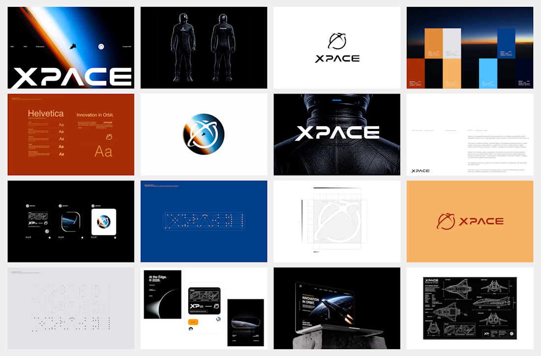

The identity system feels cohesive because the typography, electric blue accents, and image language all push in the same direction. Extending that logic into interfaces and packaging is what makes XPACE feel like a real world, not just a futuristic logo.


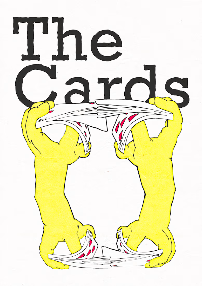


Another addition to my music poster collection. The song is I2I from A Goofy Movie, so I was surprised how serious the design ended up being for something spawned from a Disney film. But the lyrics are deep and they deserved to be represented as such!
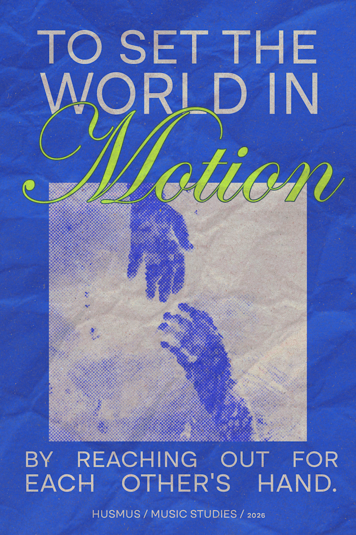


the lime green Motion word pops on that blue!