The network for creativity
Join 1.25M professional creatives like you
Connect with clients, get discovered, and run your business 100% commission-free
Creatives on Contra have earned over $150M and we are just getting started
Back to feedPost

What a thrill — it's my first time at the Makeathon! 🚂 I joined the challenge a little late, but I worked hard to finish my project: Cozy Night Train (No es mucho pero es trabajo honesto :p )
I always use pomodoro and ambient music to focus, but this time I wanted to create something of my own. It has switchable modes, an interactive radio, and — to get creative — a typewriter to jot down your tasks!
I built the whole thing with Figma Make, and also used Weave and the Figma MCP so I wouldn't burn through all my Make credits too fast haha.
Take a ride 👉 https://gauge-tarot-09304731.figma.site/


so calming
The network for creativity
Join 1.25M professional creatives like you
Connect with clients, get discovered, and run your business 100% commission-free
Creatives on Contra have earned over $150M and we are just getting started








Related posts

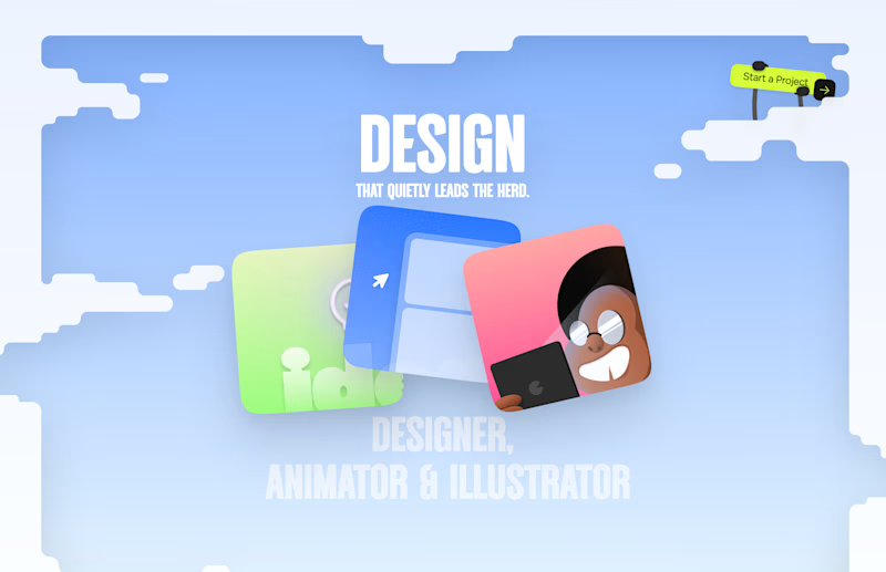
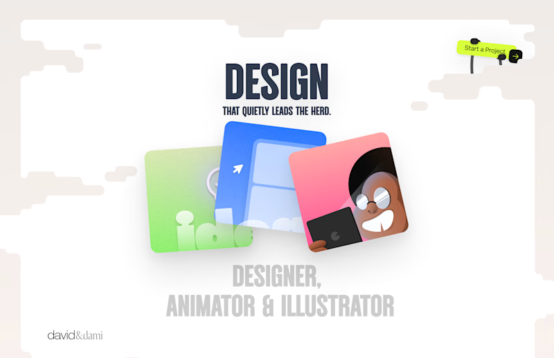
Should I go for left or right? Focusing on updating and finishing up my portfolio... and then I came across this crossroads. Another alternative is to make them switchable themes through a toggle, but I still need to decide which should be the default.
27 voted
75%
9 voted
25%
36 votes
Closed

Left is better because the text is readable, the overall blue background is not flashing to the eyes as compared to the right one.
For the top right button " Start a project ", you can add some animation so that it stands out and encourage users to click on it.


The app looks amazing, but do you think the number font might be a bit hard for people to read quickly when checking their money?


Kajabi isn’t only for courses 👀
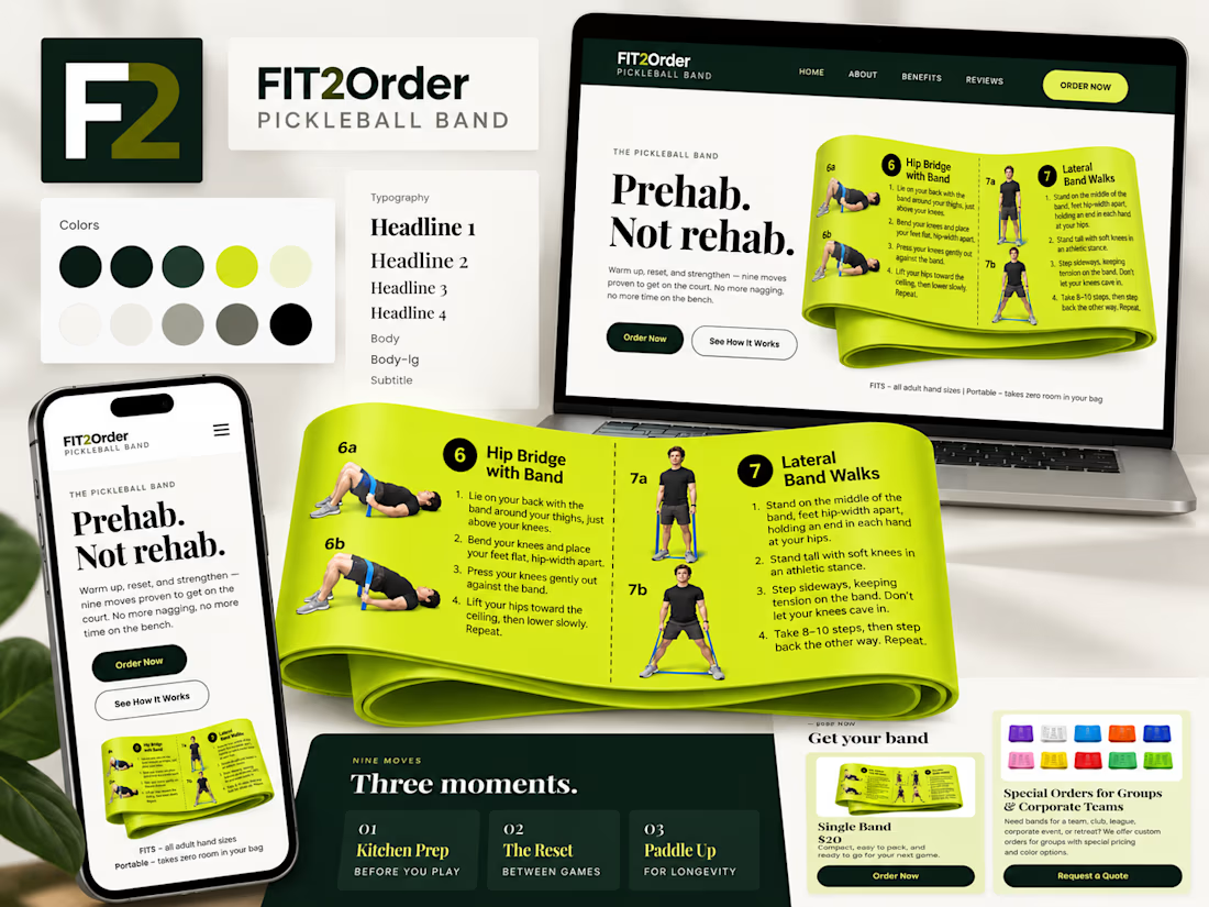
For Fit2Order’s new Pickleball Band, we created a complete product experience inside Kajabi – from the landing page and checkout to order forms, confirmations, and the post-purchase flow.
A fun one for us because it meant adapting Kajabi to work for a physical product while still keeping everything simple for the team to manage.


Prehab, Not rehab is a sharp headline for the band. The lime against deep green stays readable across all three devices.