The network for creativity
Join 1.25M professional creatives like you
Connect with clients, get discovered, and run your business 100% commission-free
Creatives on Contra have earned over $150M and we are just getting started
Back to feedPost

Content Strategy & Editorial Curation


The network for creativity
Join 1.25M professional creatives like you
Connect with clients, get discovered, and run your business 100% commission-free
Creatives on Contra have earned over $150M and we are just getting started











Related posts

Title / Headline:
The Quiet Hours — Cultural Magazine Web Design & Brand Identity
Description
Overview:
The Quiet Hours is an editorial-driven digital magazine concept focused on slow living, culture, and thoughtful essays, designed with a sophisticated print-inspired digital aesthetic.
Design Highlights:
Print-Inspired Editorial Layout: Engineered a structured grid system blending classic editorial serif display typography with clean body text for an immersive reading experience.
Calm & Earthy Color Palette: Curated a muted, harmonious color scheme (Pampad, Ink, Ember, Teal, and Pod) to evoke a sense of quiet and reflection.
Content Architecture: Structured clear content hierarchies, including issue highlights, article previews, and category navigation.
Mobile Responsive Layout: Designed a seamless mobile reading interface tailored for on-the-go content consumption.
Tools & Stack:
Figma, Adobe Illustrator, Editorial Typography, Web Design, UI/UX Layouts.


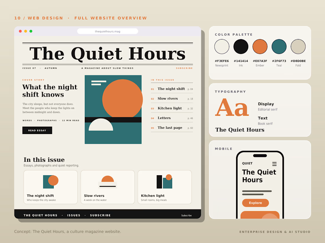

The Pampad, Ink, Ember, Teal and Pod palette names alone tell me this is a thoughtfully built system. Print-inspired editorial grids are so satisfying when they respect the reading experience, and this clearly does.

A refreshing color palette inspired by each flavor, paired with bold yet minimal typography, creates strong shelf presence while maintaining a natural and premium feel.


Title / Headline:
Atlas of Cities — Editorial Web Design & Brand Identity System
Description
Overview:
Atlas of Cities is an editorial-driven web experience designed to translate complex urban analytics, housing statistics, and green space data into compelling, human-readable visual stories.
Design Highlights:
Modular Grid System: Engineered a high-density, structured layout balancing editorial typography with high-impact data visualization.
Editorial Typography: Paired clean display serif typography with ultra-legible body fonts to deliver a premium publishing aesthetics.
Brand Identity & Color Palette: Minimalist high-contrast palette (Signal Red, Neutral Gray, Off-White) optimized for maximum legibility and brand authority.
Cross-Platform Responsive Design: Fully adapted desktop and mobile interfaces, ensuring a seamless reading experience across all devices.
Tools & Stack:
Figma, Design Systems, Typography Scale, Data Visualization Design, UI/UX Responsive Layouts.
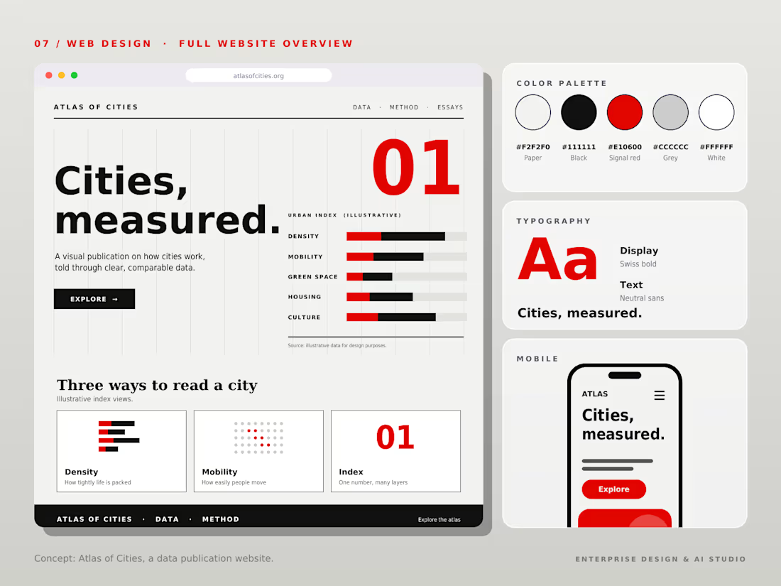
Turning urban analytics and housing stats into human-readable visual stories is a noble brief. The Signal Red accent cutting through the off-white gives it that premium editorial punch, and the modular grid keeps the density under control.