The network for creativity
Join 1.25M professional creatives like you
Connect with clients, get discovered, and run your business 100% commission-free
Creatives on Contra have earned over $150M and we are just getting started
Back to feedPost

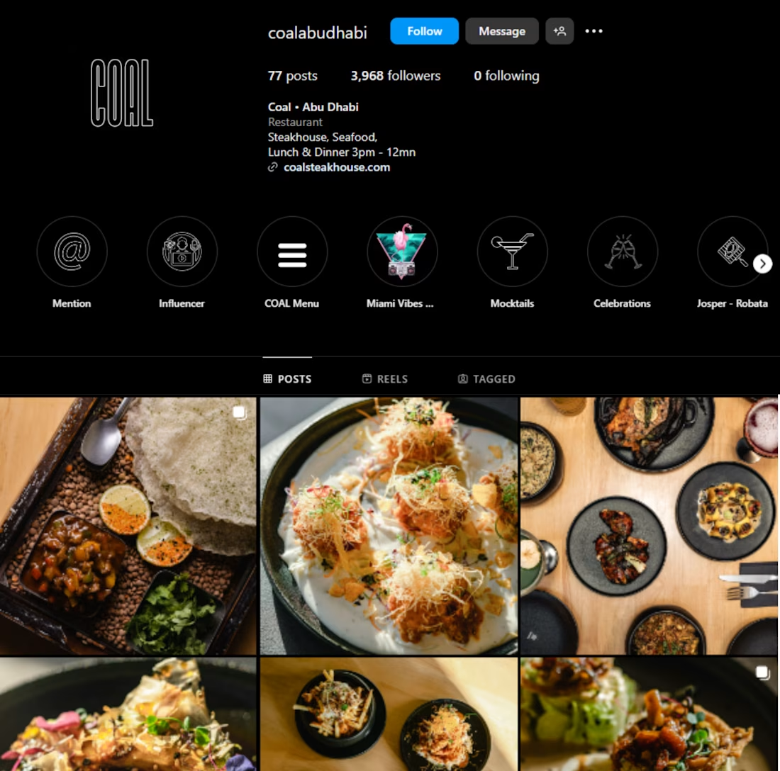
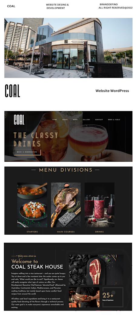
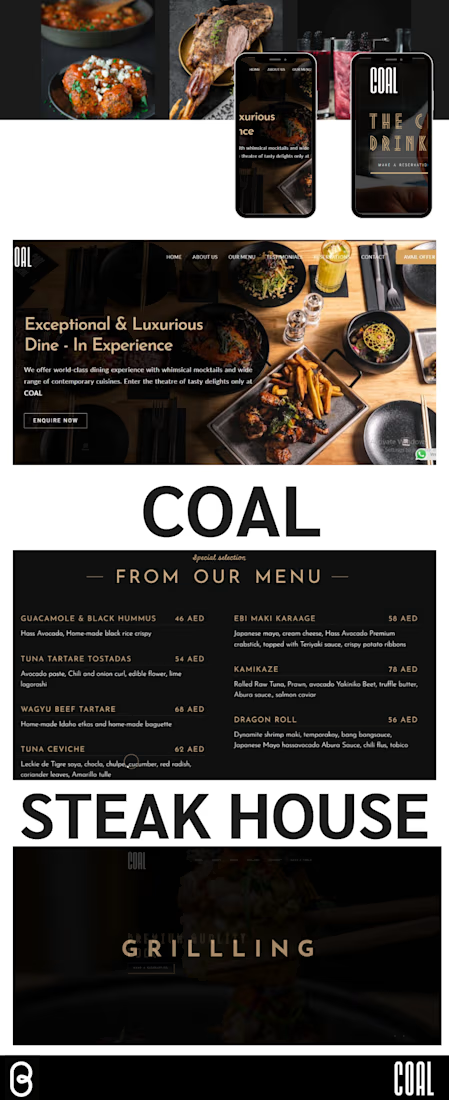
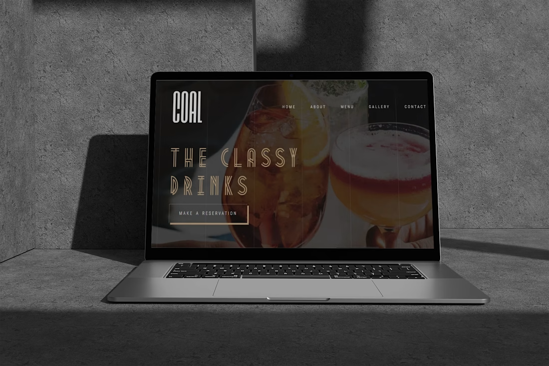
✨ New Brand, New Creative Journey | Coal Steak House 🔥
Happy to share that I've started working with a new brand — Coal Steak House! 🤎
Excited to be part of this new journey, working on its social media presence, creative ideas, content planning, and brand storytelling.
The goal is to build a strong visual identity and create engaging content that captures the restaurant's personality and makes people hungry just by scrolling! 🍽️
Looking forward to bringing more creative ideas to life. Stay tuned for updates!

The network for creativity
Join 1.25M professional creatives like you
Connect with clients, get discovered, and run your business 100% commission-free
Creatives on Contra have earned over $150M and we are just getting started



Related posts



ONE CRAVING. TWO VERY DIFFERENT EXPERIENCES. 🍔
What if the same food-delivery industry could tell two completely different visual stories?
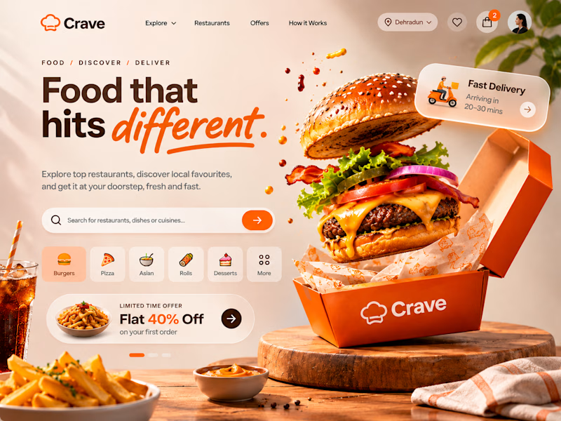
🍊 CRAVE — Made to Tempt
Warm tones, expressive typography, vibrant food photography and playful 3D elements. Designed to make food discovery feel exciting, inviting and full of personality.
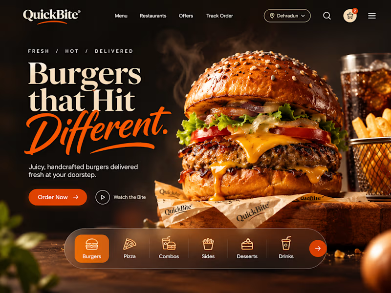
🖤 QUICKBITE — Made to Indulge
A darker, richer visual direction with cinematic burger photography, bold editorial typography and immersive layouts. Designed to put the food front and centre and make every interaction feel intentional.
Two brands. Two moods. Two approaches to the same experience.
Now I'm curious:
Which direction would make YOU stop scrolling and place an order?
Drop your pick below. I'd love to hear the reasoning behind it!
2 voted
29%
5 voted
71%
7 votes
Closed

QuickBite is unique in a good way!

Something & Nothing - a spec film for Yuzu Premium Soda
“Yoga in the morning. Raving at night.”
That’s how Something & Nothing’s co-founders describe the idea behind their brand: modern contradiction, the pull between wellness and hedonism we all live with. It shaped their name and their scales logo. I wanted it to shape the film too.
So the story is built on their name.
Morning is nothing: silence, sunlight, a slow stretch.
Night is something: bass, strobes, a packed floor.
One can belongs to both.
A quiet Japanese morning (a nod to Yuzu’s origin) keeps getting interrupted by a party that flickers in. The can stays in exactly the same place through every flicker, the one thing that doesn’t change between the two worlds.
Approach
Concept built on the brand’s own positioning and name, not a generic product ad
Visual language taken from their identity: bright geometric light, colour blocking, art-led calm
Match cuts and flickers, with the can held in place across both worlds
Character and product consistency across 10+ shots
Sound design that switches hard between birdsong and club bass
Tools: Nano Banana Pro & Google Flow (stills), Seedance 2.5 & Veo 3.1 (motion), plus the edit, sound design and grade.
Want a film built around your brand’s own story? Message me, or see more at aivaproduction.com
Unofficial concept. Not commissioned by or affiliated with Something & Nothing.


Nice 👍🏻