The network for creativity
Join 1.25M professional creatives like you
Connect with clients, get discovered, and run your business 100% commission-free
Creatives on Contra have earned over $150M and we are just getting started
Back to feedPost

For the past months, I’ve been building something quietly.
Not another productivity tool.
Not another motivational product.
But a structured self-reflection web-app.
It’s called Quantum Mirror Adventure.
It helps you:
– understand your life patterns
– reconnect with your inner direction
– review past decisions
– clarify your present
– design your next chapter consciously
No noise.
No hype.
Just a guided mirror.
If you’re into deep work and honest self-inventory,
I’d genuinely value your feedback — especially on UX and clarity.
You can explore it here:
👉 www.qma.show
Wishing you a focused and intentional March.
— Kamil


The network for creativity
Join 1.25M professional creatives like you
Connect with clients, get discovered, and run your business 100% commission-free
Creatives on Contra have earned over $150M and we are just getting started
Related posts


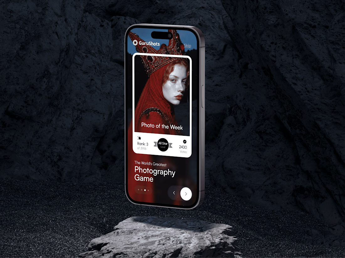
A new day, a new design to share! 📸
This time it is a photography challenge app that brings creativity and competition together through contests, voting, and gamification. What do you think of this one? ✨



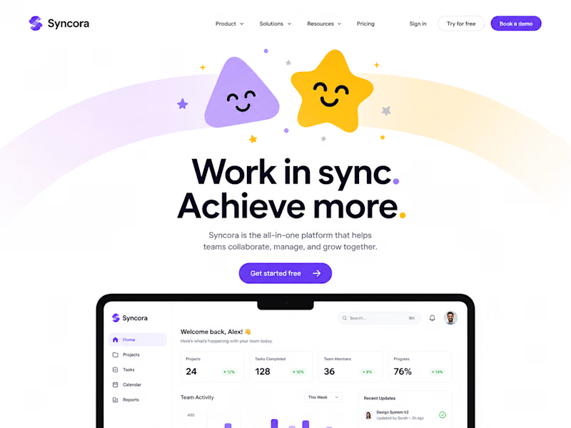
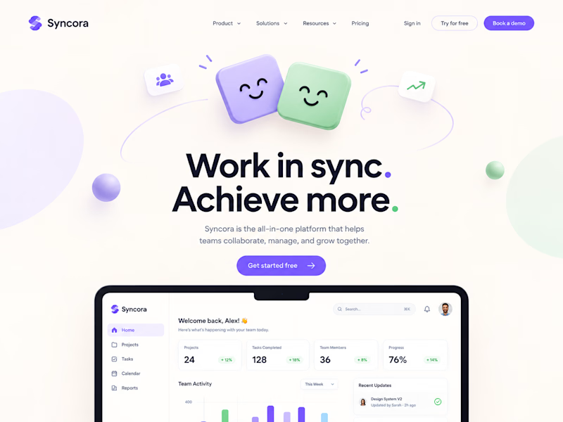
Testing two hero illustration directions for Syncora, an all-in-one team collaboration platform.
Which one fits a collaboration tool better? 👇
3 voted
43%
4 voted
57%
7 votes
Closed

Definitely Soft Sync. It looks clean, friendly and professional for work. The first one with the star and rainbow feels a little too much like a kids' app for a team business tool.

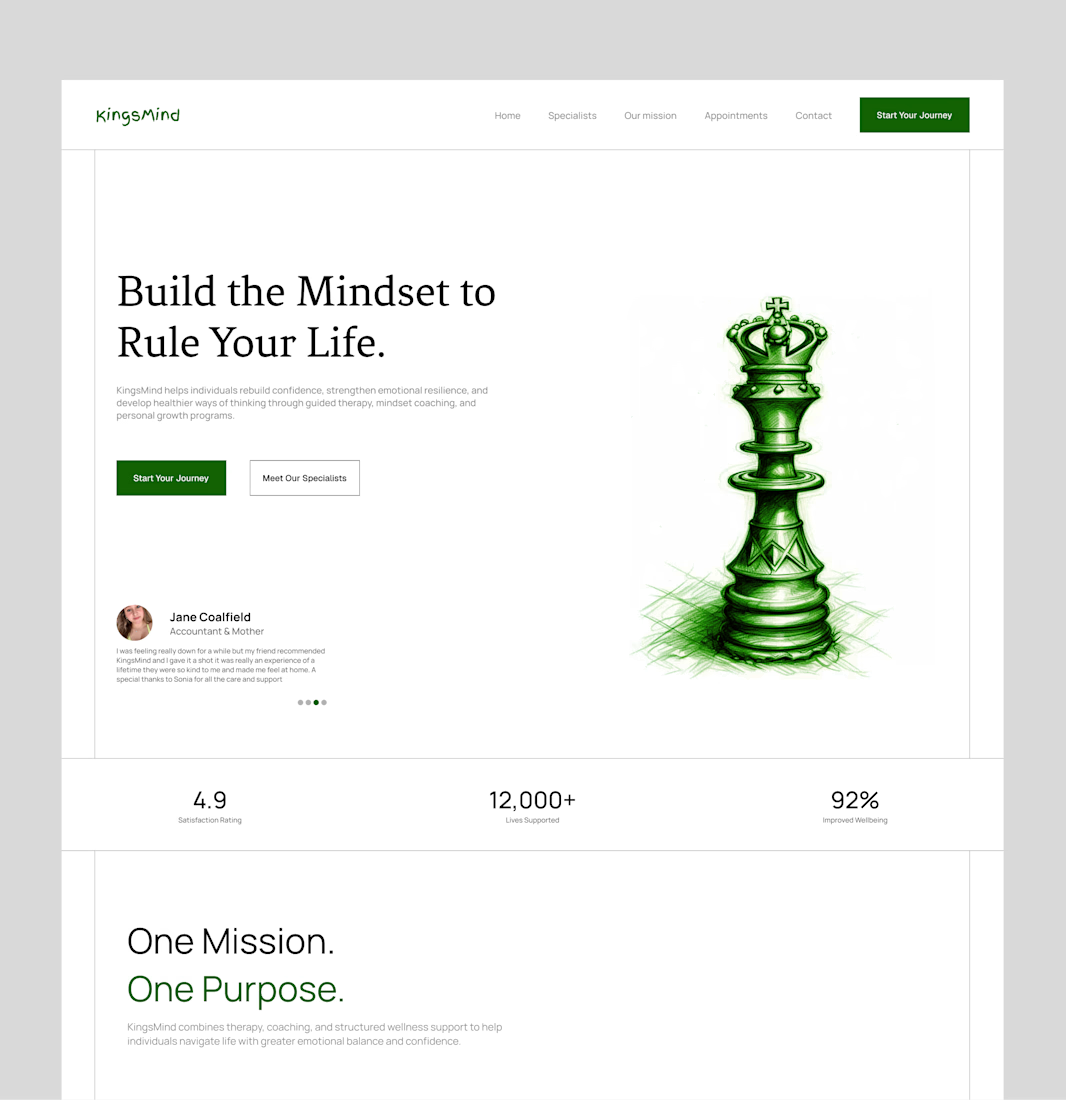
Bringing an old hero section design back to the spotlight. ✨
A hero section is often the first thing people see when they visit a website, so it needs to do more than just look good. It should capture attention, communicate the brand's message, and guide visitors toward the next step.
For this concept, I focused on creating a clean layout, strong visual hierarchy, and a balanced composition that makes the content feel clear and engaging without overwhelming the viewer.
Looking back at older projects is always a good reminder of how much thought goes into the little details that make a design work.
What do you think of this one? 👀
#WebDesign #UIUXDesign #HeroSection #LandingPageDesign #Framer #WebDesigner #UIDesign #DesignInspiration #Contra #PortfolioWork


this is amazing design