The network for creativity
Join 1.25M professional creatives like you
Connect with clients, get discovered, and run your business 100% commission-free
Creatives on Contra have earned over $150M and we are just getting started


The network for creativity
Join 1.25M professional creatives like you
Connect with clients, get discovered, and run your business 100% commission-free
Creatives on Contra have earned over $150M and we are just getting started






Related posts


Honestly these colors 👍

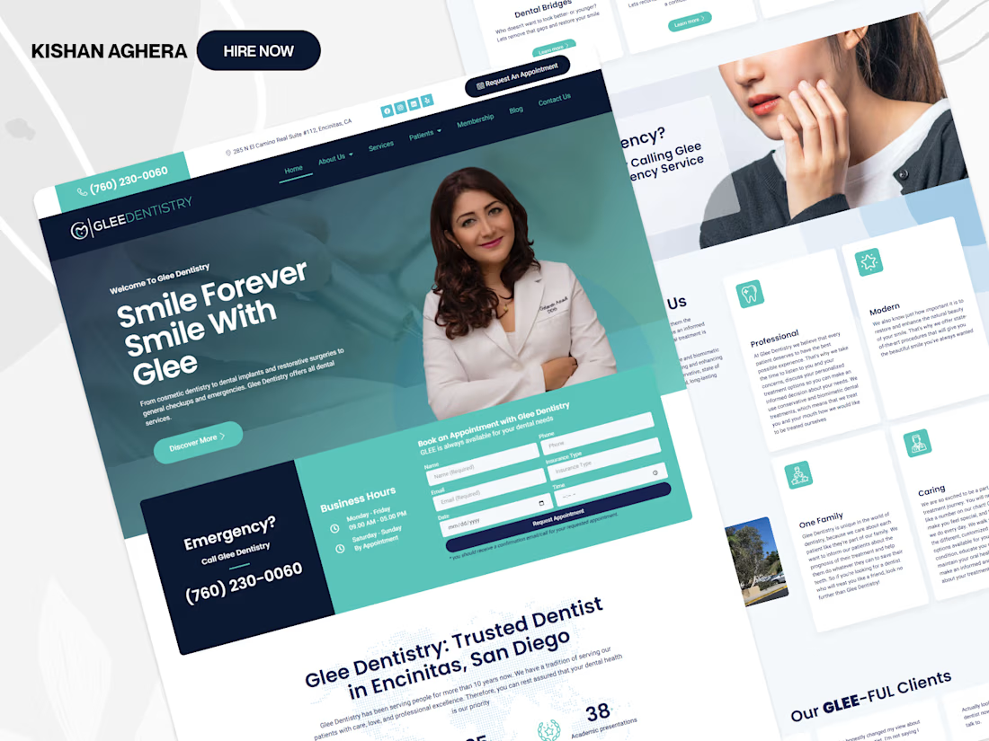
ResearchHub helps product teams plan studies, collect feedback, analyze user behavior, and uncover meaningful product insights in one clean research platform. The landing page combines a minimal white layout, soft green visual direction, survey builder previews, feedback widgets, heatmap analysis, participant insights, trust sections, and clear CTAs to make user research feel more structured, approachable, and decision-ready.
📩 Collaborate with Us? Contra Cansaas Agency
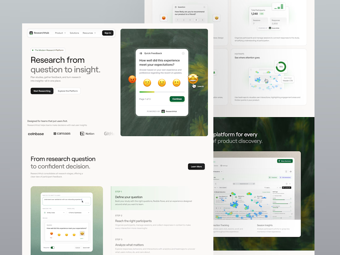

The emoji feedback card floating over the hero is a smart way to show the product. Nice restraint with the green.

Online store for Flor Canela, a fashion accessories brand: bags, belts, headbands, earrings and handmade headpieces for special events. 🌸
Live: florcanela.com
What I built:
Elegant custom design aligned with the brand
Product catalog with categories, search and sale prices
Shopping cart and secure checkout with WooPayments
Legal pages (privacy, terms, returns, cookies)
Easy self-management: the client updates products, orders and content from the WordPress dashboard
Fully responsive, mobile-first design
Tech stack:
WordPress · WooCommerce · Astra · Spectra · WooPayments · Hostinger


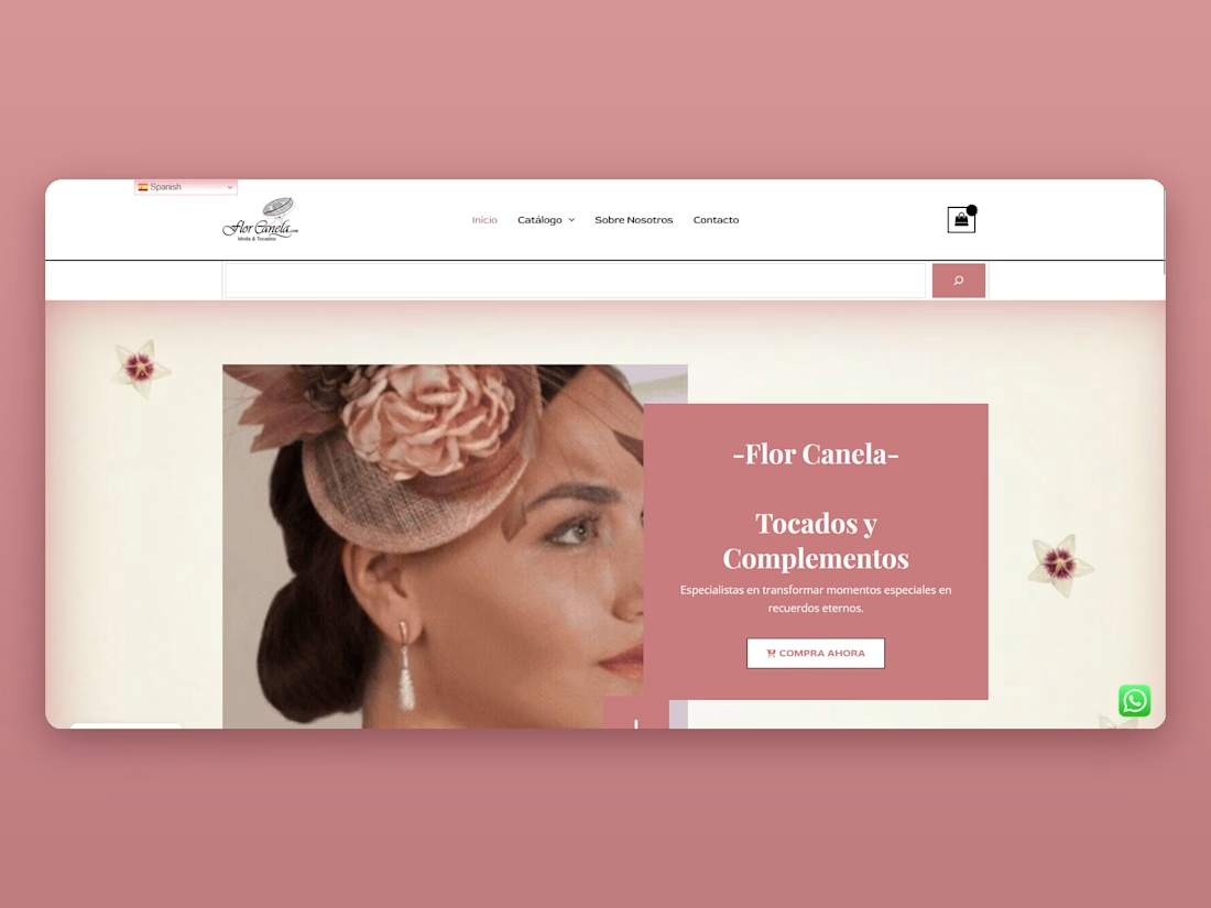

Beautiful setup. The combination of elegant design and easy product management is a strong win for the client.