The network for creativity
Join 1.25M professional creatives like you
Connect with clients, get discovered, and run your business 100% commission-free
Creatives on Contra have earned over $150M and we are just getting started
Back to feedPost

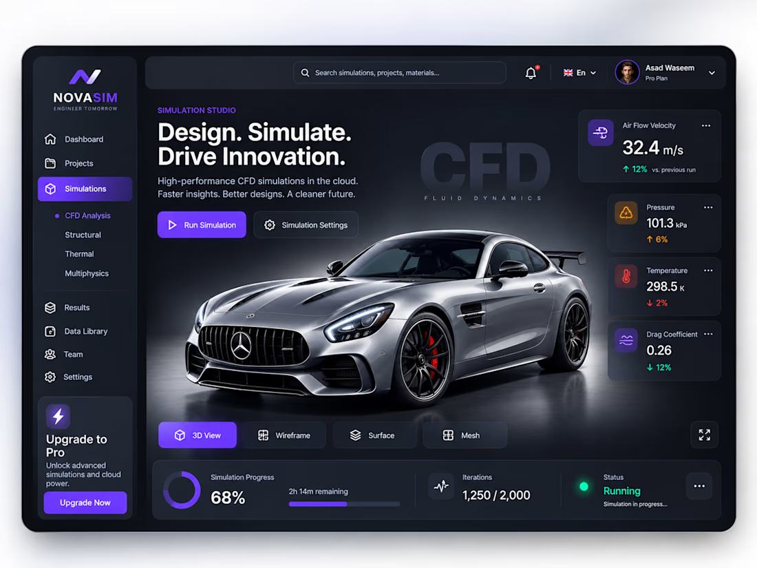
CFD Simulation Dashboard UI/UX | Automotive Engineering SaaS
Exploring a modern CFD Simulation Dashboard UI/UX concept for automotive engineering and simulation software.
The interface is designed around 3D vehicle visualization, aerodynamic analysis, real-time simulation metrics, airflow velocity, pressure, temperature, drag coefficient, and simulation progress.
The goal was to create a dashboard that feels technical and powerful while keeping complex engineering data easy to scan and understand.

The network for creativity
Join 1.25M professional creatives like you
Connect with clients, get discovered, and run your business 100% commission-free
Creatives on Contra have earned over $150M and we are just getting started











Related posts

Exploring a clean, modern SaaS dashboard UI. Focused on simple layouts, smooth interactions, and a better user experience 🚀


i had to like this, it got my attention, very nice build mate.

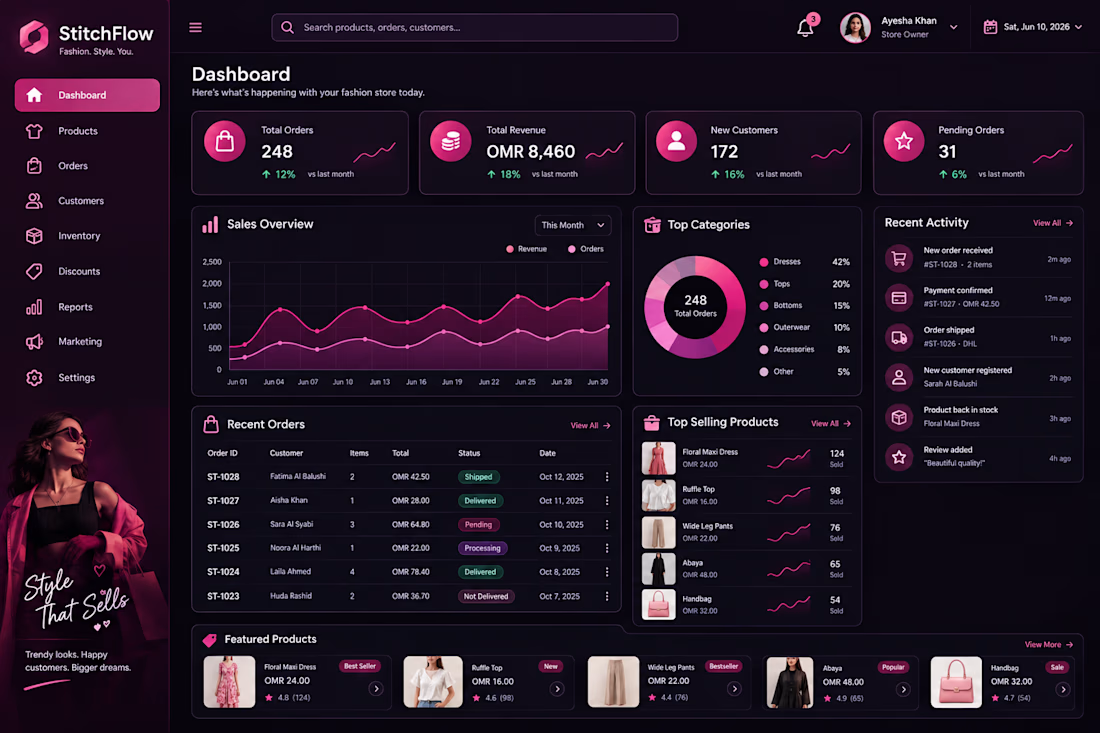
Stitch Flow — Women’s Fashion Dashboard UI Design 🎨
What do you think of the design? I’d love to hear your honest opinion and suggestions! 💗


That's really fulfilling design it has all you need but it needs to be more minimalistic ❤️
Great job Abi🎉🎉🎉

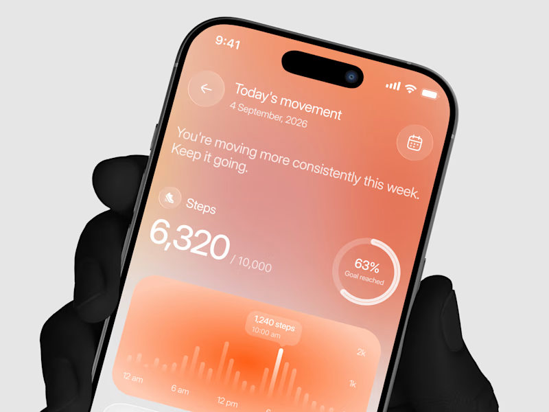
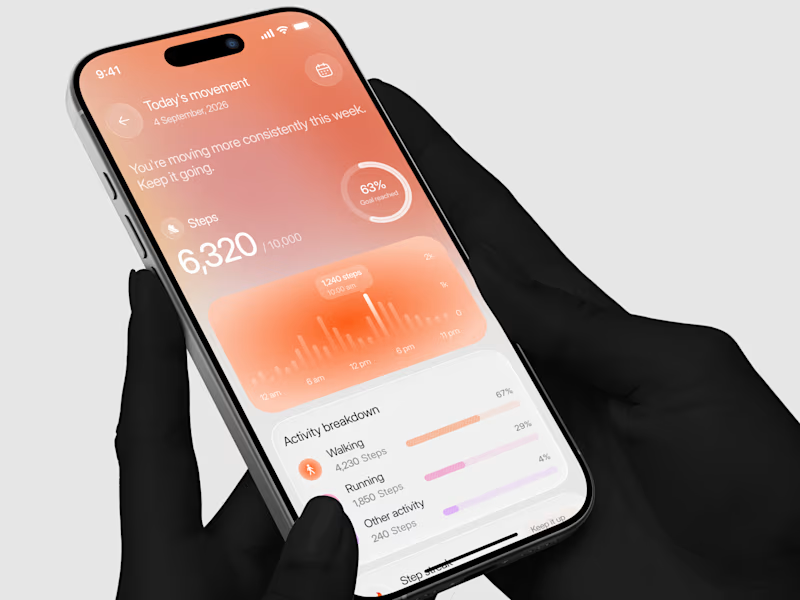
Designed a step tracking screen where you can see your daily progress and weekly trend in one glance.
Same screen, two shots. Which one would stop your scroll? 👀

11 voted
73%
4 voted
27%
15 votes
Closed
