The network for creativity
Join 1.25M professional creatives like you
Connect with clients, get discovered, and run your business 100% commission-free
Creatives on Contra have earned over $150M and we are just getting started
Back to feedPost


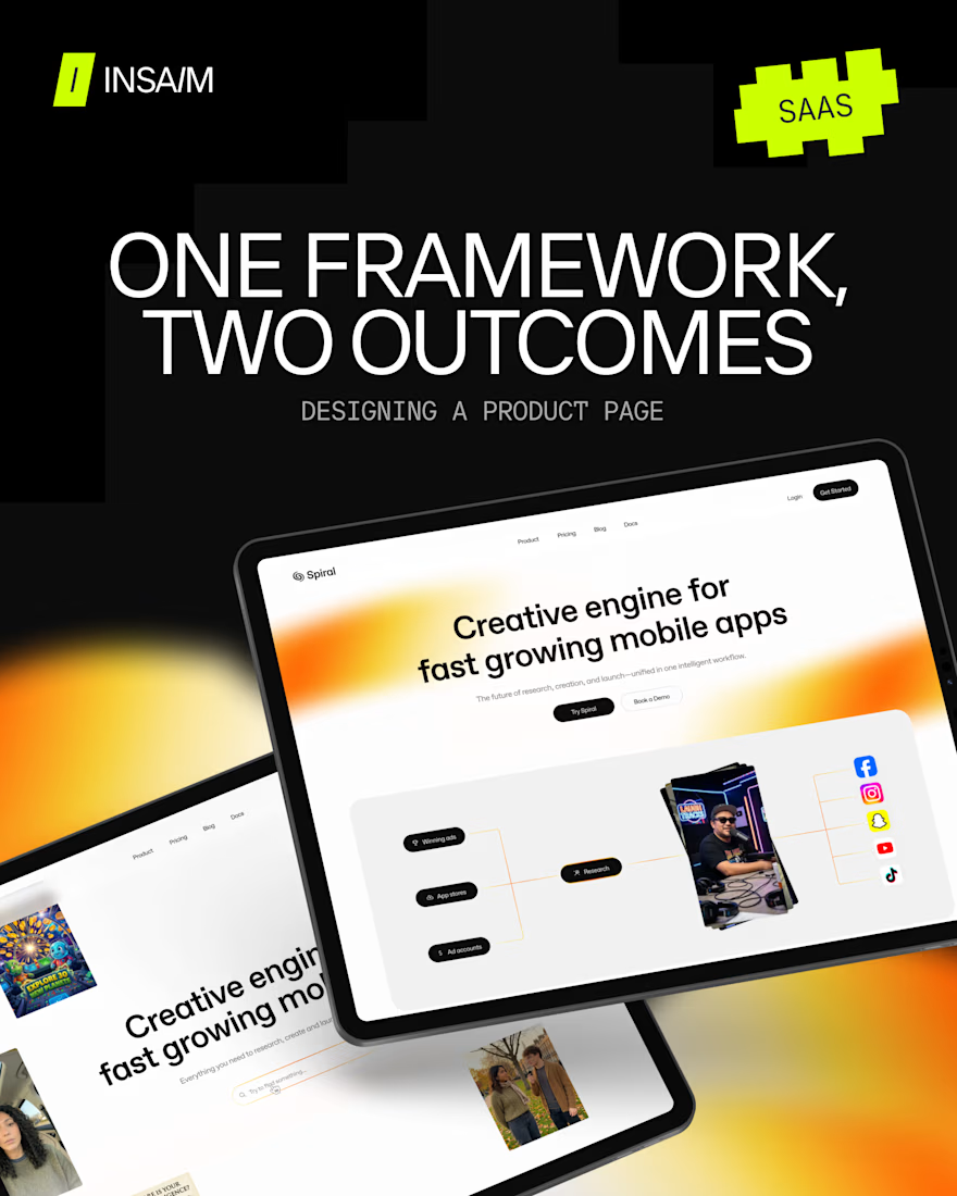
We designed the same product page twice, so you could see the difference.
We've been researching how high-converting SaaS product pages are actually built, and the answer isn't better copy or sharper visuals. It's choosing the right combination of marketing framework and structure pattern before anything is designed.
Take Outcome-Driven: one of the dominant marketing frameworks for mature SaaS right now. Two products can run it and land in completely different places depending on the pattern.
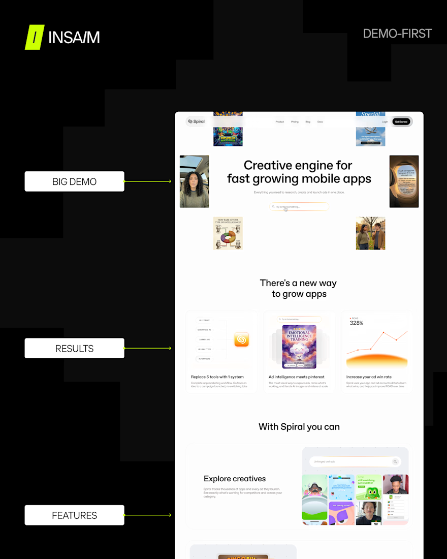
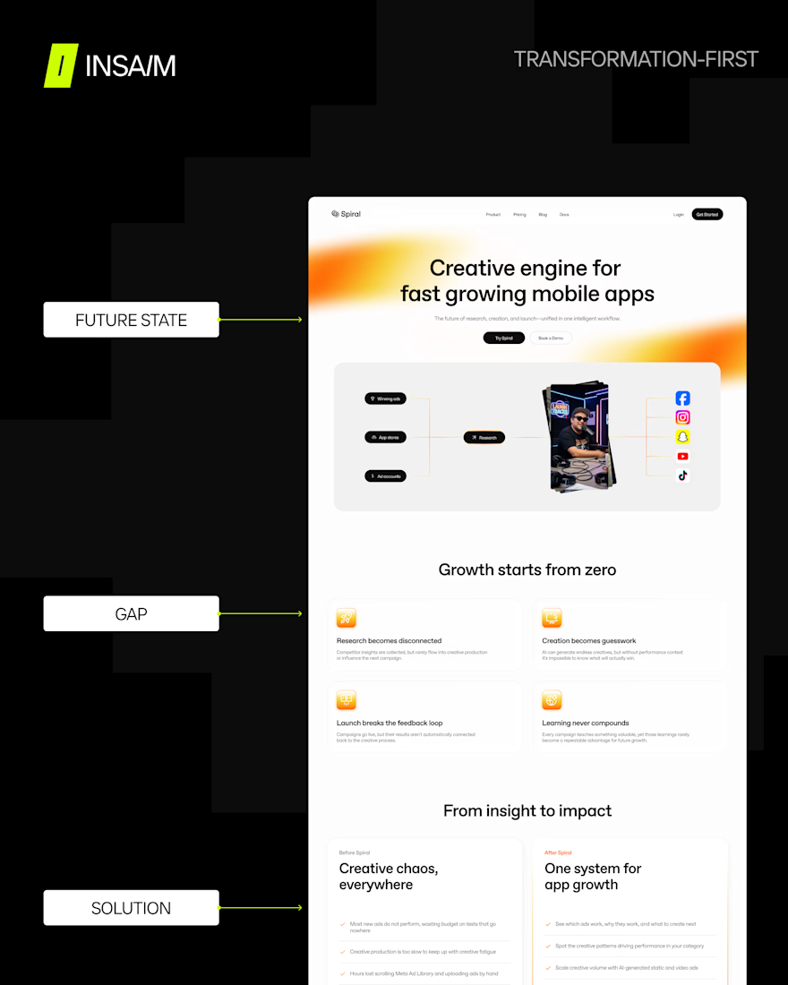
Demo-first pattern opens on the interface: the product speaks before any explanation. Transformation-first opens on the future state. The gap between there and where you are now is what drives the page.
We explored both through Spiral, one of our recent projects, and here is a short side by side. Which one do you prefer?
The best pages mix and match, though doing that well starts with understanding what each pattern actually does. That's what the breakdown is for.
Full breakdown of SaaS product page frameworks, patterns, and block-level logic → https://www.insaim.design/blog/how-high-converting-saas-product-pages-are-actually-built
The network for creativity
Join 1.25M professional creatives like you
Connect with clients, get discovered, and run your business 100% commission-free
Creatives on Contra have earned over $150M and we are just getting started







Related posts

AI Automation SaaS Landing Page
A modern AI automation SaaS website design focused on simplifying workflows, automating repetitive tasks, and helping businesses work smarter. Designed with a clean interface, intuitive user experience, and a scalable visual system to communicate the value of AI-powered automation.


Amazing

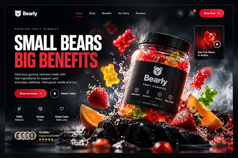
Which gummy brand would make you stop scrolling?
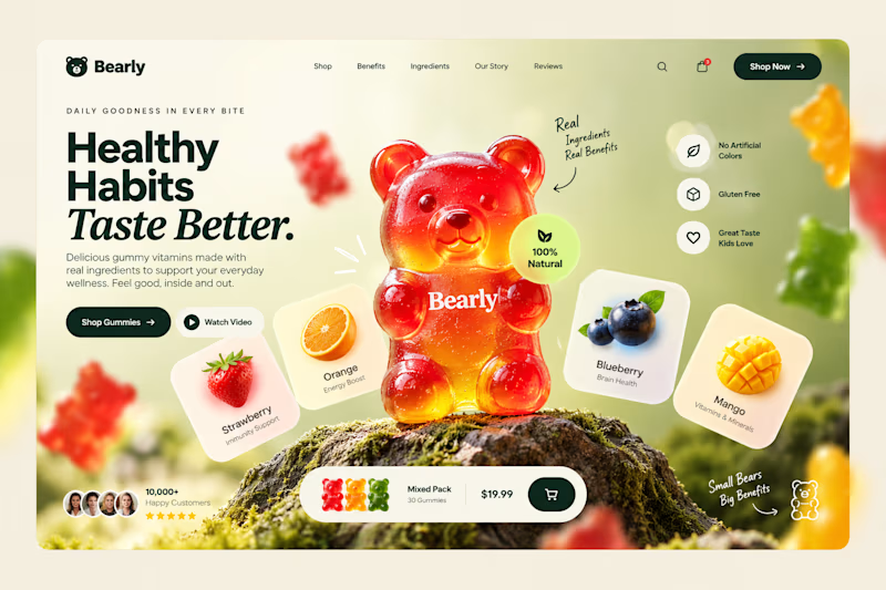
Two different directions for Bearly, a gummy candy brand concept.
One is bright, playful, and fruit-inspired. The other is bold, dark, and premium.
Same product, two completely different visual experiences.
Which one would you choose? Vote below! 👇
#BrandIdentity #WebDesign #UIUX #EcommerceDesign #Figma #DesignInspiration #ABTesting
9 voted
75%
3 voted
25%
12 votes
Closed

I will always love it playful cant lie

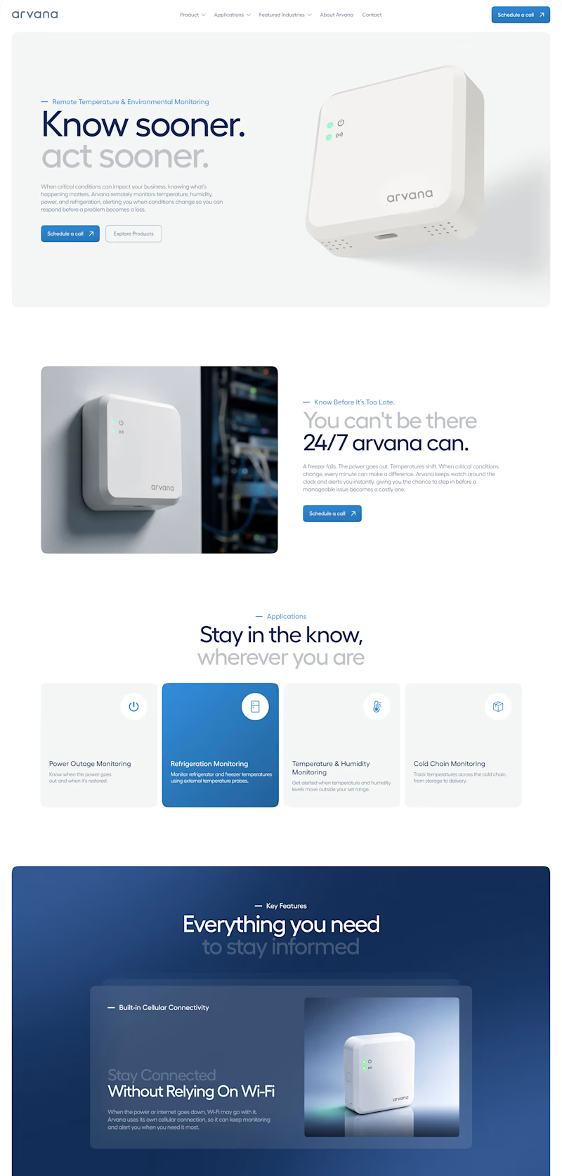
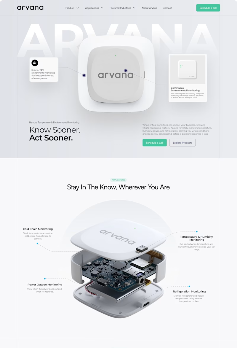
✨ Two website concepts. One brand. Which Arvana design stands out?
I explored two creative directions for Arvana, balancing clean aesthetics with product-focused storytelling and a modern tech feel. 🌐💡
🔵 Option 1: Clean & Corporate 🟢 Option 2: Bold & Interactive
Which direction would you choose? 👀
Cast your vote! 🗳️👇
1 voted
4%
25 voted
96%
26 votes
Closed