The network for creativity
Join 1.25M professional creatives like you
Connect with clients, get discovered, and run your business 100% commission-free
Creatives on Contra have earned over $150M and we are just getting started
Back to feedPost

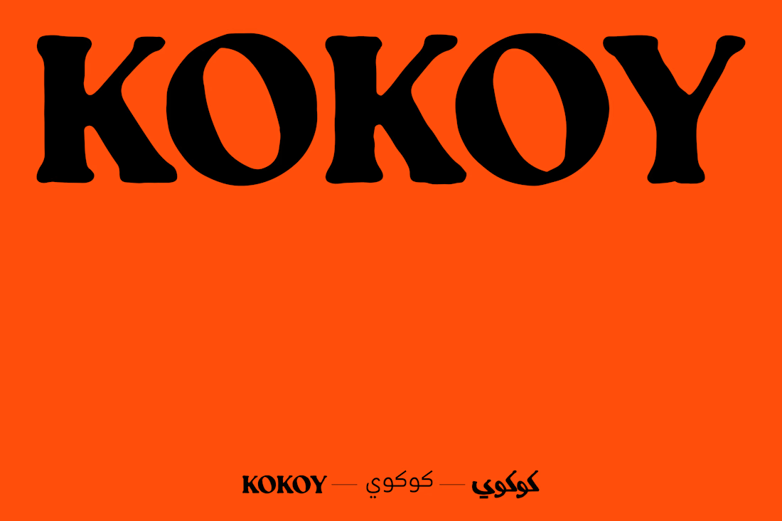
Kokoy is rooted in Kuwait, a country where Arabic is both language and identity; it was essential to honor this cultural foundation in the visual expression of the brand. Translating the name into Arabic wasn’t just a linguistic decision; it was a gesture of cultural authenticity and local pride
To deepen this connection, the logotype was redesigned drawing from traditional Arabic calligraphy, blending its rich, flowing heritage with Kokoy’s playful and bold personality. This allowed the brand to speak in a visual dialect that feels both familiar and fresh to its audience, celebrating Kuwait’s aesthetic traditions while inviting a new generation into a colorful, contemporary dessert experience.
Through this design choice, Kokoy becomes more than a brand; it becomes a bridge between tradition and modernity, between local roots and global reach.



Arabic calligraphy and a heavy playful Latin wordmark usually want different stroke contrast, so that pairing is a tricky one to land. Did you draw the Latin side first and bend the calligraphy toward it, or start from the Arabic form?
The network for creativity
Join 1.25M professional creatives like you
Connect with clients, get discovered, and run your business 100% commission-free
Creatives on Contra have earned over $150M and we are just getting started



Related posts

guys, I need your help choosing a profile cover video.
which one looks better?
22 voted
13%
141 voted
87%
163 votes
Closed


Logistics & Supply Chain Website Design
A modern logistics website concept designed for transportation, freight, and supply chain companies. The design focuses on building trust, showcasing services, streamlining shipment management, and improving customer engagement through a clean, professional, and conversion-focused user experience.


Strong hero!

What would you need to see before you call something a full brand?
Today I made two.
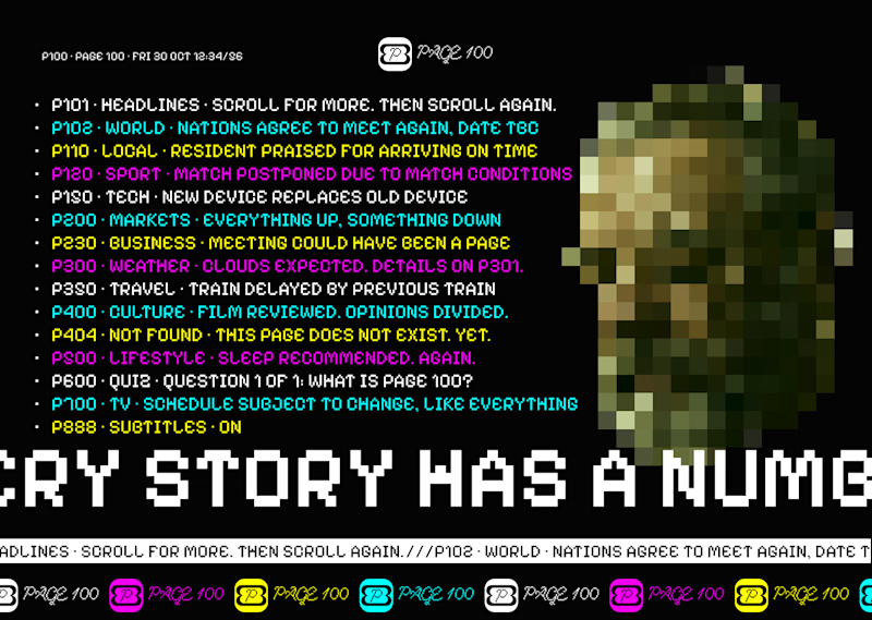
Page 100, a news brand that runs on a ticker and transitions.
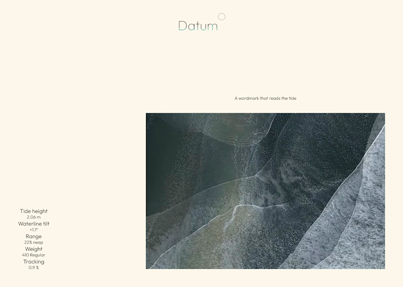
Datum, a wordmark half underwater that reads the tide, so it is never the same twice.
Both are becoming full case studies. What goes in?
9 voted
45%
11 voted
55%
20 votes
Closed

Version one looks clean and sick, idnk why, but it looks intresting for me, like smth special. Nice job!