The network for creativity
Join 1.25M professional creatives like you
Connect with clients, get discovered, and run your business 100% commission-free
Creatives on Contra have earned over $150M and we are just getting started
Back to feedPost

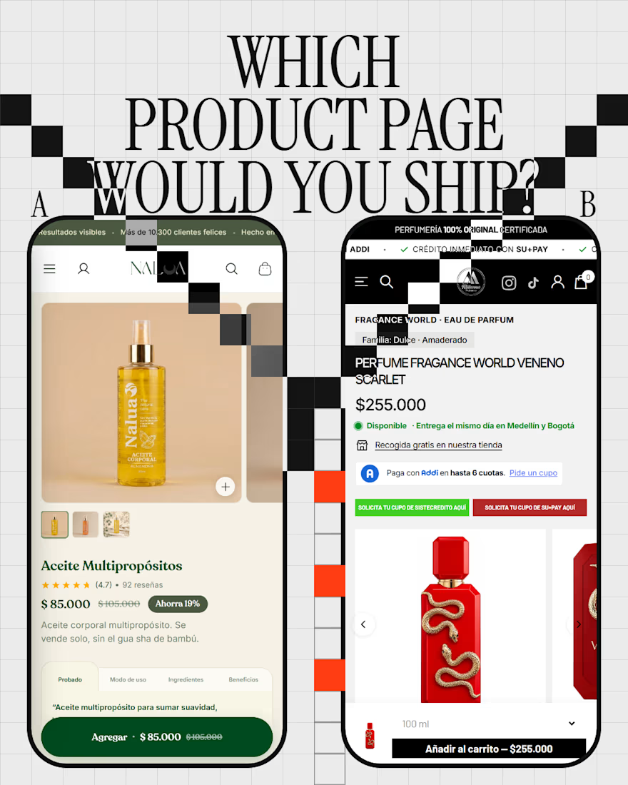
One product page opens with the bottle. The other opens with the price, the stock and the delivery day.
A is Nalua, a skincare brand. A big photo of the oil first, then the name, the reviews, the price with the saving, and an add button that stays on screen as you scroll.
B is Perfumería Millennio. Before you see the bottle you get the price, an in-stock dot, a delivery line, free pickup in store and ways to pay in installments. The photo comes after the answers.
Both are Shopify stores I worked on (Nalua I built, Millennio is a customized theme), captured on a phone on 3 Oct 2026.
My guess: it depends on who lands there. Someone comparing prices wants B. Someone who just saw the oil on Instagram wants A.
A or B: which would you ship? Vote in the comments, and tell me what you'd move to the top of the one you didn't pick.
The network for creativity
Join 1.25M professional creatives like you
Connect with clients, get discovered, and run your business 100% commission-free
Creatives on Contra have earned over $150M and we are just getting started






Related posts

Built a Conversion-Focused Shopify Store for True Fresh 🧼
Just completed a Shopify store for True Fresh, a brand specializing in washing machine and appliance cleaning products.
The goal was to create a clean, trustworthy storefront that makes it easy for customers to understand the product, see the results, and make a purchase.
What I built:
→ Figma to pixel-perfect Shopify development
→ Mobile-first responsive design
→ Conversion-focused product pages
→ Washing machine cleaning product showcases
→ Before & after cleaning comparisons
→ Product bundles & upsells
→ Customer reviews & social proof
→ FAQ sections to reduce purchase friction
→ Blog integration for SEO
→ Clean, modern UI/UX
→ Performance-focused development
Tech stack:
Shopify • Liquid • HTML/CSS • JavaScript
The store is designed around the product's key selling points: removing buildup and odors, easy monthly maintenance, compatibility with different washer types, and building trust through reviews and product education.
🔗 Live store: https://true-fresh.com/
Looking to build or improve a Shopify store for your brand? Let’s connect.
#Shopify #ShopifyDeveloper #ShopifyStore #Ecommerce #DTC #WebDevelopment #ConversionRateOptimization #Freelance


𝗗𝗔𝗬 𝟭𝟭 𝗢𝗙 𝟯𝟬𝗗𝗔𝗬𝗦
𝗪𝗶𝘅 𝗦𝘁𝘂𝗱𝗶𝗼 𝘃𝘀 𝗦𝗵𝗼𝗽𝗶𝗳𝘆: 𝗪𝗵𝗶𝗰𝗵 𝗜𝘀 𝗕𝗲𝘁𝘁𝗲𝗿 𝗳𝗼𝗿 𝗦𝗺𝗮𝗹𝗹 𝗕𝘂𝘀𝗶𝗻𝗲𝘀𝘀 𝗘-𝗖𝗼𝗺𝗺𝗲𝗿𝗰𝗲?
𝗗𝗲𝗰𝗶𝗱𝗶𝗻𝗴 𝘄𝗵𝗲𝗿𝗲 𝘁𝗼 𝗵𝗼𝘀𝘁 𝘆𝗼𝘂𝗿 𝗽𝗿𝗼𝗱𝘂𝗰𝘁𝘀?
𝗖𝗵𝗼𝗼𝘀𝗲 𝗦𝗵𝗼𝗽𝗶𝗳𝘆 𝗶𝗳: You have 50+ inventory items, need multi-currency checkout, advanced 3PL shipping integrations, and aim for pure retail scaling.
𝗖𝗵𝗼𝗼𝘀𝗲 𝗪𝗶𝘅 𝗦𝘁𝘂𝗱𝗶𝗼 𝗶𝗳: You are a boutique brand, creative agency, or service business selling digital products, bookings, and custom merchandise with bespoke visual freedom.
𝗪𝗵𝗶𝗰𝗵 𝘄𝗶𝗹𝗹 𝘆𝗼𝘂 𝗽𝗿𝗲𝗳𝗲𝗿 ?


Shopify is one of best for any ecommerce business


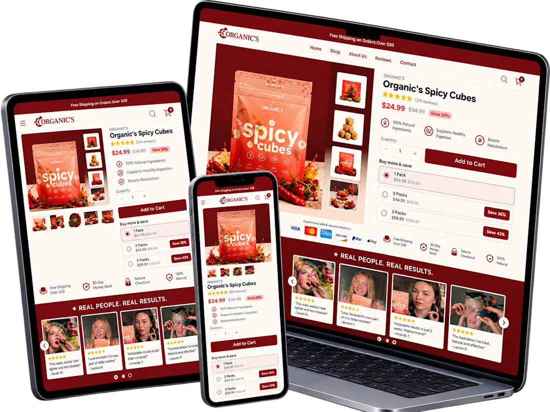
A conversion-focused Shopify product page featuring a clean, modern layout and an intuitive shopping experience.
The page brings together an engaging product gallery, bundle selection, clear Add to Cart actions, customer testimonials, product education, comparison tables, and FAQs.
The design emphasizes visual hierarchy, product discovery, purchase clarity, and trust-building elements to help shoppers make informed decisions.
Focus: Shopify UI/UX, product page design, and conversion rate optimization.

So incredible design