The network for creativity
Join 1.25M professional creatives like you
Connect with clients, get discovered, and run your business 100% commission-free
Creatives on Contra have earned over $150M and we are just getting started
Back to feedPost
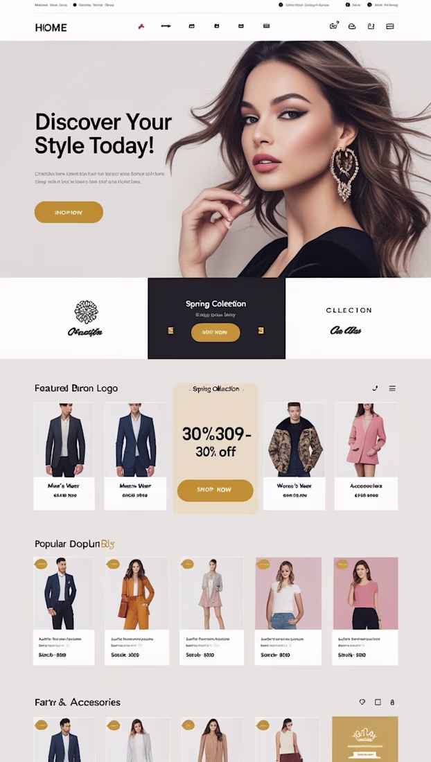
The client was a growing streetwear and fashion label with a strong aesthetic vision but a website that failed to communicate it. Their existing online storefront felt generic ... a basic template with no personality, poor visual hierarchy, and no clear path to purchase. Visitors were landing on the page and leaving immediately because the design didn't reflect the premium, editorial quality of the clothing. The brand was losing potential customers at the very first touchpoint, and the lack of a seasonal campaign section meant new collection drops went unnoticed. They needed a website that didn't just list products... it needed to sell a lifestyle.
I designed and built a full fashion e-commerce landing page in Framer that merged editorial storytelling with e-commerce functionality. The page opens with a bold, full-bleed hero section featuring a high-impact model photograph, a commanding headline, and a prominent shop CTA — immediately establishing the brand's tone. Below the fold, I created a spring collection spotlight with a dark contrast panel and promo CTA to drive urgency, followed by a featured brands section with a discount callout card to increase average order value. A product grid with clean cards, pricing, and sale badges was designed to guide shoppers toward purchase, while a fashion accessories section extended the browsing experience. The warm beige and gold palette, oversized typography, and generous whitespace gave the brand the premium boutique feel it deserved — without losing approachability.
The redesigned landing page gave the brand a cohesive, high-converting digital storefront that finally matched the quality of their clothing. The editorial hero section significantly reduced bounce rates by immediately capturing attention and communicating brand identity. The structured product grid and seasonal campaign section made it easy for returning customers to discover new drops and take action, while the strategic placement of discount callouts and sale badges created natural purchase urgency. The client reported stronger engagement from their social media traffic, with visitors spending more time on the page and the shop-now conversion path feeling intuitive across both mobile and desktop. The site now works as a full-time salesperson — visually compelling, easy to navigate, and built to grow with the brand.
The network for creativity
Join 1.25M professional creatives like you
Connect with clients, get discovered, and run your business 100% commission-free
Creatives on Contra have earned over $150M and we are just getting started
Trending
Claude
Claude has entered the design space. How are you using Claude Design?
Contra University
Learn from expert creatives how to earn more using next-gen AI tools.
creativeaiflow
Creative AI workflows are evolving. What tools do you use, and what are their strengths and weaknesses?
freelancerlife
Freelancer life is wins, pivots, and everything in between. What’s yours right now?
Related posts
Most websites look good.
Few make people stop, trust, and take action.
This landing page was designed with one goal: clarity over complexity.
Every section has a purpose:
- Clear visual hierarchy
- Generous whitespace
- Clean, modern UI
- Scalable components
Good design isn't about adding more,it's about removing what doesn't help users.
I'd love to hear your thoughts:
What part of a landing page has the biggest impact on conversions?
If you'd like, I can also make it more viral, designer-focused, or client-attracting.
Weldone ☀️ 💖
The Future in Black was built for Joy Fennell to hold a story that needed more than a standard portfolio site. Our goal from the start was to make the site feel archival and alive at once, part digital exhibit, part living brand presence, so every design decision was made to support that feeling rather than just present information.
We started with structure: how should a visitor move through this content, and what pace should that movement have? That question shaped our use of Finish Layer's block animations. Text reveals on scroll, so the story unfolds in beats instead of arriving all at once, closer to reading a book than scrolling a website. Images use hover interactions to invite a second look without pulling focus from the words around them.
From there we layered in movement. Shapes transform and shift position as the visitor scrolls, adding depth and a sense of motion that a static layout couldn't carry. This was the piece that took the most iteration, getting the timing and scale of these transforms to feel intentional rather than gimmicky meant testing several versions before landing on the current pacing.
Typography carried a lot of the brand's identity, so we uploaded Million and Inter Tight rather than relying on Squarespace's native font library. Million gives the site its editorial voice in headlines, and Inter Tight keeps body copy clean and legible against it.
The result is a site built on Squarespace's foundation, using Finish Layer's native tools alongside custom CSS and JS, pushed toward something that reads as custom, editorial, and specific to one person's story rather than a repeatable formula.
FigmasquarespacedesignsquarespacewebsitesSquarespace Website DesignWebsite CSSSquarespacesquarespacechallenge
Hey @Golden Launch this is awesome but it looks like the link you included in the comments isn't working. make sure the link is active in order for your submission to be judged 😃
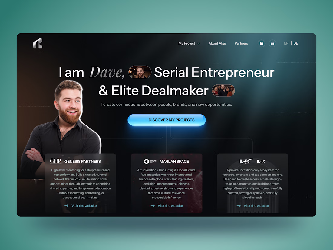
🚀 Personal Brand Website for Entrepreneur | UI/UX Case Study
Building a personal brand online is about more than just having a website — it's about creating trust from the very first interaction.
For this concept, I designed a modern personal brand website for an entrepreneur and dealmaker, combining a bold visual style with a clean user experience. The goal was to showcase credibility, highlight partnerships, and guide visitors naturally toward meaningful connections.
✨ Project highlights:
• Clean and modern UI with a premium aesthetic
• Personal branding focused homepage
• Responsive website design
• Strategic content hierarchy
• Partner & portfolio showcase
• Contact section with clear CTA
• Mobile-first experience
• Dark interface with vibrant accent colors
Always enjoy designing websites where personality and business goals come together in one cohesive experience.
💬 I'd love to hear your thoughts!