The network for creativity
Join 1.25M professional creatives like you
Connect with clients, get discovered, and run your business 100% commission-free
Creatives on Contra have earned over $150M and we are just getting started
Back to feedPost
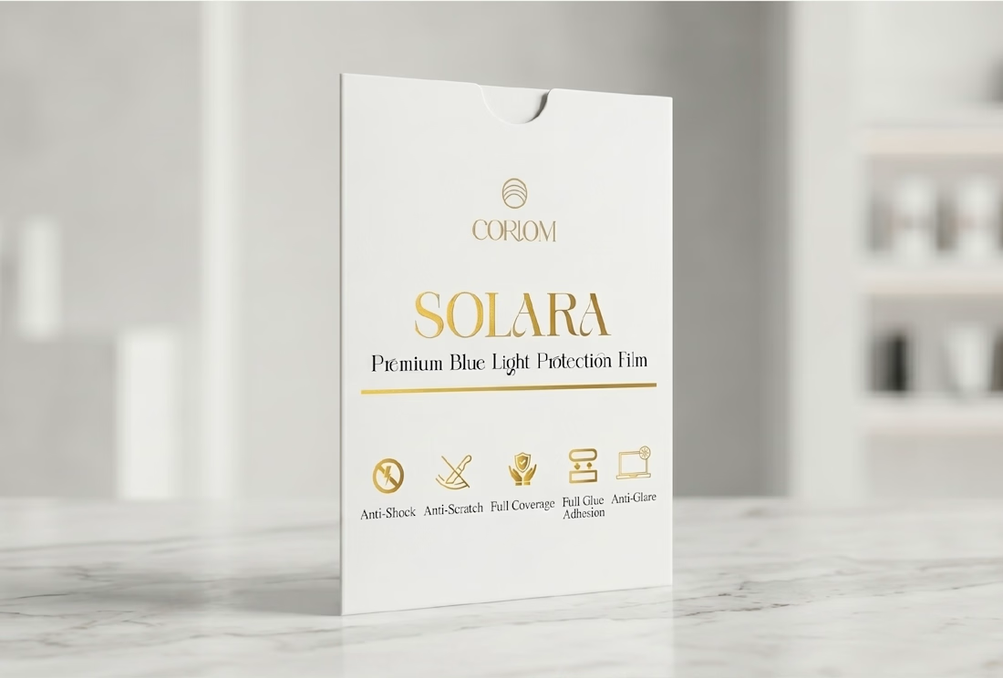
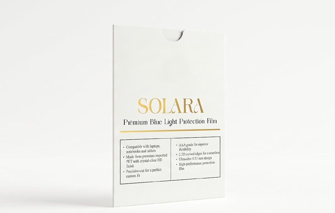
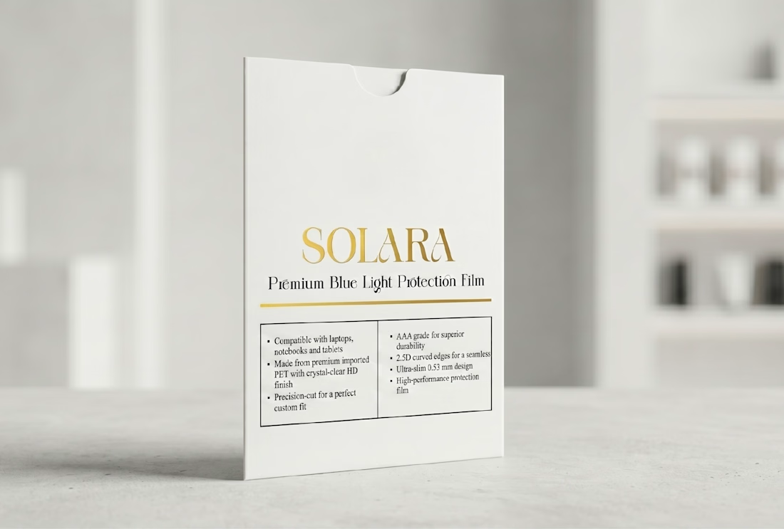
Blue-light filters usually come in cheap plastic sleeves. For SOLARA by CORIOM, I wanted the pack to feel as premium as the product it protects.
A matte white sleeve, one thin gold rule, a high-contrast serif wordmark and four simple benefit icons on the front. The back keeps specs and instructions in a calm two-column grid, so it still reads cleanly on a busy shelf.
Packaging designers, would you push the gold further, or keep it this quiet? Curious what you'd change.


Amazing

Thanks
The network for creativity
Join 1.25M professional creatives like you
Connect with clients, get discovered, and run your business 100% commission-free
Creatives on Contra have earned over $150M and we are just getting started






Related posts


Creating 2 concepts for a project, this is the first one.
I’m really enjoying the process!
Right now, we’re defining the strategy and visual direction, which will later serve as the foundation for developing the final brand identity.
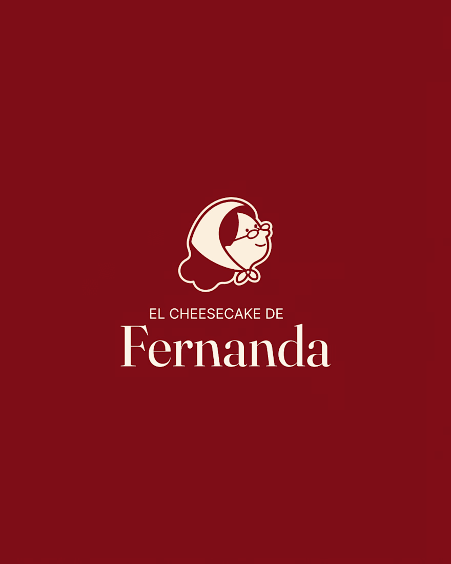
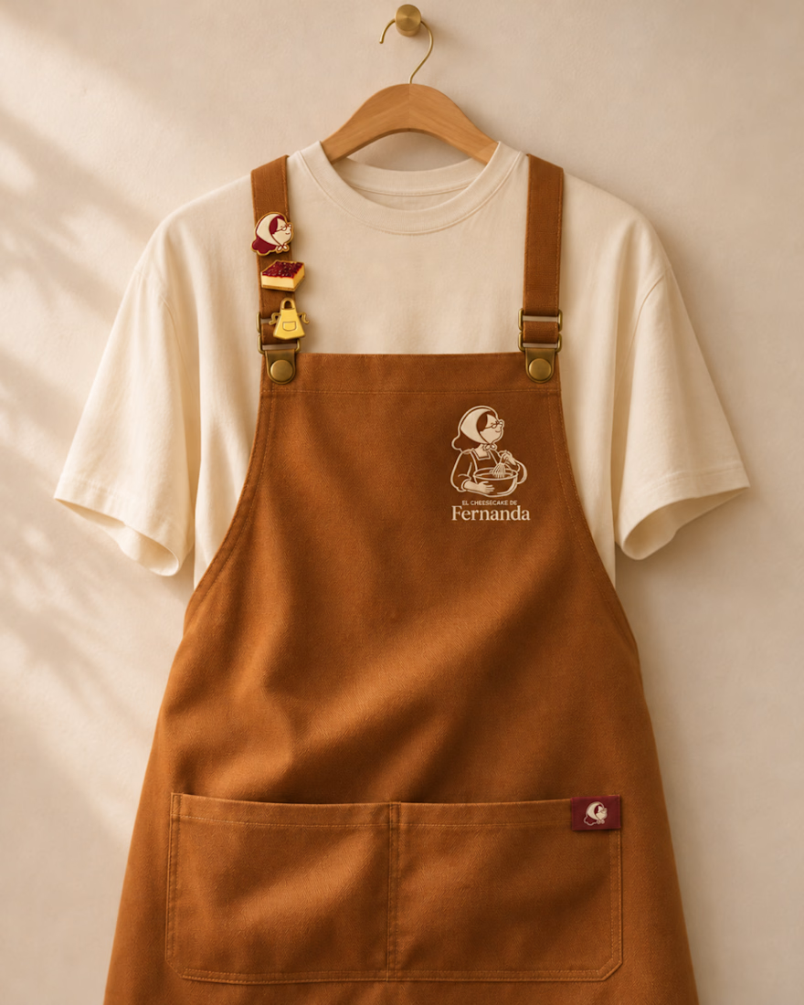
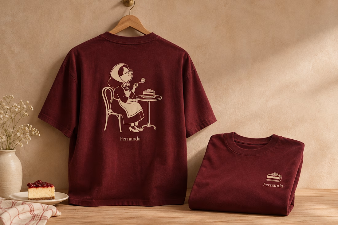

Nice logo design I like how logo is placed in clothes

Big news! We opened an agency. To deliver the best mascot work the world has seen, me @Mary Delaney and @Arsen Airyan are teaming up with mascot.berlin
Check it live, and stay tuned for more!

Looks cool, kepp going!

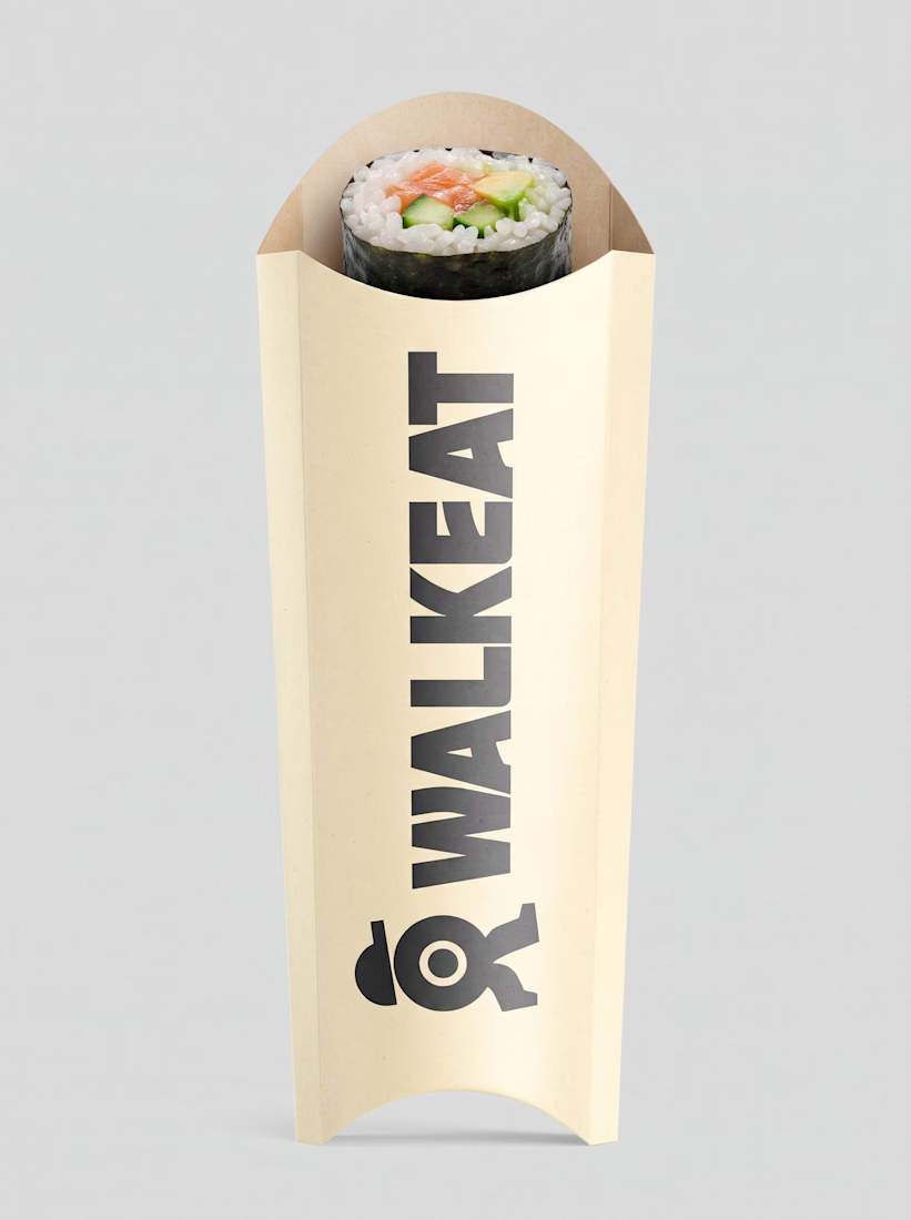
A sushi roll with a life of its own.
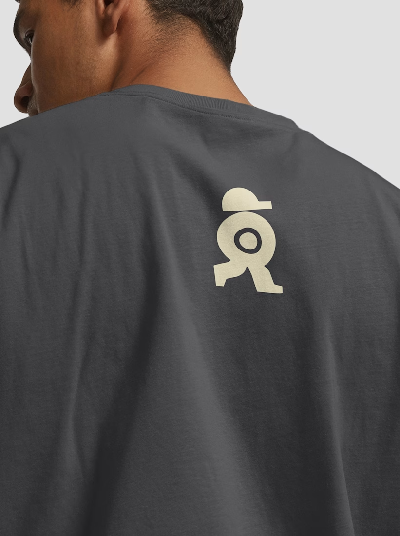
The WALKEAT identity transforms the shape of a sushi roll into a walking character. Its circular center references the cross-section of the roll, while the cap and legs bring movement and personality to the figure.
The custom-designed wordmark reinforces this concept through subtle modifications to the W, A, and E, creating a visual connection between typography and symbol.
A simple, playful and contemporary identity that communicates the product without relying on literal Japanese imagery or an overly cartoonish character.





Great work!!