The network for creativity
Join 1.25M professional creatives like you
Connect with clients, get discovered, and run your business 100% commission-free
Creatives on Contra have earned over $150M and we are just getting started
Back to feedPost

Designing Bubbly: Communicating Core Value in 3 Seconds
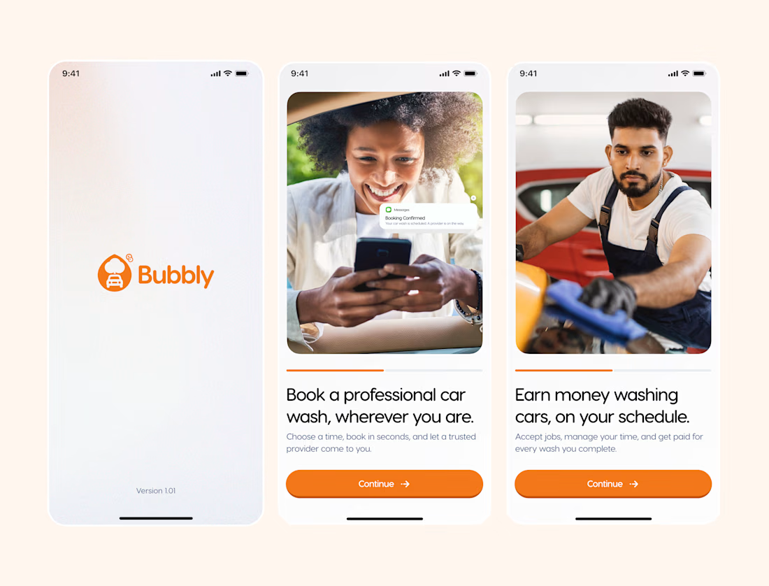
Can a user understand your app’s entire business model before signing up? That was the core challenge behind the onboarding flow for Bubbly—a dual-sided car wash platform.
Instead of long walkthroughs, these three screens quickly deliver the value proposition for both sides of the marketplace:
Brand Identity: Establishing instant trust through a clean splash screen.
Demand Side: Letting customers book a professional car wash anywhere in seconds.
Supply Side: Showing washers how to register, accept jobs, and earn on their schedule.
In onboarding, brevity is clarity. If users don't grasp the app's purpose at a glance, the UX isn't doing its job.
Does this sequence clearly communicate Bubbly’s value proposition? I’d love to hear how you approach dual-sided onboarding!
I’m Damilola, a Product Designer who also designs the visual presence around the product.
The network for creativity
Join 1.25M professional creatives like you
Connect with clients, get discovered, and run your business 100% commission-free
Creatives on Contra have earned over $150M and we are just getting started








Related posts

𝗧𝗿𝗮𝗱𝗶𝘁𝗶𝗼𝗻𝗮𝗹 𝗙𝗶𝗴𝗺𝗮 𝗱𝗲𝘀𝗶𝗴𝗻 𝗶𝘀 𝗱𝗲𝗮𝗱 ! ! !
As a designer, I love how AI is changing the way we work.
We’re moving from simply sending clients static designs on Figma to building clickable prototypes that bring their vision to life.
Now, a founder can actually experience how their website will look and feel before development is complete.
They can click through pages, explore interactions, and see animations in action.
And for developers? The handover becomes much smoother because they can see how everything is supposed to work, not just how it should look.
Less guesswork. Better collaboration. A clearer vision.
Honestly, it’s a win-win for everyone.
I think every designer and developer should embrace AI in 2026. Not to replace our skills, but to expand what we can create with them. 🚀
So are you still team traditional Figma design ? Or you now use Ai to advance your design work ?

Awesome work!

Interactive AI Analytics Dashboard | SaaS Product Design
A modern, animated AI-powered eCommerce analytics dashboard designed to help businesses track sales performance, monitor revenue, understand customer behavior, and make data-driven decisions.
The design combines a clean SaaS interface, intuitive data visualization, interactive dashboard elements, and smooth animations to create a more engaging user experience. Every section is designed to make complex analytics easier to understand while maintaining a professional, scalable, and user-friendly layout.


Super clean work!

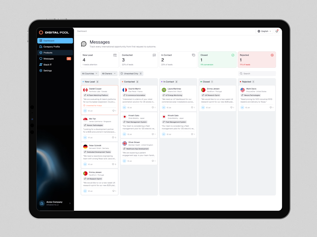
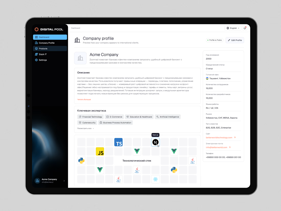
Digital Pool — Website Redesign & Product Dashboard Design
Digital Pool is a digital marketplace connecting businesses with verified software vendors, IT companies, and technology solutions.
The goal was to create a modern, intuitive experience for both businesses looking for technology partners and companies showcasing their products and services.
My work covered the public-facing website and a dedicated company dashboard, including company profiles, product management, application workflows, lead tracking, and account settings.
I focused on simplifying complex workflows, improving information hierarchy, and building a consistent design system across the entire platform.
The result is a cohesive digital ecosystem that makes discovering solutions, managing products, and connecting with potential clients easier.
Live website: https://digitalpool.gov.uz/en

That's really great digitalmarket place dashboard 🎉🎉🎉
Great job 🎉