The network for creativity
Join 1.25M professional creatives like you
Connect with clients, get discovered, and run your business 100% commission-free
Creatives on Contra have earned over $150M and we are just getting started
Back to feedPost

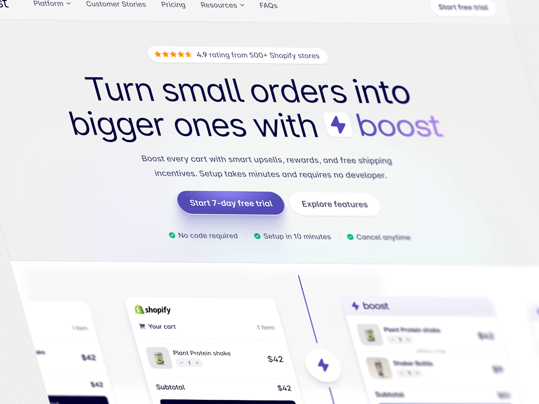
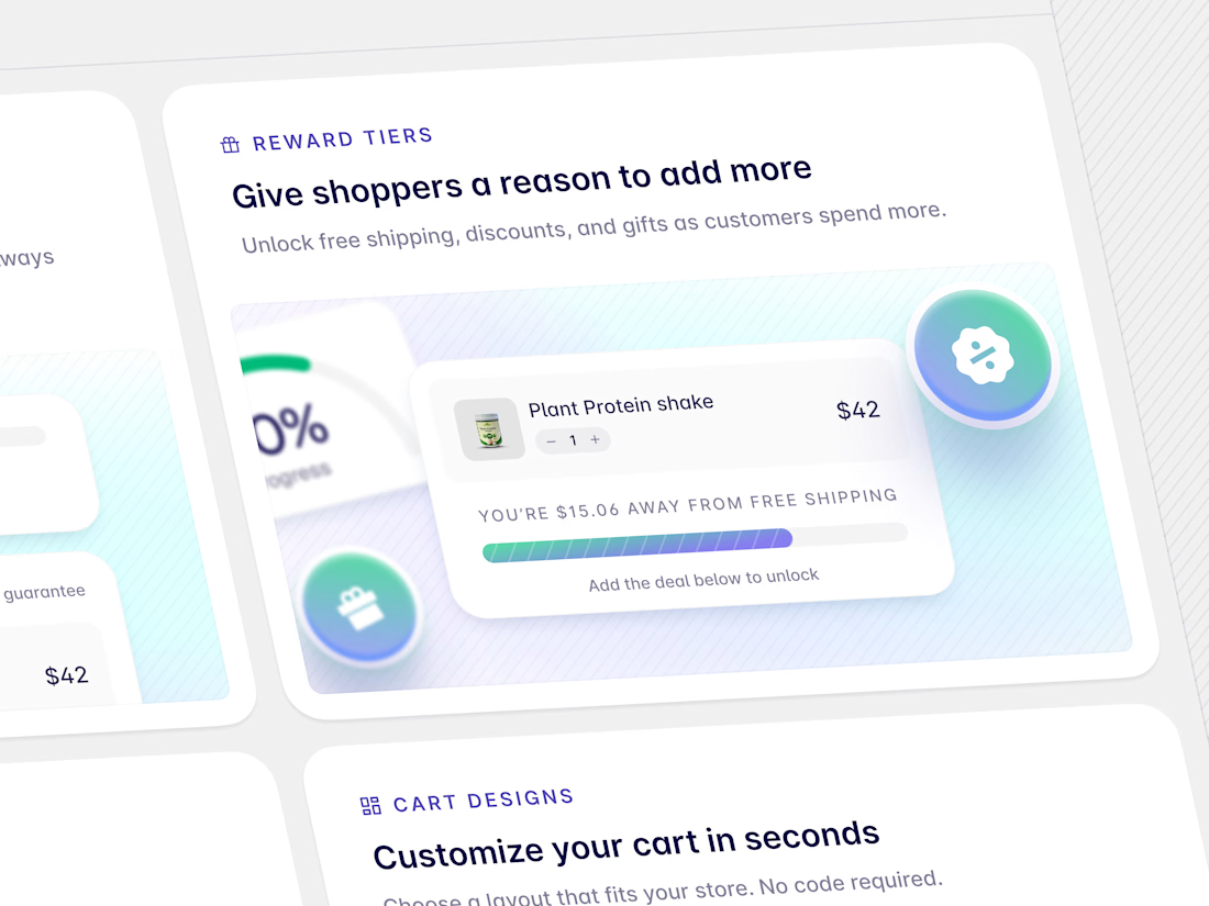
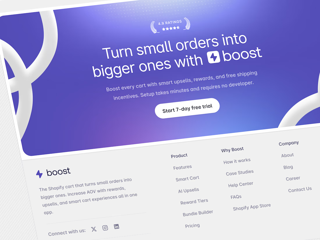
Aura: High-Conversion SaaS Landing Page
The Challenge
Technical products, particularly data analytics tools, often struggle to communicate their value quickly without overwhelming the user. The challenge was to design a hero section that balanced high-tech credibility with approachability, ensuring visitors immediately understood the product's value.
The Solution
I utilized a "Glassmorphism" aesthetic—using translucent layers and soft background gradients—to give the interface a depth that feels modern and lightweight. The layout focuses on strong hierarchy, guiding the eye from the value proposition directly to the conversion points.



The network for creativity
Join 1.25M professional creatives like you
Connect with clients, get discovered, and run your business 100% commission-free
Creatives on Contra have earned over $150M and we are just getting started











Related posts


Brilliant work

FinPulse — Premium Cross-Border Remittance App
Designed a trustworthy FinTech mobile app for global money transfers.
Process: Started with user flow & wireframes for 3-tap transfer, then built a scalable design system in Figma with 100+ components.
Outcome: Final UI focuses on clarity and trust — from onboarding to Home Dashboard ($12,450 balance), Send Money, and Money Sent success state. Built for conversion and speed.
Tools: Figma, iOS Design System, SF Pro
Tags: Mobile App, FinTech, UI/UX, Product Design


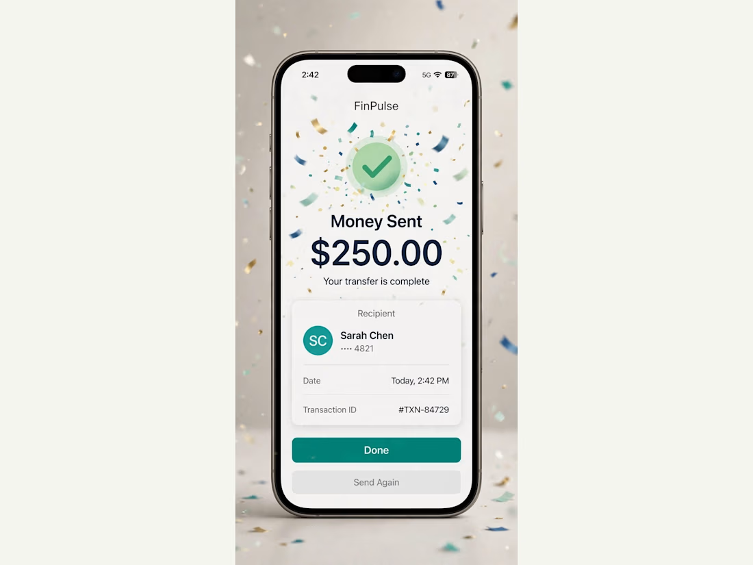
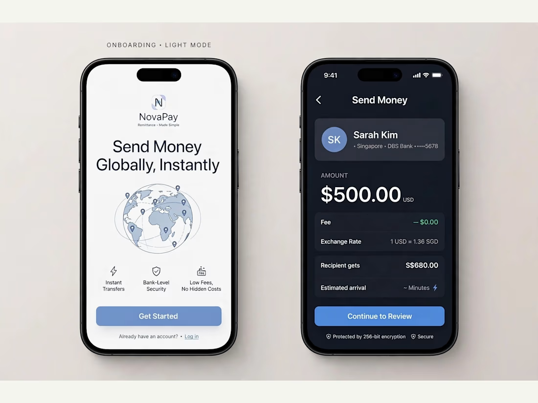
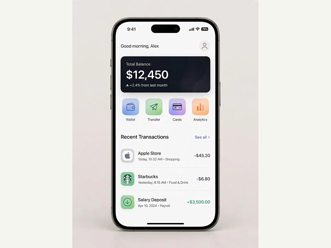
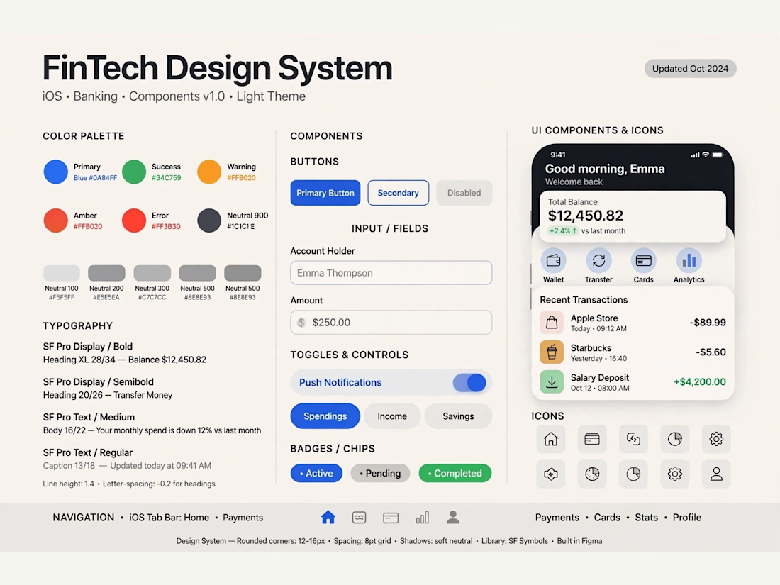

Really solid FinTech mobile design. Clean, trustworthy, and the user flow sounds well thought out. Great outcome on the final UI!

The team is cooking
Motion design for the logo we are making for Nation e-commerce


Wou