The network for creativity
Join 1.25M professional creatives like you
Connect with clients, get discovered, and run your business 100% commission-free
Creatives on Contra have earned over $150M and we are just getting started
Back to feedPost
Taste Test
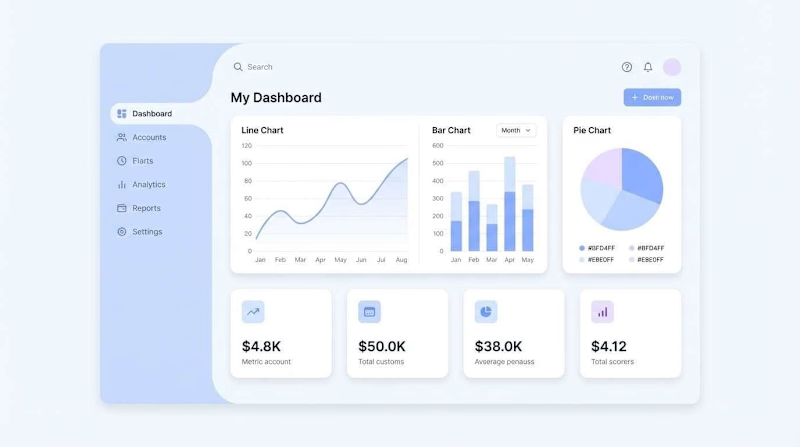
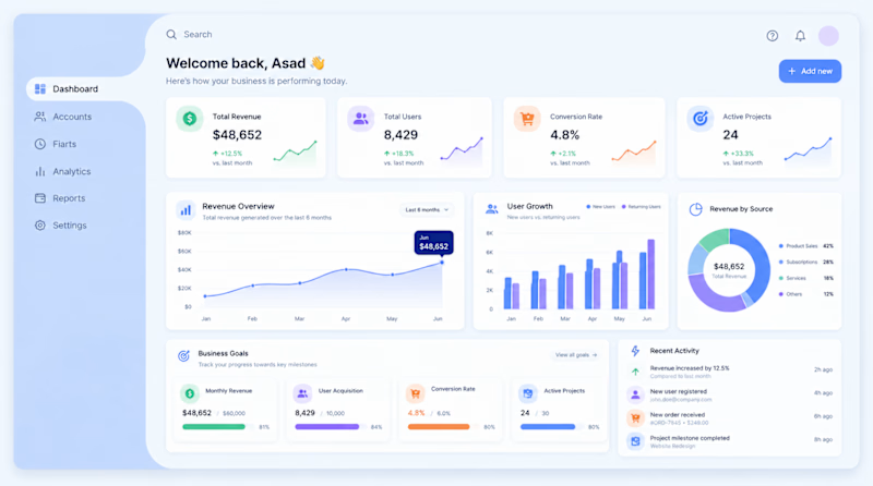
I explored two different approaches for the same dashboard, keeping the project, navigation, sidebar, and overall visual system consistent.
The only thing I changed was the content strategy: one version is designed around Clarity, helping users quickly understand what is happening, while the other is designed around Business Goals, focusing on outcomes, priorities, and what the business needs to achieve.
Now I’m curious which direction feels more effective for a real product.
Which design suits the best?
1 voted
100%
0 voted
0%
1 vote
Closed


Great Work

Thanks!
The network for creativity
Join 1.25M professional creatives like you
Connect with clients, get discovered, and run your business 100% commission-free
Creatives on Contra have earned over $150M and we are just getting started



Related posts


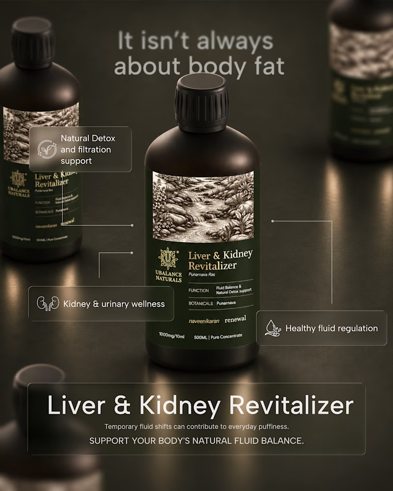
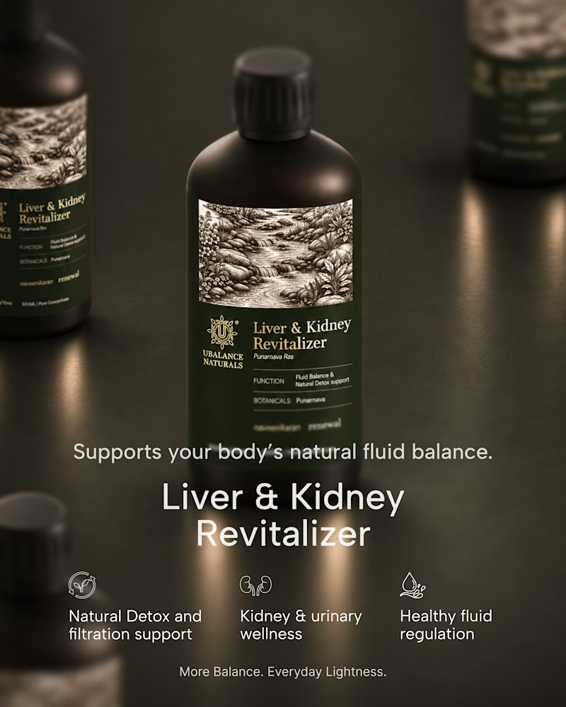
A quick exploration of two different directions for a wellness product ad.
One focuses on the product, while the other brings more attention to the product information.
These are early explorations, just to get a feel for the brand and its visual direction.
I’d love to hear your honest thoughts. Which direction feels more effective, and what would you improve?
1 voted
50%
1 voted
50%
2 votes
Closed

Honest take: the information-first direction wins for me. "It isn't always about body fat" is a proper hook — it speaks to the actual worry behind the product, so it stops the scroll. The product-first shot is gorgeous, but it reads more like a product page image than an ad. One...


Which homepage would make you more likely to explore the platform?
HackStack features bold typography, teal gradients, and a centered layout focused on AI tools and automation. DataVistaHQ uses purple accents, a split layout, and a prominent dashboard preview to introduce its business intelligence platform.
I would like your perspective on the visual design, clarity, and first impression. Which approach communicates its value more effectively and makes you want to take the next step?
Vote for your preferred design and share what influenced your choice: the colors, headline, layout, dashboard preview, or overall presentation.
#WebDesign #AIWebsites #UIUXDesign #SaaSDesign #TransformedDesign


2 voted
17%

10 voted
83%

12 votes
Closed

Visually, I lean toward DataVistaHQ, but the cognitive load is really high. The value proposition and the stats feel like they're competing for attention.
On the other hand, HackStack has a much better visual hierarchy. The value proposition and CTA group immediately give me a...

Choose your product hero shot
2 voted
29%
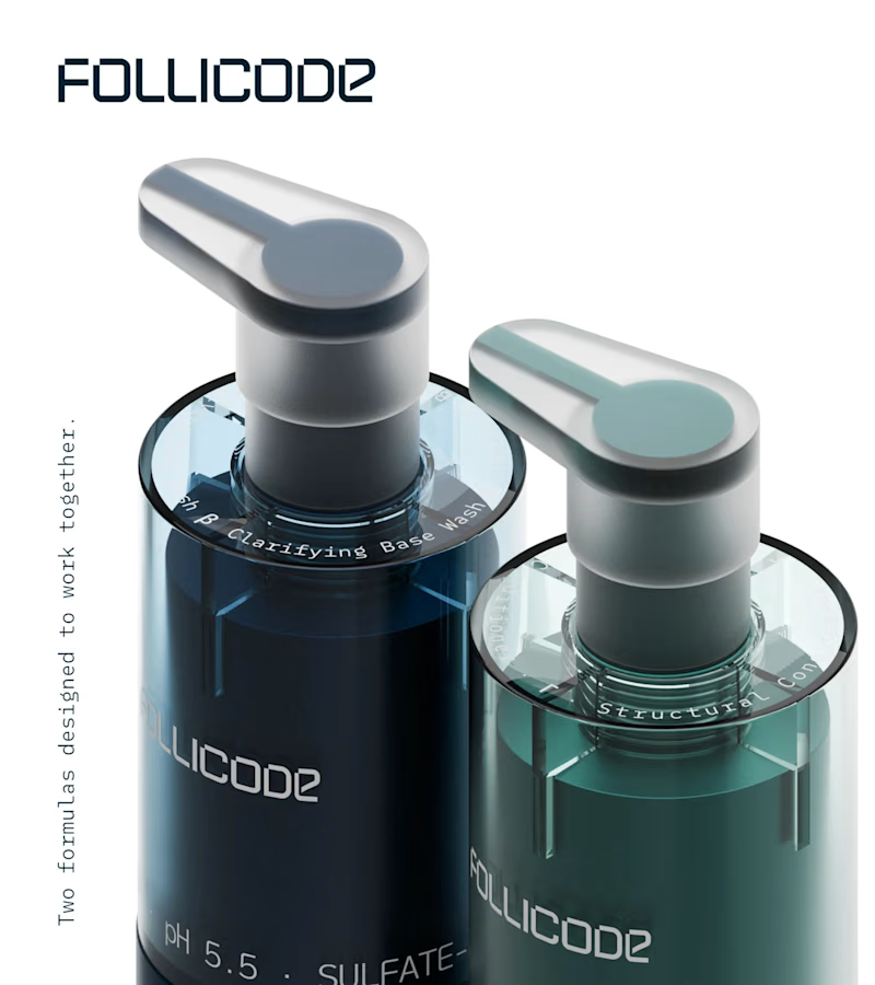
5 voted
71%
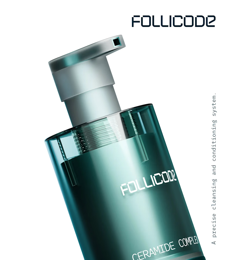
7 votes
Closed
Option 2 for me. The single bottle has room to breathe and the FOLLICODE branding reads instantly — it feels like a proper hero. Option 1 is nice for showing the system, but the two bottles compete with each other and the label gets a bit lost in the dark. I'd run Option 2 as...