The network for creativity
Join 1.25M professional creatives like you
Connect with clients, get discovered, and run your business 100% commission-free
Creatives on Contra have earned over $150M and we are just getting started
Back to feedPost

Where design stops asking for permission.
This visual study piece imagines a world where architecture, fashion, and art are no longer separate disciplines; but one continuous language. Structure becomes fabric. Fabric becomes movement. The body becomes a living building.
It asks: what would design look like if there were no limits?
No limits holding back form.
No categories dividing creativity.
No rules about what something should be.
It’s a study of fluidity culture and strength.
A reminder that when we allow disciplines to merge, we don’t just create objects, we create experience ✨️


The network for creativity
Join 1.25M professional creatives like you
Connect with clients, get discovered, and run your business 100% commission-free
Creatives on Contra have earned over $150M and we are just getting started



Related posts

A fashion storefront needs to show the outfit and make its individual pieces easy to find.
For FORM, I paired a warm, editorial lookbook with clearly grouped product names, prices, and size choices.
Cream surfaces, charcoal typography, and consistent product cards connect the homepage with the desktop and mobile screen concepts.
One useful design principle from this project: give campaign imagery and shopping details their own readable zones. The collection can have a strong visual presence while the next product decision stays clear.
Explore the complete design case study:
https://contra.com/p/rNPRqooQ-form-fashion-e-commerce-website-design
When exploring a clothing collection, what helps you most: a styled outfit or an individual product grid?

Adorable

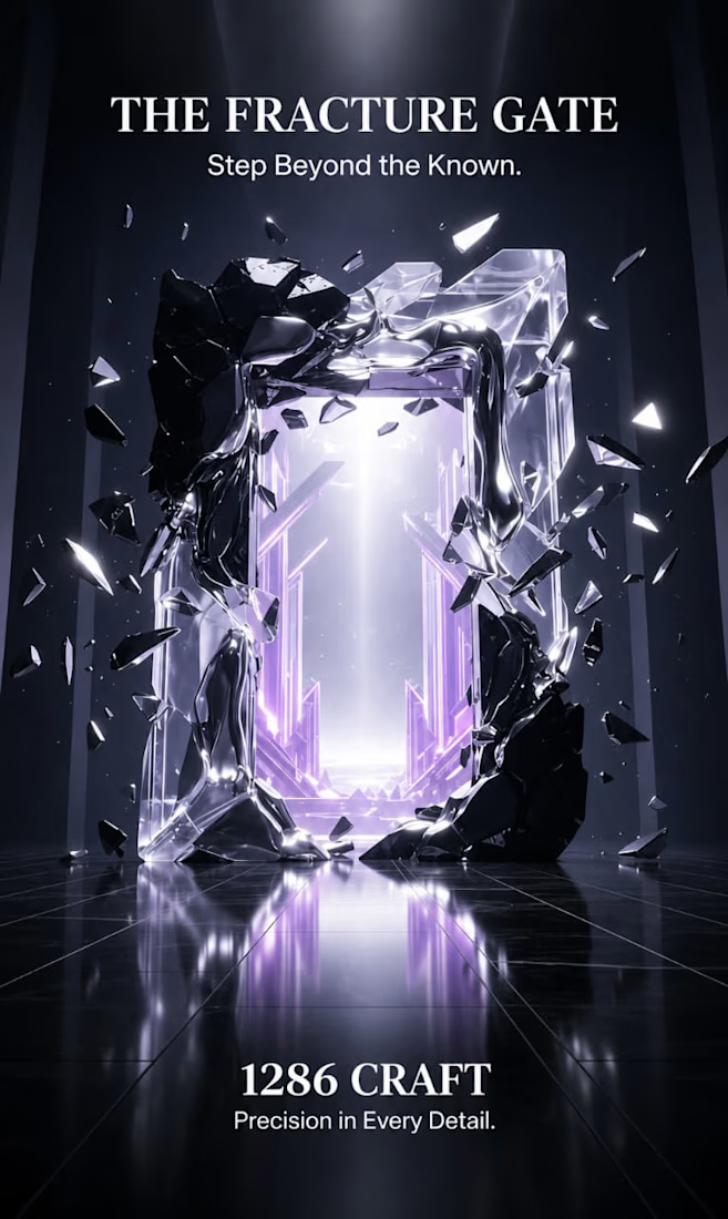
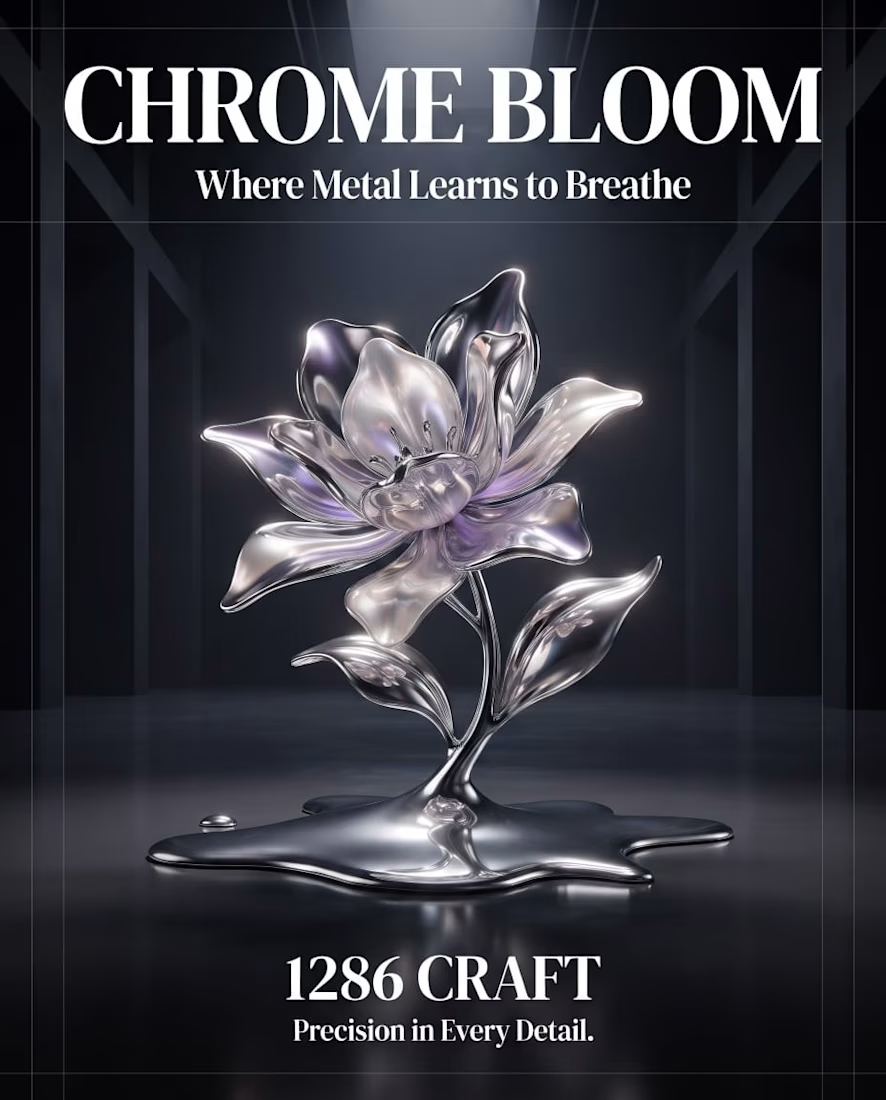
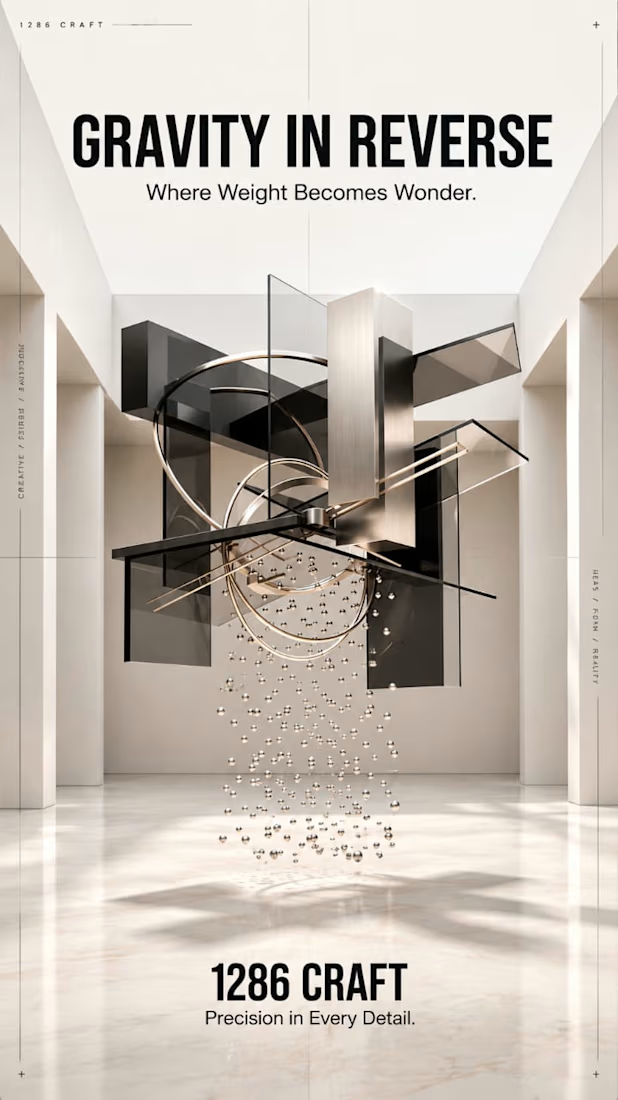
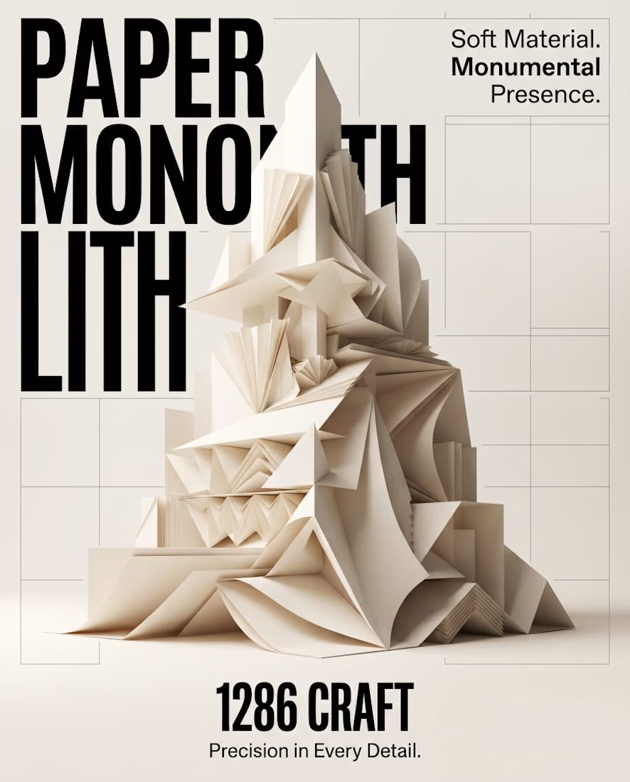
PAPER MONOLITH — Where Paper Becomes Architecture
An exploration of experimental graphic design, sculptural form, and architectural minimalism.
PAPER MONOLITH transforms the delicate nature of paper into a monumental visual statement. Inspired by origami geometry and contemporary architecture, this concept combines intricate folded structures, sophisticated typography, and refined editorial composition.
Created for 1286 CRAFT, the project explores the contrast between softness and strength through ivory-toned sculptural forms, realistic CGI aesthetics, precise geometric detailing, and a minimalist Swiss-inspired design approach.
The accompanying cinematic motion design brings the composition to life through subtle unfolding movements, atmospheric lighting, and elegant visual storytelling.
Creative Direction: Experimental Graphic Design, 3D Art Direction, Editorial Typography, Conceptual Design, Architectural Visualization, AI-Assisted Visual Design, and Cinematic Motion Design.
1286 CRAFT — Precision in Every Detail.
#1286CRAFT #GraphicDesign #ExperimentalDesign #EditorialDesign #Typography #3DArt #ArtDirection #MotionDesign #VisualIdentity #CreativePortfolio



Amazing work

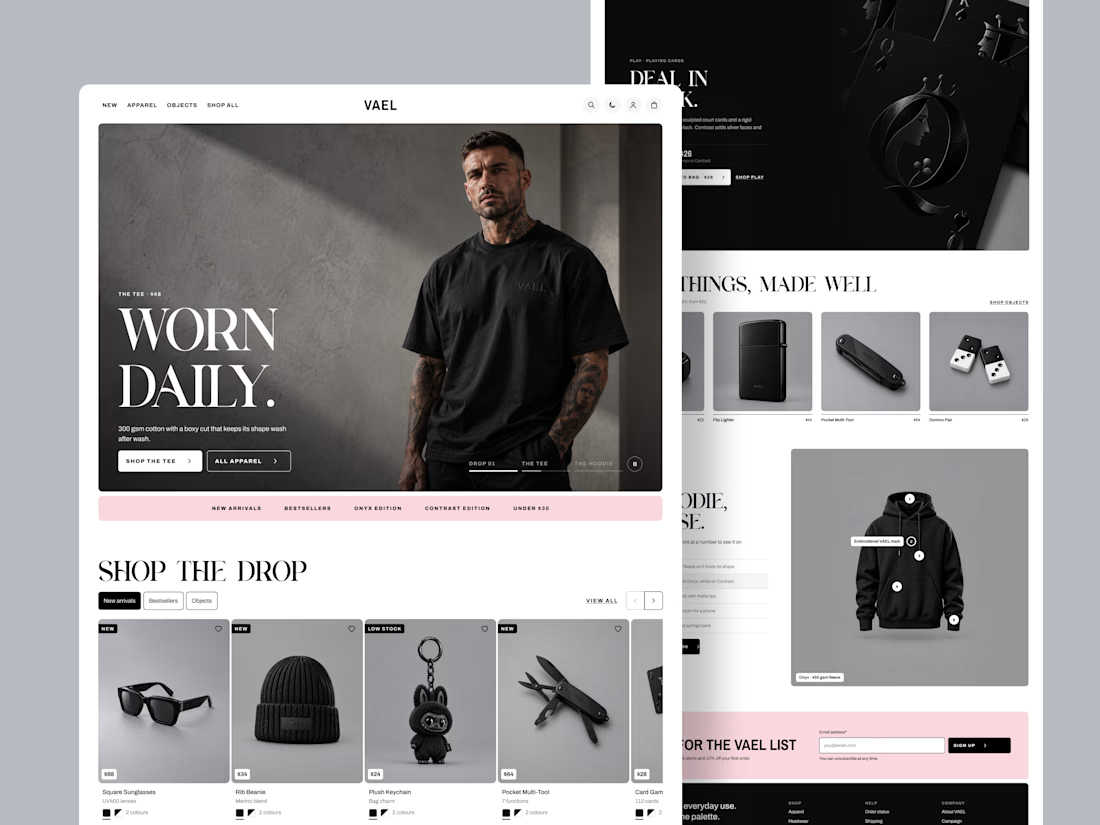
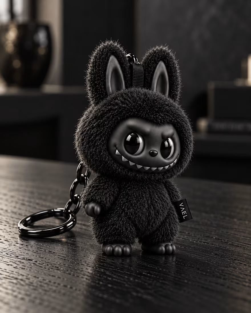
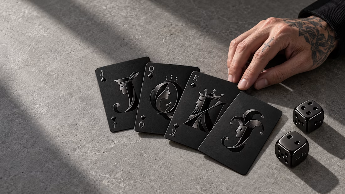
How do you design a store when every product is black? That was the challenge behind VAEL, a brand selling 15 pieces in two editions: Onyx and Contrast.
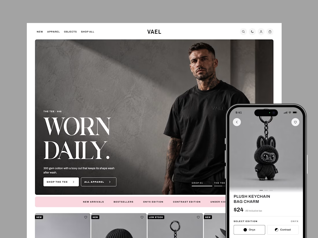
With no colour to guide shoppers, the design had to do it. Bold condensed type sets the tone, clean outlines show what's selected, and one soft pink highlights sales and rewards.
I designed 20 screens for desktop and mobile, in light and dark mode, from the homepage all the way to checkout.
The result is a store as sharp as the product, and easy to shop. Live demo: https://claude.ai/code/artifact/4e953fd5-47c5-4429-ae8f-e6550690f47b

The single pink accent against an all-black catalog does the guiding really well. How did you pick that one color, and did you test other options?