The network for creativity
Join 1.25M professional creatives like you
Connect with clients, get discovered, and run your business 100% commission-free
Creatives on Contra have earned over $150M and we are just getting started
Back to feedPost

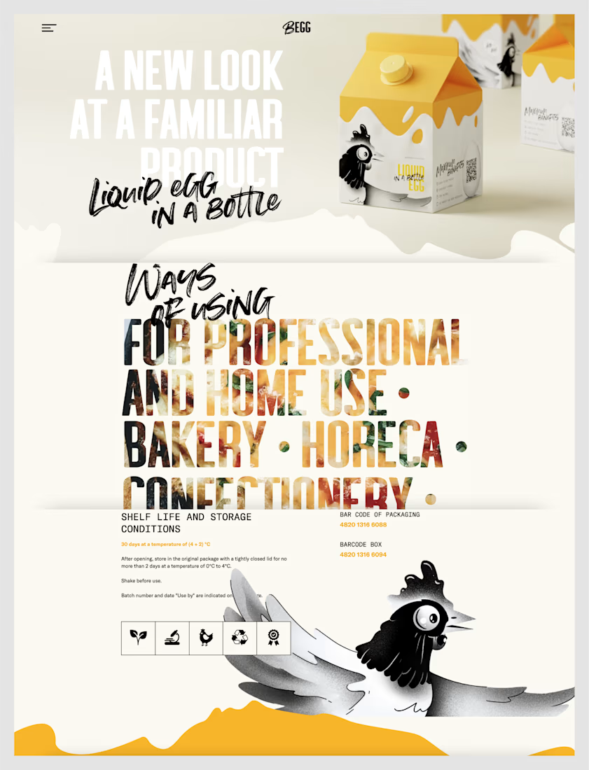
The project presents a fresh and innovative approach to packaging liquid eggs, transforming an everyday grocery item into a premium, visually appealing brand. The design uses a clean cream-and-yellow color palette inspired by eggs, combined with playful illustrations of a chicken and flowing egg-yolk graphics to reinforce the product's identity.
Design Highlights
Strong Brand Identity: The BEGG logo is simple, bold, and memorable.
Creative Packaging: The milk-carton-inspired container gives the product a unique shelf presence while communicating freshness.
Typography: Large, bold headlines paired with expressive handwritten fonts create contrast and instantly capture attention.
Illustration: The cartoon chicken mascot adds personality and makes the brand approachable and memorable.
Color Palette: Soft cream, white, black, and golden-yellow colors reflect eggs, cleanliness, and quality.
Layout: A minimalist layout with generous white space keeps the focus on the product while making the information easy to scan.
Product Information: Storage instructions, barcode details, and usage information are presented in a clear and organized way.
Target Audience
The design communicates that the product is suitable for:
Professional bakers
Home cooks
Bakeries
Hotels, restaurants, and cafés (HoReCa)
Confectionery businesses

The network for creativity
Join 1.25M professional creatives like you
Connect with clients, get discovered, and run your business 100% commission-free
Creatives on Contra have earned over $150M and we are just getting started











Related posts

looking for a great designer


this is really nice 100%. nice job



Brilliant work

