The network for creativity
Join 1.25M professional creatives like you
Connect with clients, get discovered, and run your business 100% commission-free
Creatives on Contra have earned over $150M and we are just getting started
Back to feedPost

Designing for live environments exposes problems that don’t show up anywhere else.
When content is updated under pressure, small inconsistencies become real issues. Pages drift out of sync, information gets duplicated, and even simple updates start requiring coordination across multiple areas.
That was happening with the LIV Golf Media Hub.
The platform had grown over time, but the structure behind it hadn’t kept pace. Information was spread across different page types, and updating one part of the system didn’t always carry through to the rest.
Moving into Framer allowed everything to be rebuilt around a single event model. Each tournament now follows the same structure, moving through pre-event, live, and post-event states, with content managed centrally instead of page by page.
Updates are now faster and more predictable. Information stays consistent across the platform, and the team no longer needs to manage each change manually during live events.


Creative & Clean 😍

The network for creativity
Join 1.25M professional creatives like you
Connect with clients, get discovered, and run your business 100% commission-free
Creatives on Contra have earned over $150M and we are just getting started
Related posts

I migrated Pi-lit's site from WordPress to a custom-coded, AI-native website with its own hosting. The result:
-A scalable design system that also supports their ecommerce
-30+ pages with consistent branding throughout
-Animated illustrations of their scenes and products that bring the roadway safety story to life
See Full Case Study


Lovely work

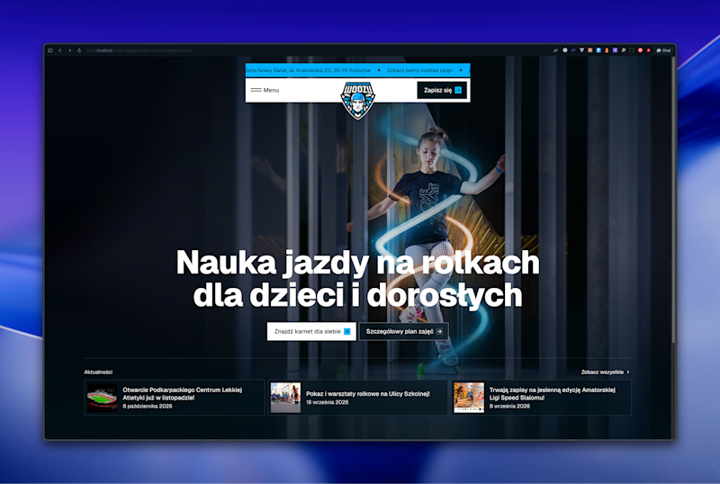
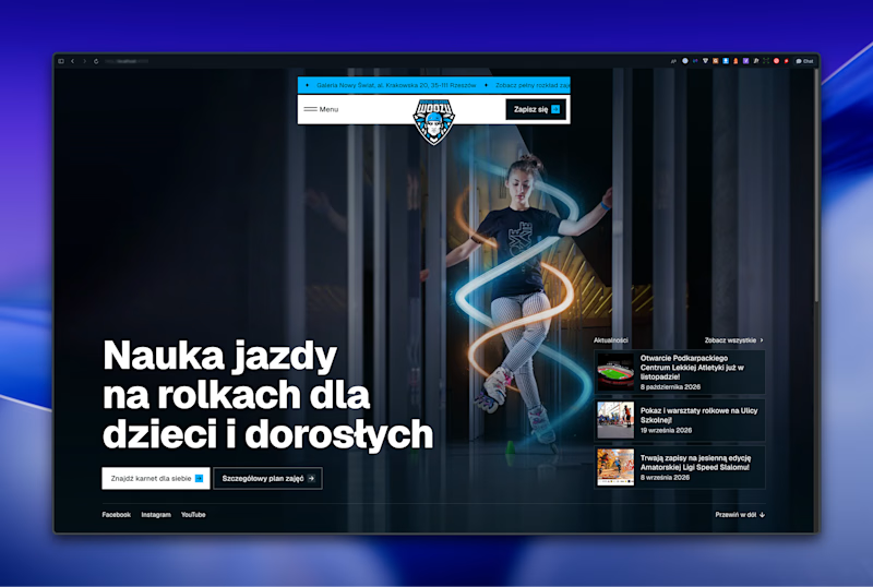

Left aligned for me. With that much body copy next to the headline it reads cleaner.


We’re testing two filtering layouts for a template library.
Top Filters
The filters are placed above the content. This option feels lighter, leaves more space for the cards, and works well when there are only a few main categories.
Sidebar Filters
The categories remain visible in the sidebar. This makes the available options easier to scan and works better for more complex filtering, but takes up some of the content space.
Which layout would help you find the right template faster?

24 voted
39%
37 voted
61%
61 votes
Closed

Such a clean presentation. You can tell a lot of thought went into this.


