The network for creativity
Join 1.25M professional creatives like you
Connect with clients, get discovered, and run your business 100% commission-free
Creatives on Contra have earned over $150M and we are just getting started
Back to feedPost

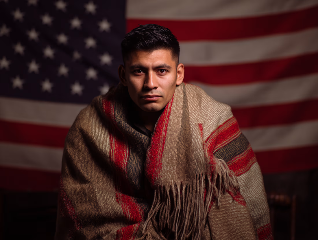
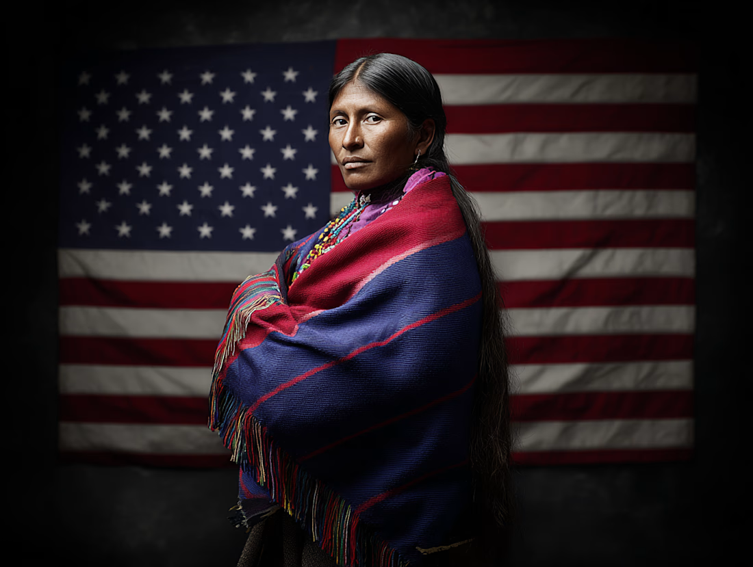
I am working on a personal project depicting immigrants that are American citizens and their heritage. These portraits are generated through MidJourney and will be part of an interactive app that talks about the country, music and the country's history of immigration



Nice
The network for creativity
Join 1.25M professional creatives like you
Connect with clients, get discovered, and run your business 100% commission-free
Creatives on Contra have earned over $150M and we are just getting started

Challenges
View all


Related posts

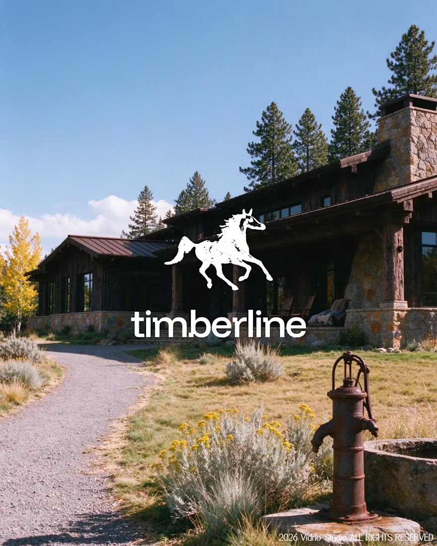
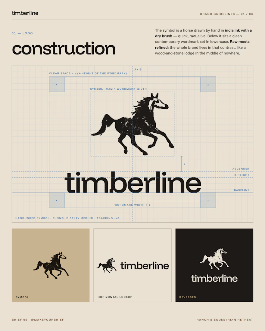
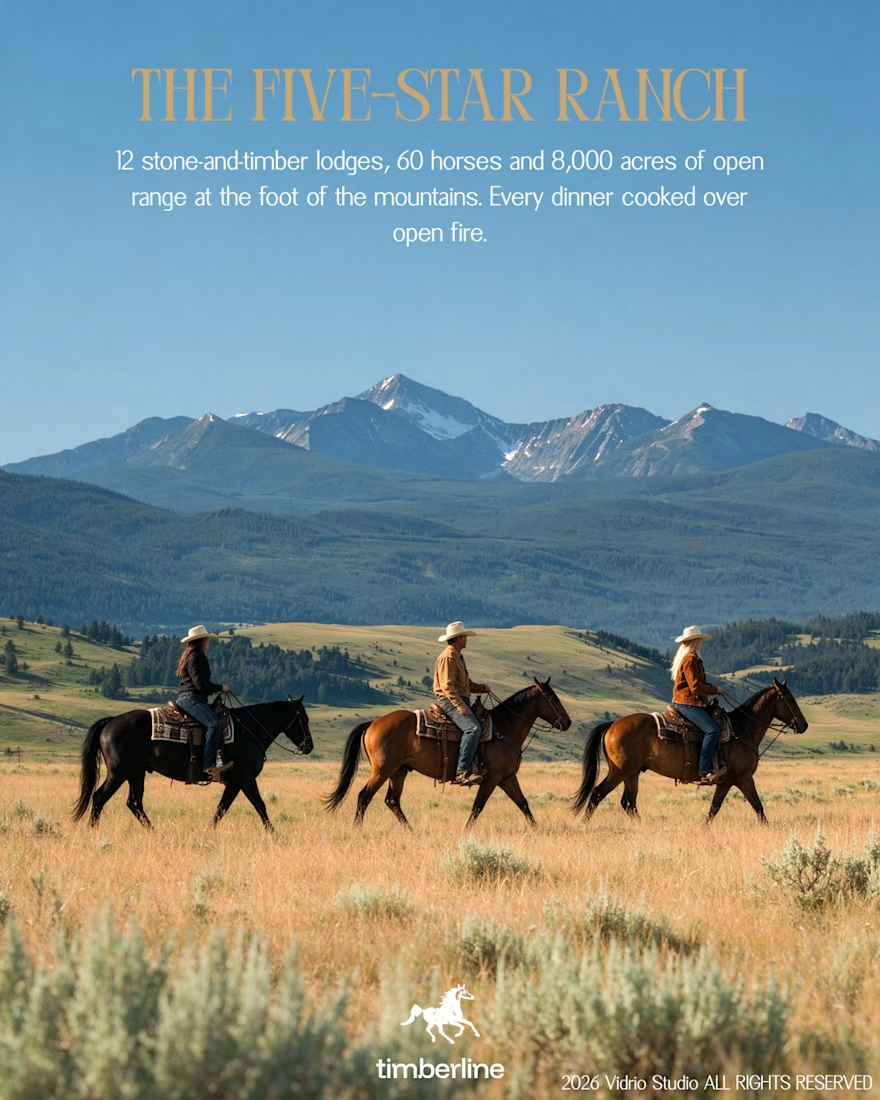
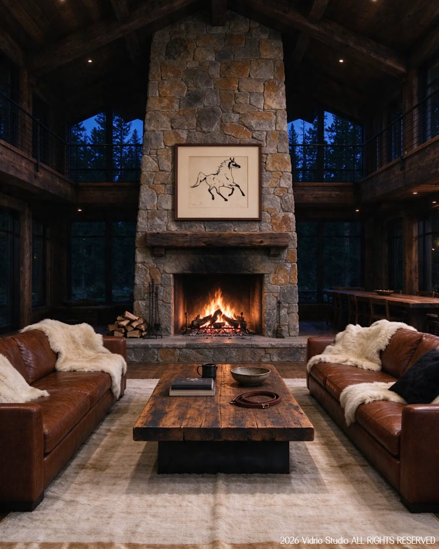
I worked on Brief 05 of the @makeyourbrief challenge: a brand identity for Timberline, a luxury ranch and equestrian retreat. I hand-drew the horse symbol with a marker, paired it with a clean modern wordmark and an earthy palette, and extended it into merch and lodge photography using AI under my own art direction, with retouching by hand.
Would you stay here? Tell me which image sold you.



That's really incredible great job Andreu❤️❤️


Amazing work

Turning a workspace into an atmosphere makes such a difference. ✨
Love the warm lighting, layered details, and cozy mood here. It feels less like a desk setup and more like a space you’d actually want to spend hours creating in. 🔥


What would your workspace look like if you turned it into an ambient little world?
I recreated my actual workstation in Midjourney, with a little extra colour, mood lighting, and cinematic polish.
The warm desk lamp, cooler screen glow, my keyboard, books, and all the little...