The network for creativity
Join 1.25M professional creatives like you
Connect with clients, get discovered, and run your business 100% commission-free
Creatives on Contra have earned over $150M and we are just getting started
Back to feedPost

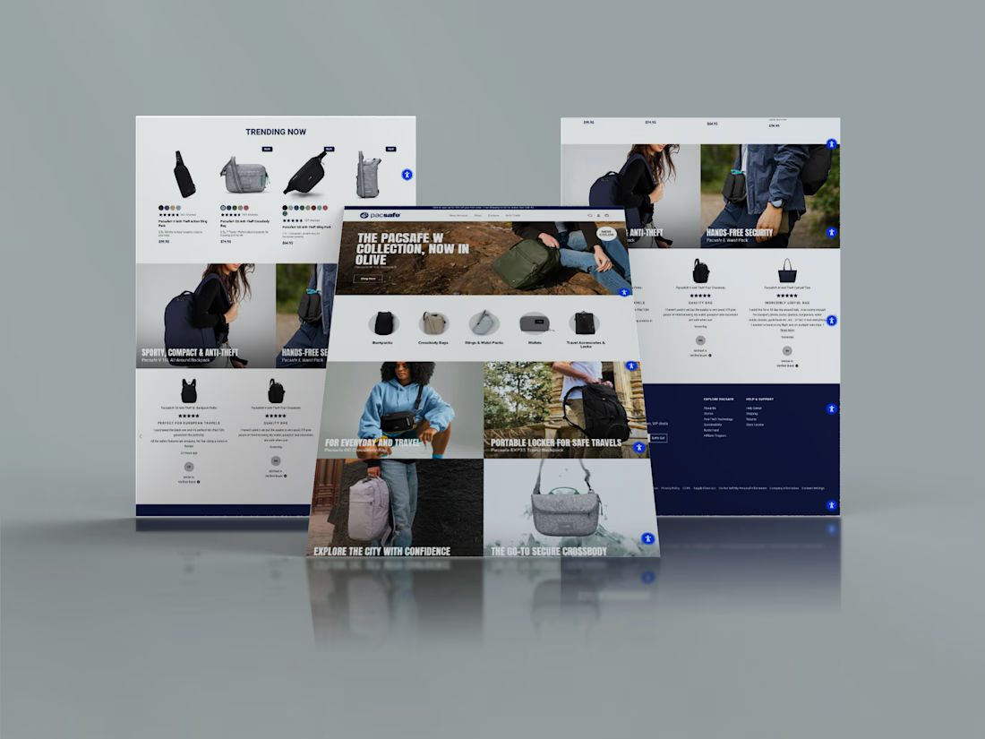
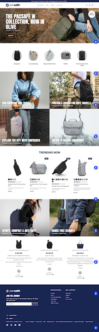
High CPA and abandoned carts? Here’s how I fixed a high-volume Shopify store's mobile UX in just 48 hours. 🚀
The Challenge
Heatmap data revealed a frustrating reality: mobile users were highly engaged but overwhelmed. Cluttered UI elements, mixed signals, and a hidden Add-to-Cart path were causing massive drop-offs right before checkout, leading to an unsustainable Cost Per Acquisition (CPA).
The Solution
I implemented a strict, data-driven 48-hour Conversion Rate Optimization (CRO) sprint to systematically identify and eliminate buying friction.
Sprint 1 Execution:
Decluttered the UI: Consolidated multiple distracting announcement bars into a single, clean message to reduce cognitive load.
Boosted Speed: Optimized image load times to ensure lightning-fast mobile browsing and keep users engaged.
Streamlined Purchasing: Built and deployed a persistent "Sticky Add-to-Cart" bar, keeping the primary action visible at all scroll depths.
The Result
By removing visual distractions and making the purchase path entirely frictionless, we successfully pushed more users deeper into the checkout funnel, lowering the CPA and recovering lost revenue.
Are mobile drop-offs hurting your bottom line? Send me a message and let's map out a customized CRO sprint for your storefront.


Solid sprint. One thing worth checking after a fix like this is whether the heatmap improvement holds once traffic mix changes week over week - a decluttered UI plus a sticky ATC can look great against last week's cohort but get muddied by seasonal traffic shifts. I'd also watch...
The network for creativity
Join 1.25M professional creatives like you
Connect with clients, get discovered, and run your business 100% commission-free
Creatives on Contra have earned over $150M and we are just getting started






Related posts


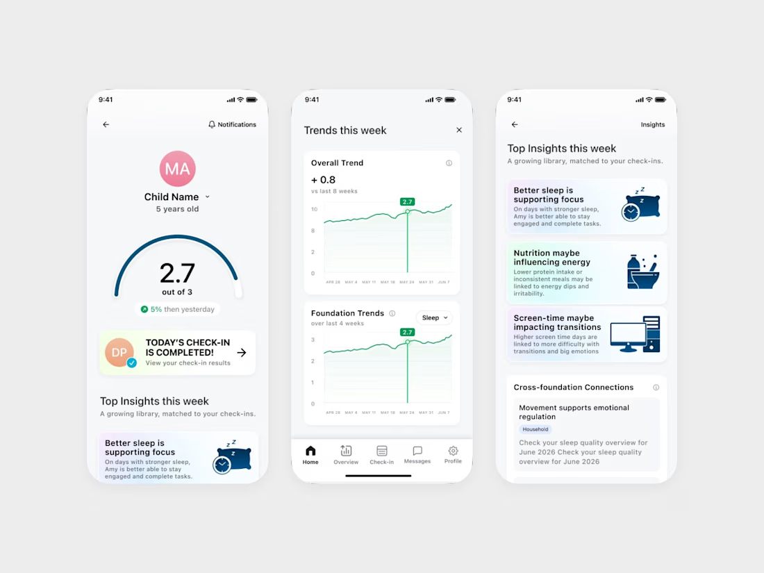
We designed an ADHD app that keeps the word ADHD off its daily screens.
It's Coastal Neuro Group's parent app. The everyday screens use words like attention, focus and regulation, and the ADHD framing stays in onboarding.
Ami Hansji, the founder, then used the same rule for the patient headers in the practitioner portal.


love this framing rule. keeping adhd in onboarding only makes it feel less clinical day to day. smart


Apple Watch → Dynamic Island → Widget → Desktop Card → Mobile.
Same concept, different screens. Exploring how one UI adapts across devices.


Good work🔥👏👏

Designed a modern Shopify ecommerce experience for Dagne Dover, focused on user experience, product discovery, and conversion optimization. The storefront presents the brand’s bags and accessories through organized product categories, featured collections, engaging product displays, and clear navigation.
My focus was on creating a smooth shopping journey with intuitive navigation, responsive layouts, clear product presentation, and strategic calls to action. The goal was to make it easier for customers to explore products, understand their options, and move confidently toward checkout while maintaining Dagne Dover’s premium brand identity.