The network for creativity
Join 1.25M professional creatives like you
Connect with clients, get discovered, and run your business 100% commission-free
Creatives on Contra have earned over $150M and we are just getting started
Back to feedPost
Hey everyone! 👋
Excited to share something I've been working on. My very first template on Framer Marketplace is officially live! 🎉
It's called Nova X - a premium dark-mode landing page designed for SaaS products, AI startups, and modern tech brands. Clean layout, built-in dashboard section, 3D visuals, and fully responsive.
This one's been a fun ride. Took me a while to get every detail right - from typography to micro-interactions - but I'm really happy with how it turned out.
Would love for you to check it out, grab it if it fits a project you're working on, or just drop me your honest feedback. Every bit of it helps me grow as a designer. 🙌

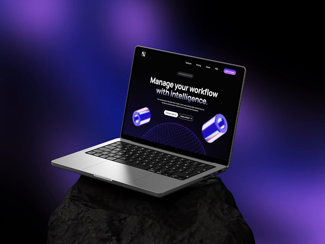
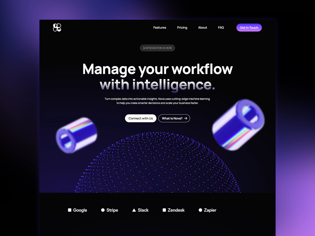
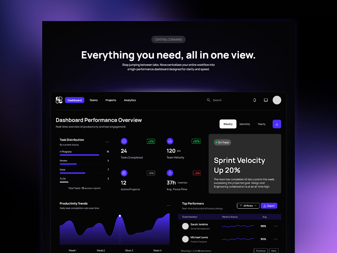
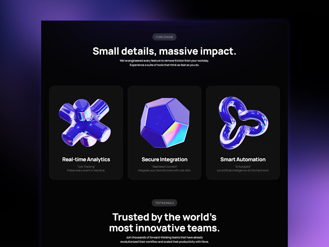


Thanks a lot! The 3D assets are not made by me. I just found it and liked it.

Looks Amazing
Thanks! 🙌


for a first time - more than impressive!!! 💯
Thanks! 🙌
The network for creativity
Join 1.25M professional creatives like you
Connect with clients, get discovered, and run your business 100% commission-free
Creatives on Contra have earned over $150M and we are just getting started





Related posts


Just launched Lamplight - Best @framer Template for Psychologists & Therapists
Remix Link: https://framer.link/tj4w3W3
A calm, editorial website template with 2 CMS-powered concern pages, a journal, and FAQs copy that actually sounds human.


Great visual hierarchy.
Which one grabs your attention and should be the main visual for a framer template thumbnail?
7 voted
50%
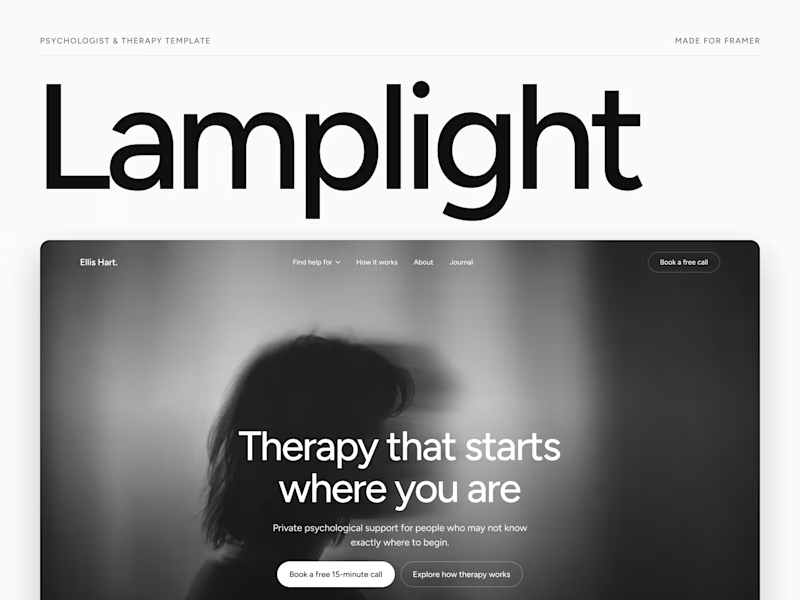
7 voted
50%
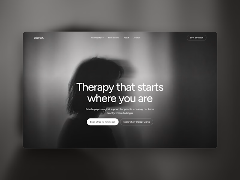
14 votes
Closed

Both works are great; it's hard to choose

Just launched Framer Portfolio template!
And...it´s totally FREE! Enjoy! 🙌
https://www.framer.com/marketplace/templates/riwa-mini/

Killer execution