The network for creativity
Join 1.25M professional creatives like you
Connect with clients, get discovered, and run your business 100% commission-free
Creatives on Contra have earned over $150M and we are just getting started
Back to feedPost

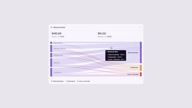
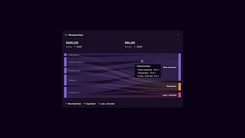
In this project, I redesigned the user interface of specific modules within a CRM system for a client. The goal was to improve user experience, simplify data access, and create a more modern and intuitive interface.
During the design process, a modular structure, clean visual hierarchy, and user-friendly interactions were prioritized. Dashboard components, form elements, and action panels were optimized to ensure a more efficient user experience.
Figma and CorelDRAW were used throughout the process for design, prototyping, and visual refinement.


The network for creativity
Join 1.25M professional creatives like you
Connect with clients, get discovered, and run your business 100% commission-free
Creatives on Contra have earned over $150M and we are just getting started
Related posts

Brand Expressions -- Merdes



love this


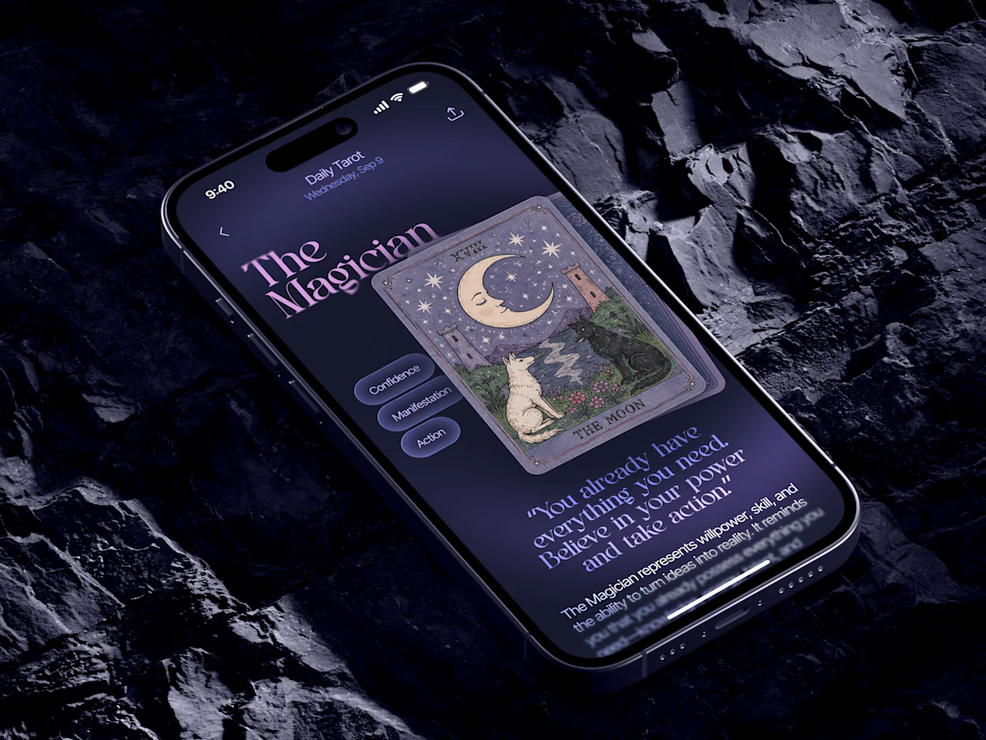
Just in time for Halloween! 🎃🔮 Excited to share this mystical tarot reading app concept, inspired by a little spooky season magic. Would love to hear your thoughts! ✨


Excellent work!