The network for creativity
Join 1.25M professional creatives like you
Connect with clients, get discovered, and run your business 100% commission-free
Creatives on Contra have earned over $150M and we are just getting started
Back to feedPost
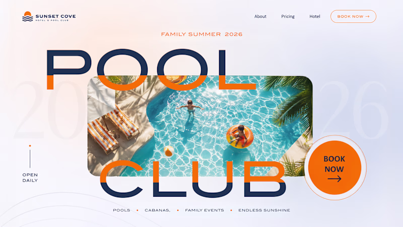
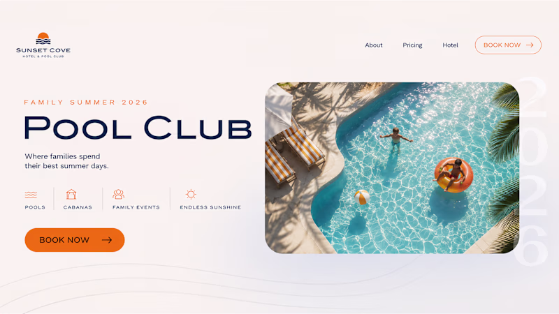
Building high-end web templates for tech companies means focusing entirely on the responsiveness of elements in production.
In this preview of "Stills", you can see how the layout handles the shift from a desktop grid down to a mobile viewport.
Instead of relying on fixed heights or messy hacks, everything is controlled through strict padding and gap variables.
When the layout collapses into a vertical direction on mobile, the content switches to a clean left alignment.
This matches the natural reading rhythm of the phone breakpoint and prevents text wrap clipping.
By keeping the design system strictly organized under the hood, the entire template remains incredibly lightweight, with no layout shifts when loading dynamic CMS data.
The "stills" template release is coming soon.
The network for creativity
Join 1.25M professional creatives like you
Connect with clients, get discovered, and run your business 100% commission-free
Creatives on Contra have earned over $150M and we are just getting started
Related posts
Summer inspired a small design experiment ☀️ We created two hero concepts for the same website. One follows a classic layout. The other takes a more editorial approach with oversized typography and a less conventional composition.
Which direction would you choose for a real project? 1 or 2?
72 voted
62%
45 voted
38%
117 votes
Closed
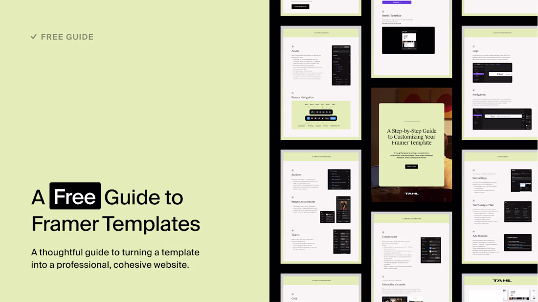
Today, I'm giving away my "Launch with Intention" PDF for FREE.
This guide is included with every template we sell at tahl.shop but I've decided to make it available to everyone.
Designed for Framer templates, it's a practical guide to help you launch your website with clarity, confidence, and ease, no matter which template you're using.
Get your free guide here: https://tahl.shop/freebie
This is a kind gesture
Trending
Claude
Claude has entered the design space. How are you using Claude Design?
Contra University
Learn from expert creatives how to earn more using next-gen AI tools.
MagicPath
The canvas is infinite, and exploration is becoming the workflow. How are you using MagicPath?
creativeaiflow
Creative AI workflows are evolving. What tools do you use, and what are their strengths and weaknesses?
freelancerlife
Freelancer life is wins, pivots, and everything in between. What’s yours right now?