The network for creativity
Join 1.25M professional creatives like you
Connect with clients, get discovered, and run your business 100% commission-free
Creatives on Contra have earned over $150M and we are just getting started
Back to feedPost

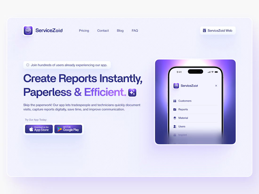
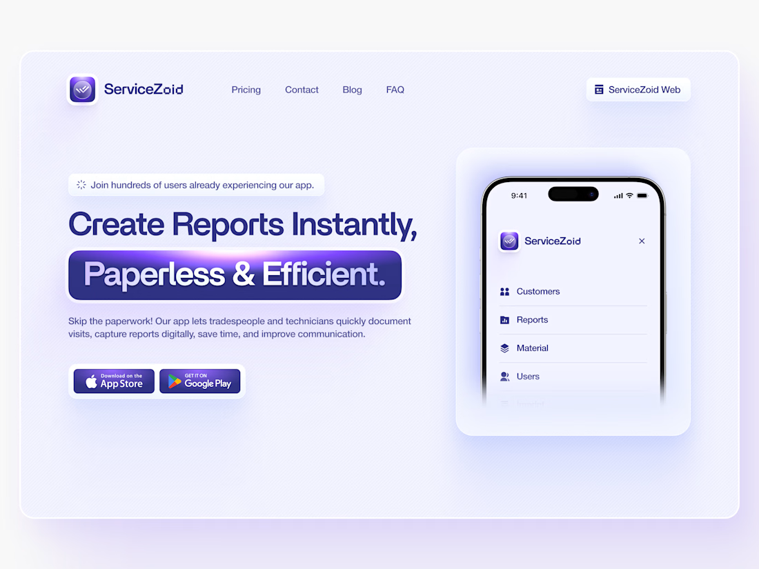
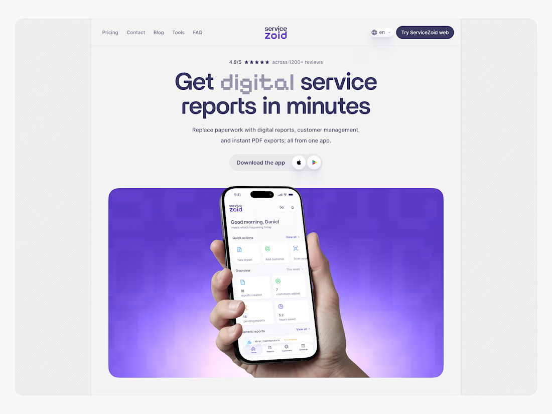
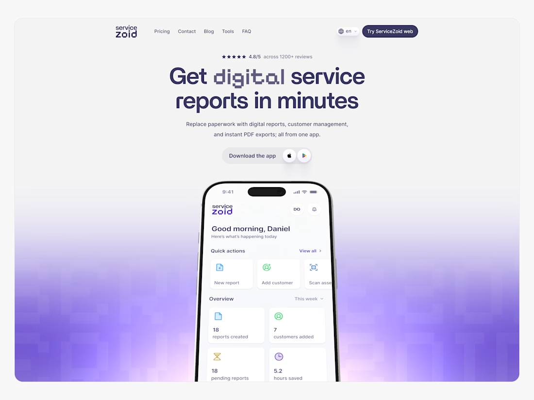
Redid a hero section I designed a year ago, and the old file was rough to look at.
Glowing gradient pill wrapped around half the headline. Phone mockup floating over a dark glow with nothing containing it. A settings-list app screen that told you nothing about the product.
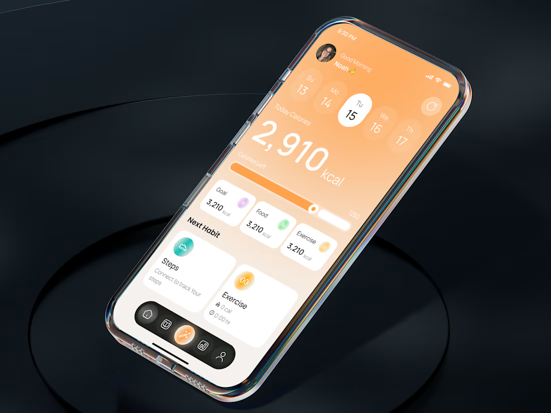
Fixed version: plain type carrying its own weight instead of the pill, the phone sitting in a contained surface instead of a glow, and a dashboard home screen I designed from scratch (no real product screens to reference) instead of the generic list. Even my first pass at the new "digital" got too colorful and broke the palette, so I pulled it back to one brand color.
Nothing here got fancier. It got more disciplined. If you're cringing at old work, that's the sign your eye improved.


The details are everything.
Work in progress. 👀
The network for creativity
Join 1.25M professional creatives like you
Connect with clients, get discovered, and run your business 100% commission-free
Creatives on Contra have earned over $150M and we are just getting started
Trending

Claude
Claude has entered the design space. How are you using it?

Contra University
Learn from expert creatives how to earn more using next-gen AI tools.
Brand Design
The best brand designers are on Contra. Scroll to see what's trending in brand design. What are you building?
creativeaiflow
Creative AI workflows are evolving. What tools do you use, and what are their strengths and weaknesses?
freelancerlife
Freelancer life is wins, pivots, and everything in between. What’s yours right now?





Related posts

AI Calorie Tracker & Habit Planner App UI

Awesome!

I love experimenting with uncommon gradients.
Tried something a little different with this one. Did it work?

Works brilliantly!


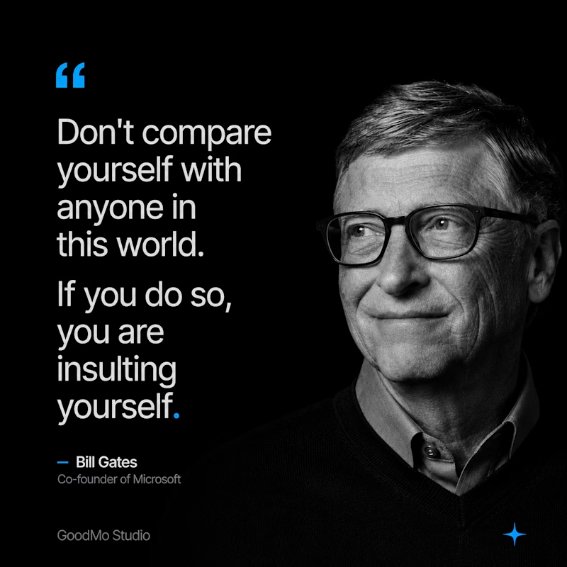
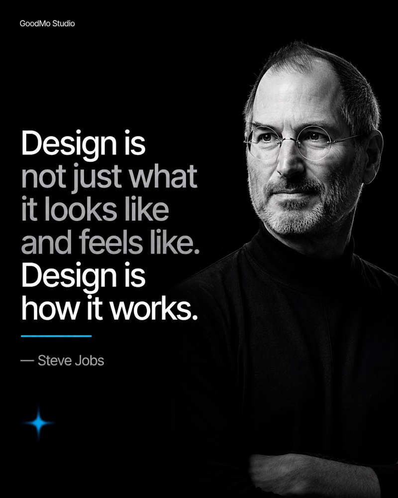
Recent designs we tested for GoodMo Studio, which one do you prefer?

7 voted
54%
6 voted
46%
13 votes
Closed
