The network for creativity
Join 1.25M professional creatives like you
Connect with clients, get discovered, and run your business 100% commission-free
Creatives on Contra have earned over $150M and we are just getting started
Back to feedPost
Started this week with clarity, purpose, and the mindset to improve, even if it's just 1% better than last week.
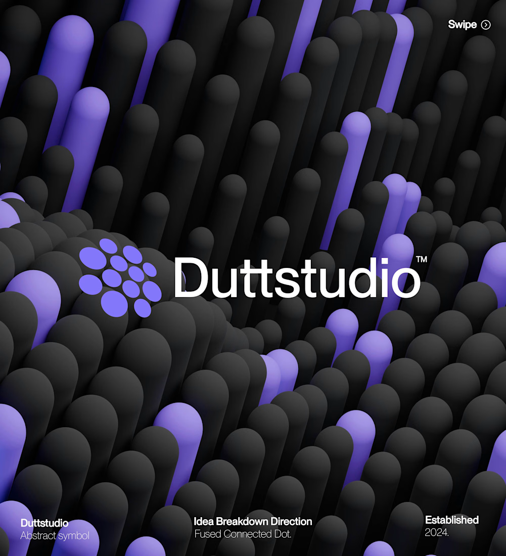
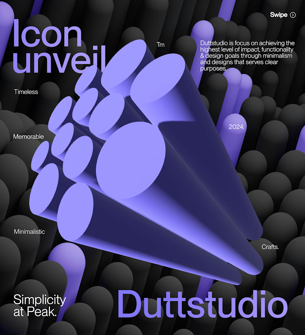
Creating Unique identities required Learning and putting them into practice.

This is amazing!!

Thank You !
The network for creativity
Join 1.25M professional creatives like you
Connect with clients, get discovered, and run your business 100% commission-free
Creatives on Contra have earned over $150M and we are just getting started











Related posts


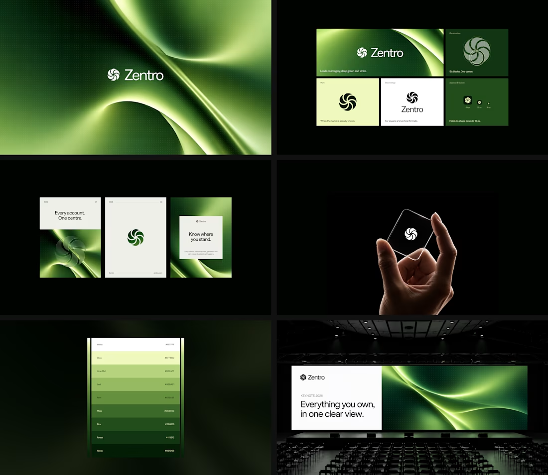

Clean and confident work! The green gradient with the mark feels very modern for fintech - trustworthy but not boring. The app screens look really polished. Curious how you landed on this mark, does it represent growth / movement?

Meet Borcelle Padel Club. 🎾
Where every rally brings a little more energy, every match creates a connection, and every game is worth showing up for.
A fresh identity for a club built around the love of the game.
Game on. See you on the court.
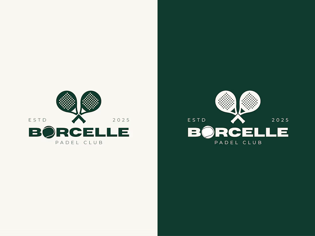

This logo design is really great for padel MIFTAHUL nice job 🎉🎉🔥🔥

HuroPay Branding for Fintech
We built its identity to feel the same way: fast, clear and human.
Need a branding? DM Now...
#branding #brandidentity #logo
