The network for creativity
Join 1.25M professional creatives like you
Connect with clients, get discovered, and run your business 100% commission-free
Creatives on Contra have earned over $150M and we are just getting started
Back to feedPost

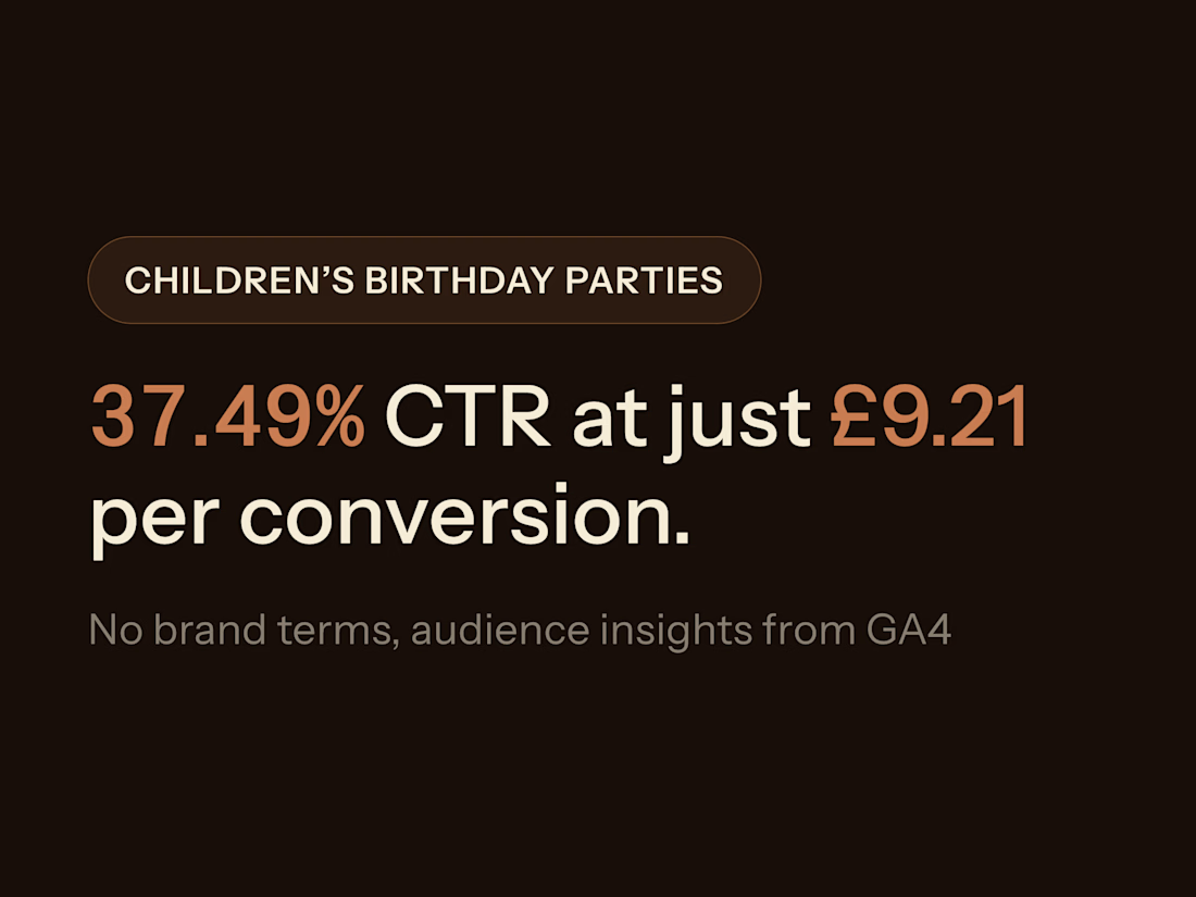
Used GA4 to identify the locations and audiences most engaged with the business, then aligned ad messaging tightly with that real search intent — no brand terms involved. The campaign achieved a 37.49% CTR, a 7.33% conversion rate, and a cost per conversion of just £9.21.


The network for creativity
Join 1.25M professional creatives like you
Connect with clients, get discovered, and run your business 100% commission-free
Creatives on Contra have earned over $150M and we are just getting started





Related posts

Automated B2B Lead Gen Engine from LinkedIn Jobs (n8n + Apify + Apollo + Gemini)
Project Overview
Hiring intent is the highest-converting B2B buying signal. When a company posts an open role on LinkedIn, they have an active pain point, immediate budget, and executive mandate to solve that problem.
This automated production engine runs every morning without manual intervention. It scrapes fresh LinkedIn job postings via Apify, filters out non-target companies, queries Apollo.io to identify the exact decision-maker (Founder, CEO, VP, or Head of Department) with their verified work email, and uses Google Gemini to write hyper-personalized outbound pitch drafts directly into Google Sheets.
Visual Showcase & Live Architecture
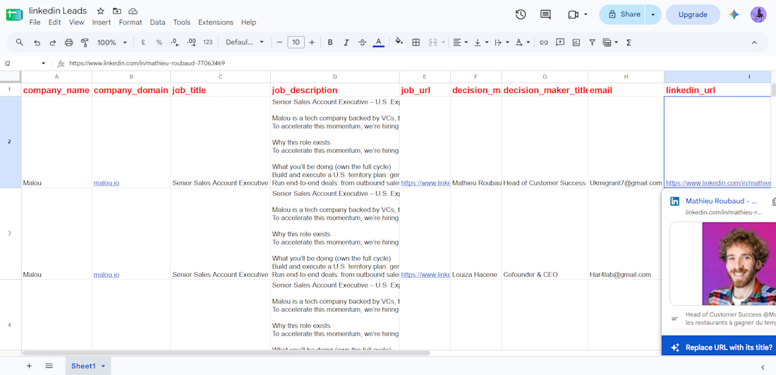
1. Verified Leads Database & AI Outbound Drafts (Google Sheets)
Preview unavailable
Automated output storing company data, verified decision-maker email, LinkedIn profile URL, hiring intent triggers, and ready-to-send AI cold email copy.
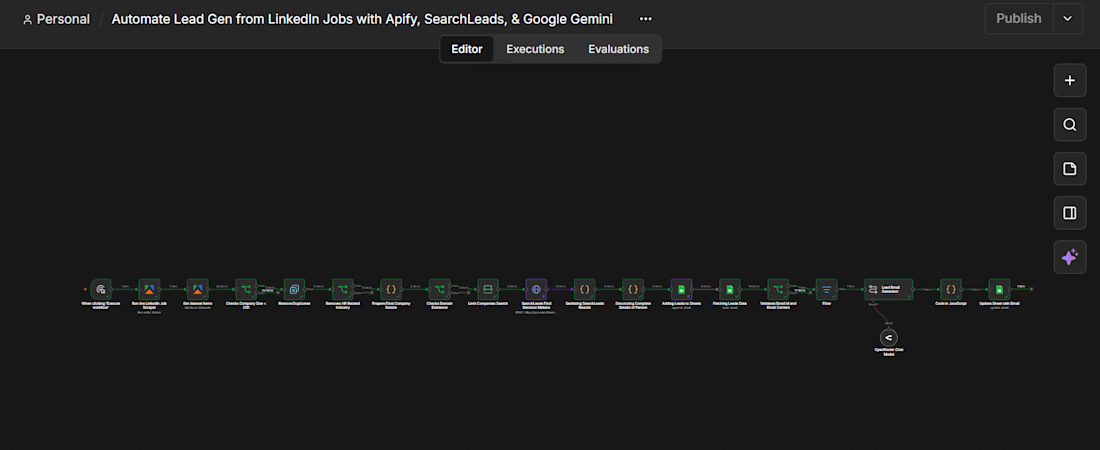
2. End-to-End n8n Engine Blueprint
Preview unavailable
Full production pipeline orchestrating Apify actor execution, domain validation, Apollo personnel search, Gemini structured output parsing, and real-time sheet sync.
Technical Workflow Architecture
Targeted Job Extraction (Apify): Triggers an automated actor scraping LinkedIn job postings based on target titles, geographic focus, and date posted.
Data Sanitization & Strict Gatekeeping: Filters dataset entries by company size (< 250 headcount), eliminates recruitment agencies and HR service providers, and verifies live web domain resolution.
Personnel Enrichment & Email Validation (Apollo.io): Targets executive personas matching the hiring team, executes verification checks against corporate MX records, and retrieves direct work emails and LinkedIn URLs.
Context-Aware Email Drafting (Google Gemini): Analyzes job descriptions, extracts company pain points, and drafts personalized 3-sentence email openers with high deliverability scores.
Centralized Data Lake (Google Sheets / CRM Sync): Logs verified contact records, generated copy, and campaign statuses, ready for direct one-click import into Smartlead, Instantly, or Clay.
Key Performance Metrics
Runtime Execution: 2 minutes per batch run (50–100 validated leads).
Email Deliverability: 98%+ valid deliverability via Apollo API verification.
Workflow Efficiency: Replaces 10–15 hours per week of manual SDR prospecting.
Data Quality: 100% deduplicated against previous pipeline runs.
Deliverables Included
Complete standalone n8n workflow JSON blueprint ready for self-hosted or n8n cloud instances.
Pre-configured Apify scraper actor setup and Apollo.io API integration.
Custom Google Sheets outbound tracking dashboard with schema validation.
Gemini prompt engineering optimized for high cold-outreach open and reply rates.
1-on-1 Loom video walkthrough and handover documentatio



This is beautiful

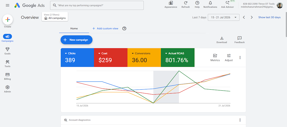
801.76% ROAS from Google Ads spend into Business Growth
🚀 Turn your Google Ads budget into profitable growth.
A week alone:
✅ 389 Clicks
💰 $259 Ad Spend
🎯 36 Conversions
🚀 801.76% ROAS
I help businesses generate more leads and sales through data-driven Google Ads strategies, conversion tracking (GA4, GTM), campaign optimisation, and continuous performance improvements. Whether you're launching new campaigns or scaling existing ones, I focus on maximising ROI—not just increasing traffic.
Great performance doesn't come from increasing budgets—it comes from optimising campaigns continuously and making data-driven decisions.
Let's grow


Hello all!
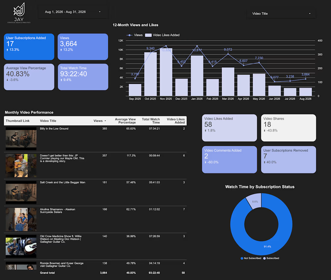
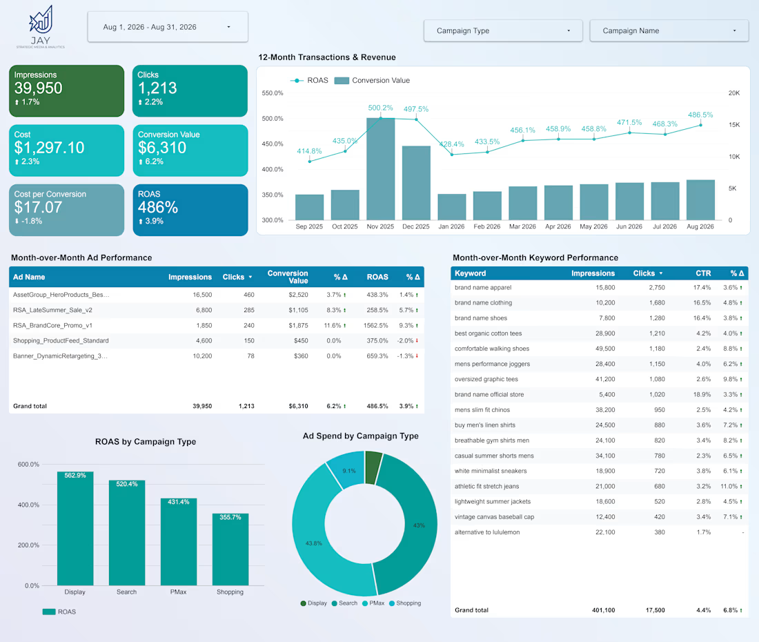
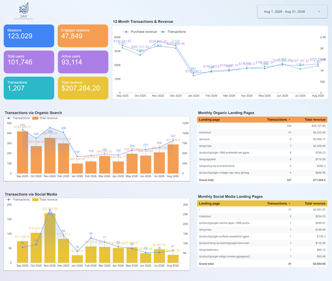
Assembling a few sample performance and analytics dashboards, using randomized dummy data to keep client info private, to refine how reporting gets presented to design and brand partners.
When working on brand, web, or UI/UX projects, what metrics or visual insights do you actually find valuable in a report? Are you looking to see how visual changes impact user engagement and conversion paths, or do you prefer high-level ROI summaries to show clients the impact of your work?
Always open to connecting with designers, agencies, and growth strategists looking to partner on the performance and reporting side of client accounts.