The network for creativity
Join 1.25M professional creatives like you
Connect with clients, get discovered, and run your business 100% commission-free
Creatives on Contra have earned over $150M and we are just getting started
Back to feedPost

Hello! 👋
Presenting to you today's exploration
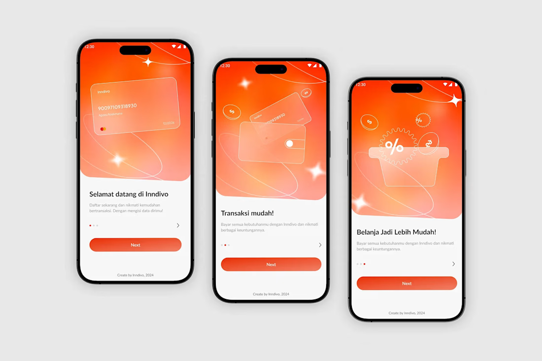
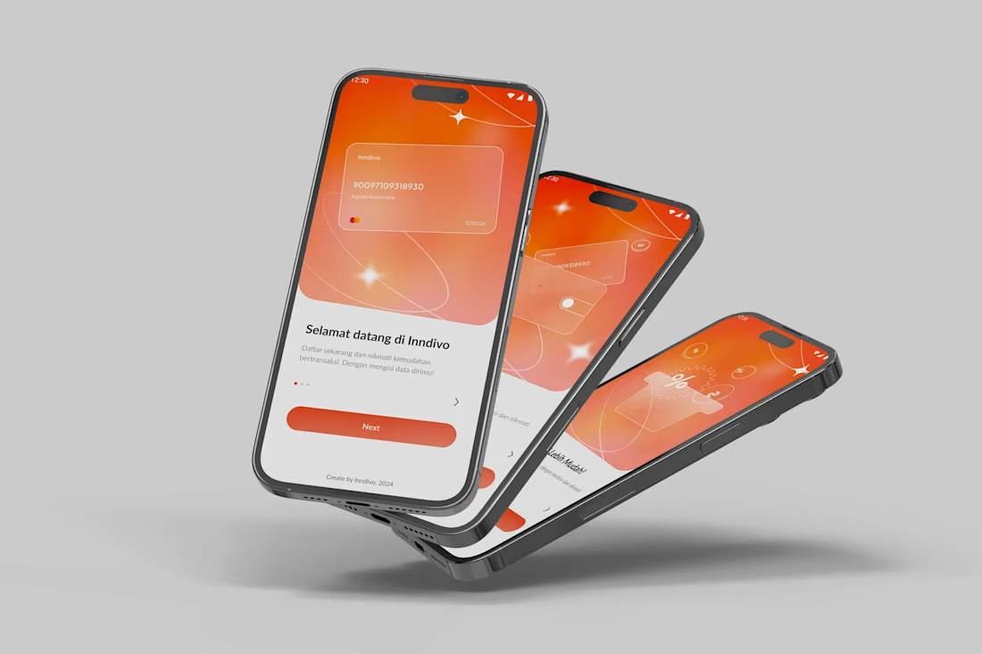
Inndivo ⏤ Onboarding Mobile App 💰



Good work
The network for creativity
Join 1.25M professional creatives like you
Connect with clients, get discovered, and run your business 100% commission-free
Creatives on Contra have earned over $150M and we are just getting started

Challenges
View all


Related posts


The low-poly scene already has a strong sense of place, and the 60fps browser target makes the interaction feel ambitious in the best way. I especially like how the restrained palette lets the “Explore the Silo” typography lead the experience.

Keystone - HR Management Platform
Employee list screens are the homework assignment of SaaS design. A table is a table is a table. Nobody's winning an award for this view and that's exactly why it matters.
The restraint here is the point. No colored tags, no status badges fighting for attention, no dashboard widgets crammed into the sidebar. Just the data, breathing in a dark container with enough row spacing that your eyes don't blur at record five.
That split between a bold brand identity and a restrained product UI is one of the hardest things to get right in B2B SaaS.
#SaaS #DashboardDesign #DarkUI #B2BTech #ProductDesign
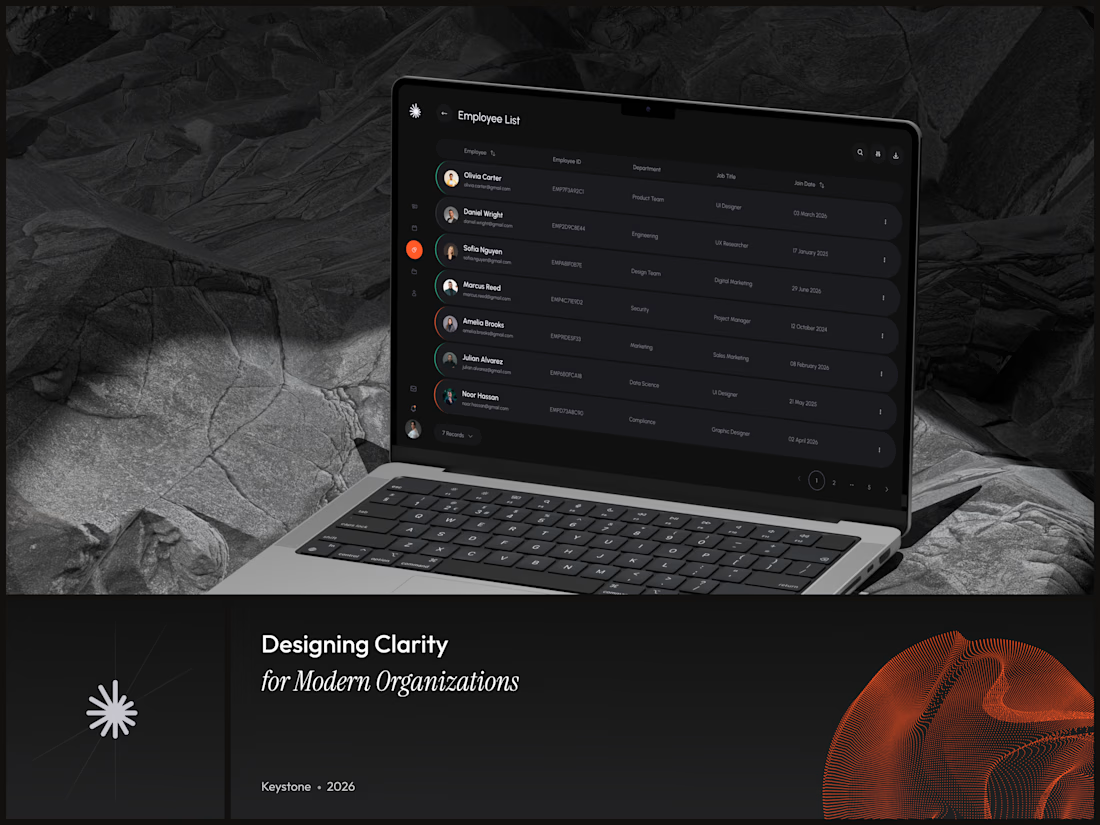

"A table is a table" is the harder argument to make internally than the design itself - most teams would've shipped colored status tags just to have something to show in a review.

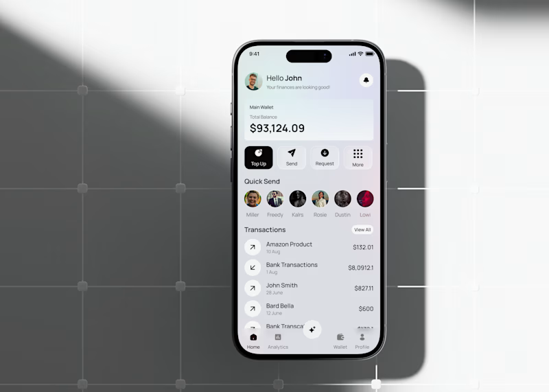
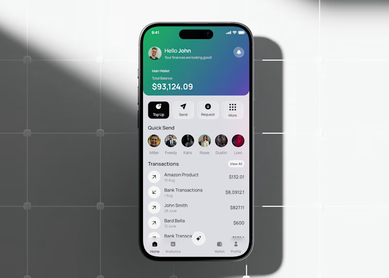
Fintech app home dashboard design
A mobile wallet app concept focused on everyday money management: checking your balance, sending money to people you pay often, and keeping an eye on recent transactions all from one home screen.
The layout keeps the essentials up top (balance, quick actions like Top Up, Send, Request) and moves frequent contacts and transaction history below, so the most-used actions stay within reach without extra taps.
This version tests a gradient treatment on the balance card to see if it helps the total stand out against the rest of the screen, versus a flatter, neutral card.
Would love to hear which balance card style feels more natural to use day to day.
3 voted
33%
6 voted
67%
9 votes
Closed

the gradient is cool