The network for creativity
Join 1.25M professional creatives like you
Connect with clients, get discovered, and run your business 100% commission-free
Creatives on Contra have earned over $150M and we are just getting started
Back to feedPost

Your team may be describing three different businesses under one brand name.
The founder talks about the vision.
The website lists services.
The sales proposal competes on price.
Each version might be accurate. Together, they can leave customers unsure what they are choosing.
Before changing the logo, put those three descriptions side by side.
Can you find the same priority audience?
The same customer problem?
The same reason to choose the business?
If those answers change with the channel, visual consistency alone will not resolve the confusion.
Start by agreeing on the value the brand needs to communicate. Then give each channel a specific role in explaining it.
Where does your business tell its clearest story today?
The network for creativity
Join 1.25M professional creatives like you
Connect with clients, get discovered, and run your business 100% commission-free
Creatives on Contra have earned over $150M and we are just getting started



Related posts

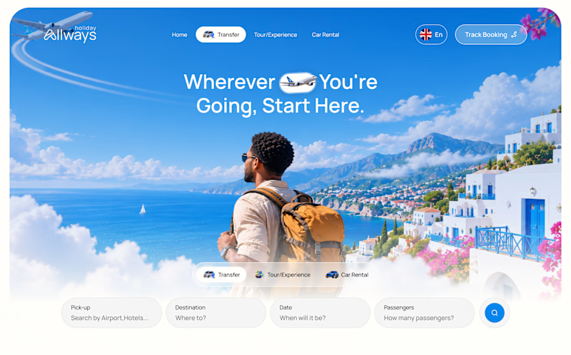
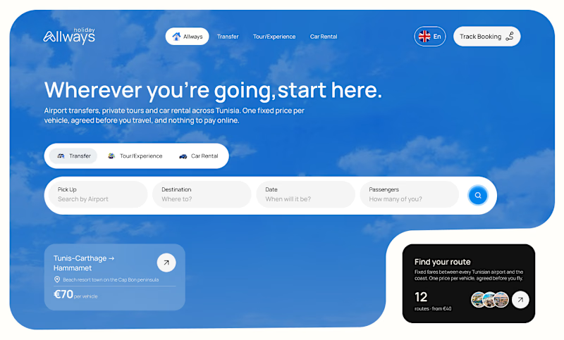
I missed an important detail in th first design direction, and the client rejected it.
After revisiting the feedback, I came up with another directiona nd it got approved
Both designs serve the same product, which one do you think got accepted for a web application?
Direction 1
Direction 2

9 voted
69%
4 voted
31%
13 votes
Closed


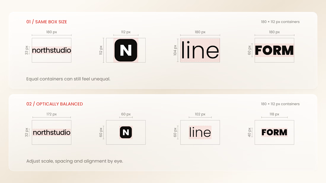
Why do logos look uneven even when they have the same size?
Every logo has a different shape, proportion, and visual weight. A wide wordmark can appear smaller than a compact symbol, while a bold logo may dominate a thinner one - even when their dimensions are technically identical.
That’s why logo sections shouldn’t be aligned by numbers alone.
Adjusting each logo optically, using a consistent visual area, balanced spacing, and a shared baseline helps every brand feel equally represented.
The goal isn’t to make every logo exactly the same size.
It’s to make them feel equally important.
Because visual consistency is based on perception, not just pixels.


Thanks for the information you shared

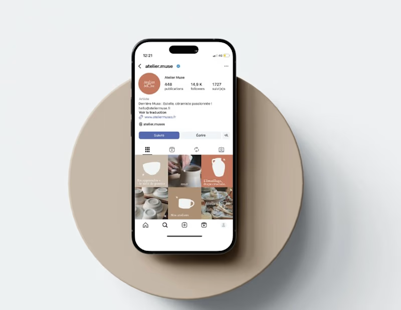
**Can Someone Understand What Your Business Offers Within 10 Seconds of Visiting Your Page?**
Imagine someone discovers your business on Instagram for the first time.
They visit your profile because something caught their attention.
But within a few seconds, they still cannot figure out exactly what you offer, who your services are for or how to get started.
That's a missed opportunity.
Your social media profile should make it easy for potential customers to understand your business without having to search through dozens of posts.
Here are four things your profile should communicate clearly:
What you offer: Make your products or services easy to understand.
Who you serve: Help visitors recognize whether your business meets their needs.
Why they should explore further: Highlight useful information about your brand, products or services.
How to reach you: Make your contact details and next steps accessible.
Your social media page is part of your customer's experience with your business.
Don't make potential customers work too hard to understand what you do.
If someone visited your business page today, would they immediately understand what you offer?