The network for creativity
Join 1.25M professional creatives like you
Connect with clients, get discovered, and run your business 100% commission-free
Creatives on Contra have earned over $150M and we are just getting started
Back to feedPost

Built this hero section with a WebGL shader running underneath editorial typography. Here's the breakdown.
The background isn't an image. It's PlasmaWave — a live shader from ReactBits, rendering in real-time using OGL (WebGL).
What I tuned:
→ Warm gold/plum color pair instead of the default purple-cyan
→ Vignette + grain layered on top — kills the "AI-generated" look, adds film texture
→ Serif typography instead of the usual sans-heavy SaaS look
→ Editorial nav/footer — minimal, magazine-style, not "startup landing page"
Built with Lovable + ReactBits. The shader itself runs on the GPU — two animated plasma bands blending into each other, customizable speed, bend, rotation, all live.
Most people use shader backgrounds and leave them looking like a tech demo. The grain + serif type + warm palette is what makes this feel like a fashion editorial instead of a SaaS pricing page.
Curious what people think 👇
Does a moving shader background actually help a hero section, or is it just noise that distracts from the headline?
#WebGL #ReactBits #Lovable #ShaderArt #UIDesign #FrontendDevelopment #EditorialDesign #BuildInPublic #Contra #CreativeCode


The network for creativity
Join 1.25M professional creatives like you
Connect with clients, get discovered, and run your business 100% commission-free
Creatives on Contra have earned over $150M and we are just getting started











Related posts

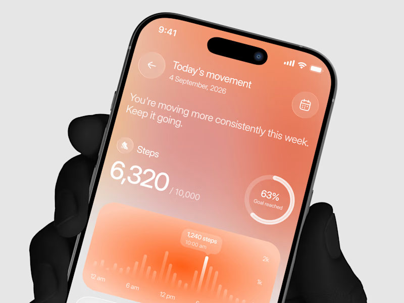
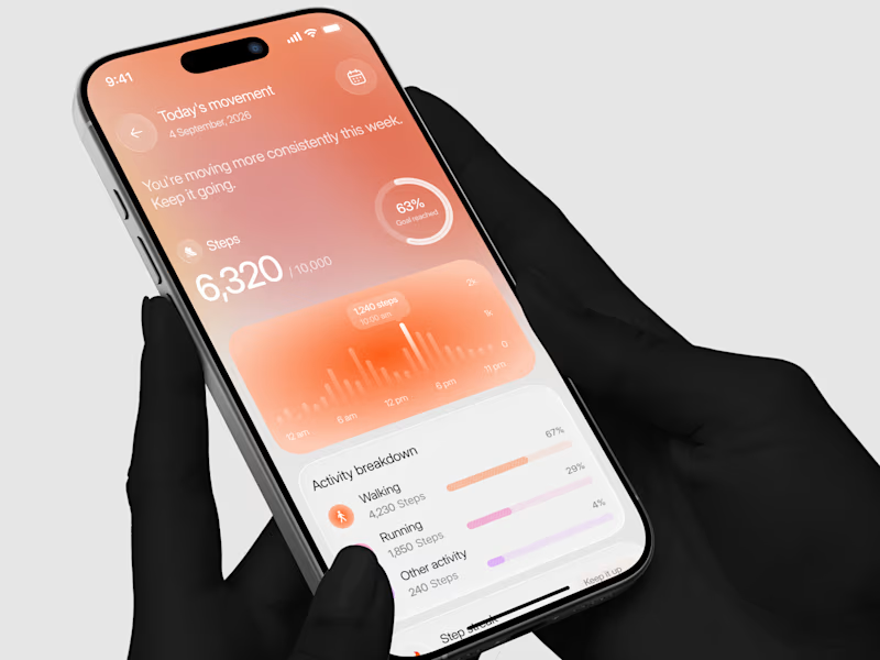
Designed a step tracking screen where you can see your daily progress and weekly trend in one glance.
Same screen, two shots. Which one would stop your scroll? 👀


11 voted
73%
4 voted
27%
15 votes
Closed

AI Automation SaaS Website Design
AUTONIX is a modern AI automation SaaS website concept designed to help businesses streamline workflows, automate repetitive tasks, and manage AI agents more efficiently.
The design combines a clean, minimal interface with bold typography, futuristic visuals, interactive UI elements, and a seamless user experience. From AI-powered task automation to real-time productivity insights, every section is designed to communicate the value of intelligent automation in a clear and engaging way.
This project explores how thoughtful UI/UX design can make complex AI technology feel intuitive, accessible, and easy to use for modern businesses.
Services: SaaS Website Design, UI/UX Design, Landing Page Design, AI Product Design.

Exploring a clean, modern SaaS dashboard UI. Focused on simple layouts, smooth interactions, and a better user experience 🚀


i had to like this, it got my attention, very nice build mate.