The network for creativity
Join 1.25M professional creatives like you
Connect with clients, get discovered, and run your business 100% commission-free
Creatives on Contra have earned over $150M and we are just getting started
Back to feedPost


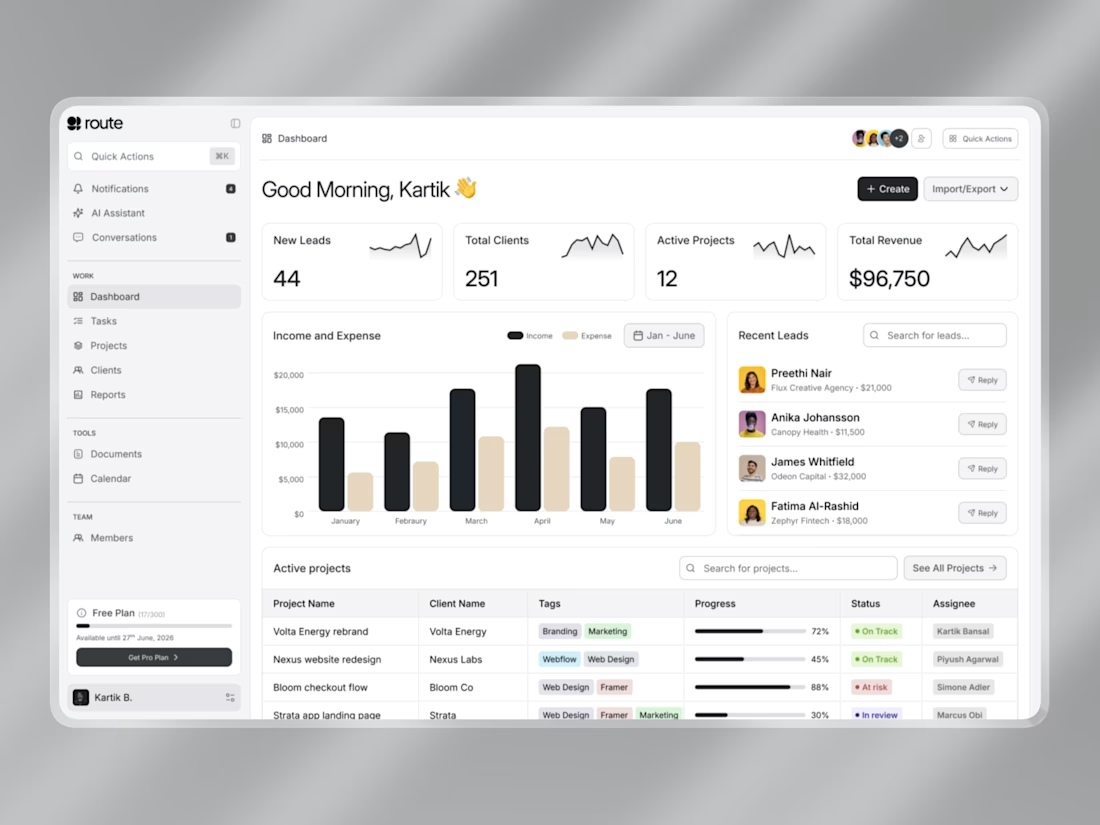

Engaging and detailed design output with clarity.
thanks
The network for creativity
Join 1.25M professional creatives like you
Connect with clients, get discovered, and run your business 100% commission-free
Creatives on Contra have earned over $150M and we are just getting started








Related posts


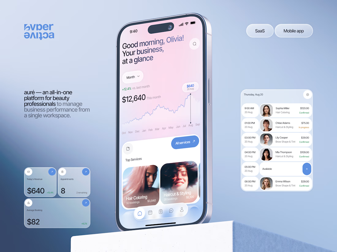
Finally wrapped up this project, and I’m excited to share the case study! 💅 A fresh product design concept for a beauty dashboard. Would love to hear your thoughts! ✨


A beauty dashboard is such a fun product design challenge, Oleksandra. The Good morning, Olivia! greeting in the header makes business metrics feel personal instead of clinical, which is exactly what a beauty professional would want.

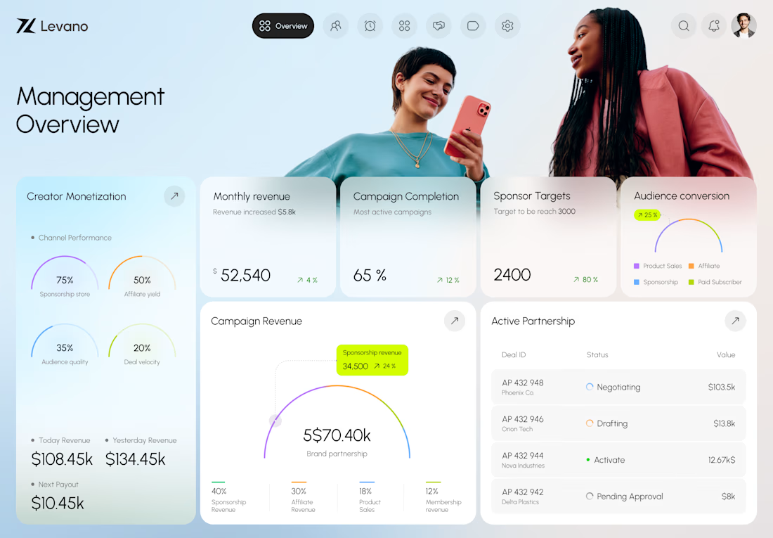
Creatora - Creator Management Dashboard
Creator focused businesses manage a lot of data across campaigns, revenue, sponsorships, audience performance, partnerships, and payouts.
The challenge wasn’t showing more data, but helping users quickly understand what’s happening and what needs attention.
For Creatora, we organized the dashboard around the metrics teams check most often, with a clear hierarchy between KPIs, trends, campaign performance, and partnership details.
We used soft gradients, rounded cards, clean typography, and focused data visualization to keep the interface premium without making it harder to use.
The result is a centralized dashboard where teams can quickly see what’s performing, what’s changing, and where they should focus next.
At Orvio, we design and build digital products that solve real problems, create better user experiences, and help businesses grow.
From product design and development to AI-powered solutions, we help ambitious businesses turn ideas into products that work.



Amazing work

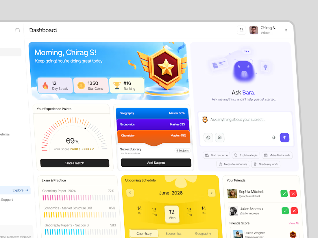
A fresh look at a gamified learning dashboard designed to make progress tracking more engaging, visual, and easy to understand.

Great job Nikanth🔥🔥