The network for creativity
Join 1.25M professional creatives like you
Connect with clients, get discovered, and run your business 100% commission-free
Creatives on Contra have earned over $150M and we are just getting started
Back to feedPost
Taste Test

What direction do you think will be more successful?
1. Bright colors, sans serifs
2. Calm, restrained, serif
I think demand is returning for calm, restrained design. Sophisticated but calm colours, elegant typography

29 voted
74%
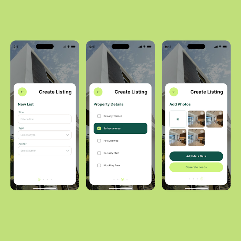
10 voted
26%
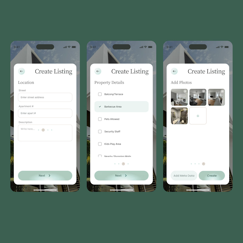
39 votes
Closed

vivid and bold, important elements looks clearly..!!easy to scan

Vivid & Bold!

though i usually do opt for calm, the vividity here really jumps out as measured & thoughtful against the deeper shade of green you've chosen; there's an element of both play & maturity in it, & i think that combo adds a sense of focus for the user's subconscious. especially...


2 all day

Vivid & Bold for me! But somehow it still feels calm tho, even with the brighter colors 💚🤍

Idk about the demand but, 'Calm and restrained' is better aligned with the niche in my opinion.


Calm & Restrained 🔥

Awesoem

I love the 1st one!

If we are talking pure aesthetic choice, then the 'Calm & Restrained' probably feels like it works better - but in all honesty these designs have way more work to be done on the fundamentals before this should even be an aesthetic choice alone.

calm one looks more premium and clean to me

2
The network for creativity
Join 1.25M professional creatives like you
Connect with clients, get discovered, and run your business 100% commission-free
Creatives on Contra have earned over $150M and we are just getting started





Related posts

Designed two directions for a health tracking app
Same data, but two very different feelings
One is dark and focused, built for athletes. The other is warm and friendly, built for everyday people
What do you think?
Which one would you open every day, A or B?
21 voted
39%
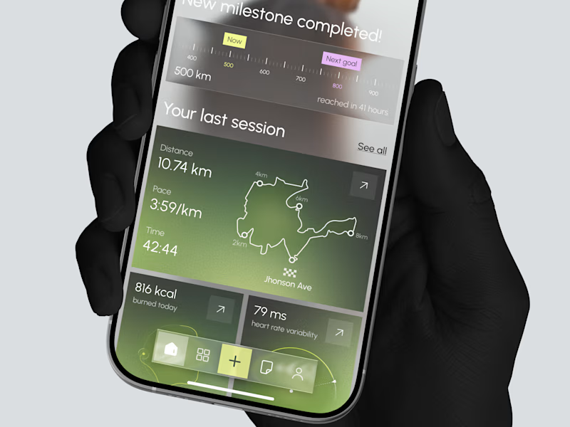
33 voted
61%
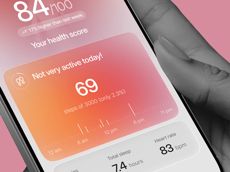
54 votes
Closed
Option 1 gave me a very fin-tech feel and option 2 feels like my health is in danger, sorry 😂

Two cuts of the same opener for Pletor 2.0. Same copy, same timing, different composition.
In the first one the words sit at opposite corners and the product cards drift in loose. In the second the cards arrive as tight stacks and the words swap corners.
I keep going back and forth on which one reads faster.
Vote in the comments, 1 or 2.
35 voted
65%
19 voted
35%
54 votes
Closed

2 for me. The tight stacks give the eye one clear place to land, so the message reads quicker. The loose drift in 1 looks beautiful but I found myself chasing the cards a bit

Designed the landing page for Smug — an AI support agent that resolves tickets, knows exactly when to escalate to a human, and has zero interest in pretending otherwise.
Most AI support tools go the humble, over-apologetic route. Smug does the opposite — the whole brand is built around a smug little cat mascot and copy like "Handled it. You're welcome." It's a genuinely fun brief: figuring out how to make confidence read as charming instead of obnoxious.
Bold electric blue and orange instead of the usual muted SaaS palette, because a product this confident shouldn't look shy about it. 💙


cool