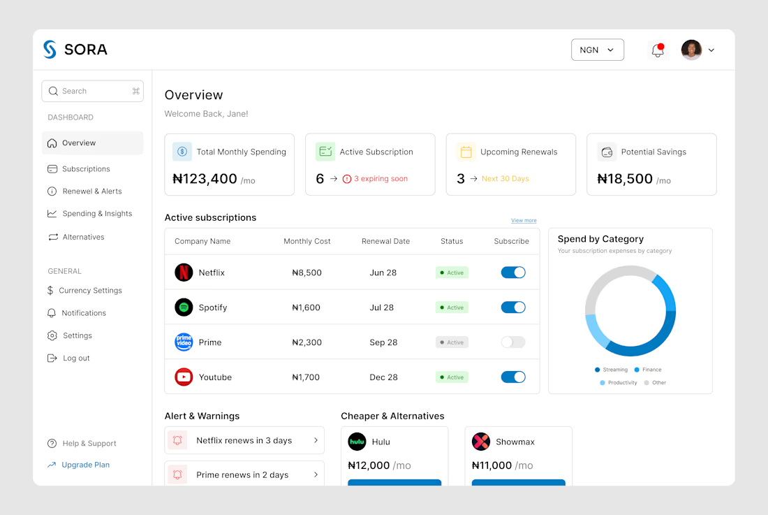
This is an app subscription management dashboard which helps users to track apps subscribed, notify the user before next payment and deadlines, suggests alternative apps.
Designed the landing page and dashboard preview for Thaw — an AI platform that tracks anxiety, mood, and burnout, framing emotional buildup as frost that gradually melts through guided sessions.
Mental health apps tend to land in one of two places: too clinical to feel human, or too soft to feel like it takes anything seriously. So the whole design leans on one strong metaphor instead — a head encased in melting ice — and lets oversized typography wrap directly around it for real visual weight.
Below the hero, the dashboard preview does the harder work: mood stability, anxiety signals, sleep quality, and a specific AI-detected insight that makes the product feel genuinely perceptive rather than generic.
A warm dark palette with cool blue type keeps the tone serious without tipping into heavy.
Creative - Midjourney
Animation - Jitter
Most B2B tech brands try to look "disruptive." But when your business model is managed IT and technical operations for the world's largest enterprises, disruption is the last thing your clients want.
They want resilience. They want 24/7 global coverage. They want a team that can resolve 725,000+ tickets while maintaining a 99.9% uptime.
We redesigned Anovia’s digital presence to match that operational reality.
Anovia (formerly Innovatia Technical Services) supports organizations at a massive scale: LVMH, iFit, and Tempo rely on their 300+ certified specialists to handle the heavy lifting of infrastructure.
The design reflects that "extended team" philosophy. We used high-density grid systems, a deep enterprise palette, and a focus on transparency. It doesn't just describe their 98% customer satisfaction; it demonstrates the rigor that earns it.
Sharing my UX/UI work for Lemonads, an AdTech platform designed to simplify Google Ads management. This case study explores how I turned complex advertising data into clear dashboards and intuitive workflows.
Strong product-design thinking here—turning dense ad-management data into a calmer dashboard is no small task. The hierarchy and status cues make the workflow feel much more approachable.