The network for creativity
Join 1.25M professional creatives like you
Connect with clients, get discovered, and run your business 100% commission-free
Creatives on Contra have earned over $150M and we are just getting started
Back to feedPost

📸 Haramaya Lens — From “Can I book?” to “You’re booked.”
I built Haramaya Lens, a booking system for a fictional photography and videography studio in Haramaya, Ethiopia, as part of the Lovable Challenge.
🔴 The Problem
For a busy solo photographer, booking customers can take a lot of time.
Customers often ask:
“Are you available?”
“What time can I come?”
“Can I change my appointment?”
“Did you confirm my booking?”
The owner may have to manually:
• Check availability
• Reply to messages
• Find a suitable time
• Confirm the appointment
• Update the calendar
• Send reminders
• Handle rescheduling and cancellations
• Follow up with customers who did not complete their booking
This creates back-and-forth communication, missed opportunities, scheduling conflicts, and unnecessary owner workload.
🟢 The Solution
Haramaya Lens turns the booking conversation into a simple self-service experience.
A customer can:
📸 Choose a service
📅 Select a date
⏰ See available time slots
📝 Enter their information
✅ Confirm the appointment
🎟️ Receive a booking reference
🔄 Reschedule or cancel when needed
At the same time, the owner gets:
📊 A clear dashboard
📆 Automatic booking/calendar updates
⏰ Availability management
🔔 Reminder tracking
🔄 Rescheduling management
📋 Customer and booking information
💬 Follow-up management
🚀 Key Advantages
1. Saves owner time
Less manual messaging and fewer repetitive questions.
2. Reduces double bookings
The system checks availability and prevents conflicting appointments.
3. Makes booking easier for customers
Customers can book without waiting for the owner to reply.
4. Reduces missed appointments
Reminder workflows help customers remember their bookings.
5. Makes rescheduling easier
Customers can manage changes without unnecessary back-and-forth.
6. Gives the owner a clear overview
Upcoming appointments, customers, availability, and follow-ups are organized in one place.
7. Works across devices
The experience is designed for desktop, tablet, and mobile users.
🎯 The Main Idea
Instead of:
Customer message → Owner checks → Back-and-forth → Confirmation → Manual update
Haramaya Lens creates:
Choose service → Choose time → Confirm → You’re booked. ✅
I built this project to focus on one question:
How can we remove as much unnecessary work as possible between a customer saying “Can I book with you?” and the owner saying “You’re booked”?
🔎 Please check the project
and leave a comment.
I’d especially like feedback on the problem, solution, user experience, design, and features.
What would you improve or add?
Built with Lovable.
@Lovable #lovablechallenge

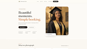
haramayalens.lovable.app
Haramaya Lens — Beautiful moments. Simple booking.
Book your photography session in Haramaya without the back-and-forth. Live availability, instant confirmation.
The network for creativity
Join 1.25M professional creatives like you
Connect with clients, get discovered, and run your business 100% commission-free
Creatives on Contra have earned over $150M and we are just getting started




Related posts

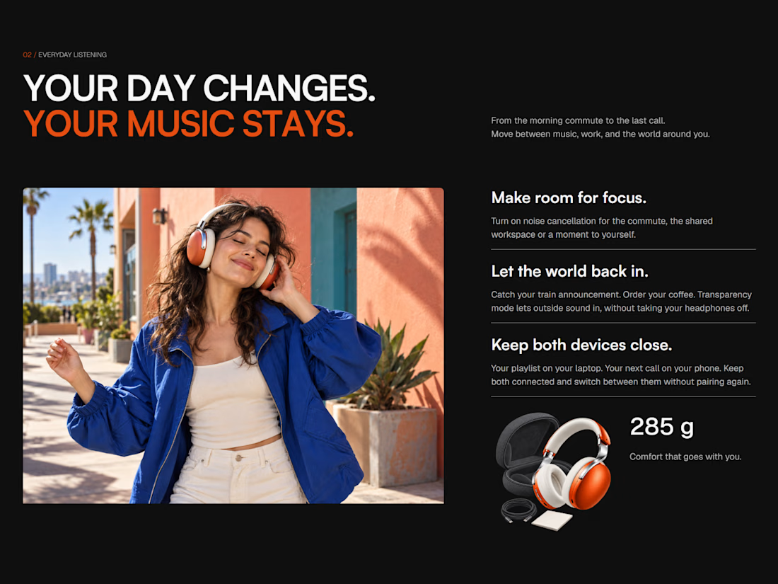
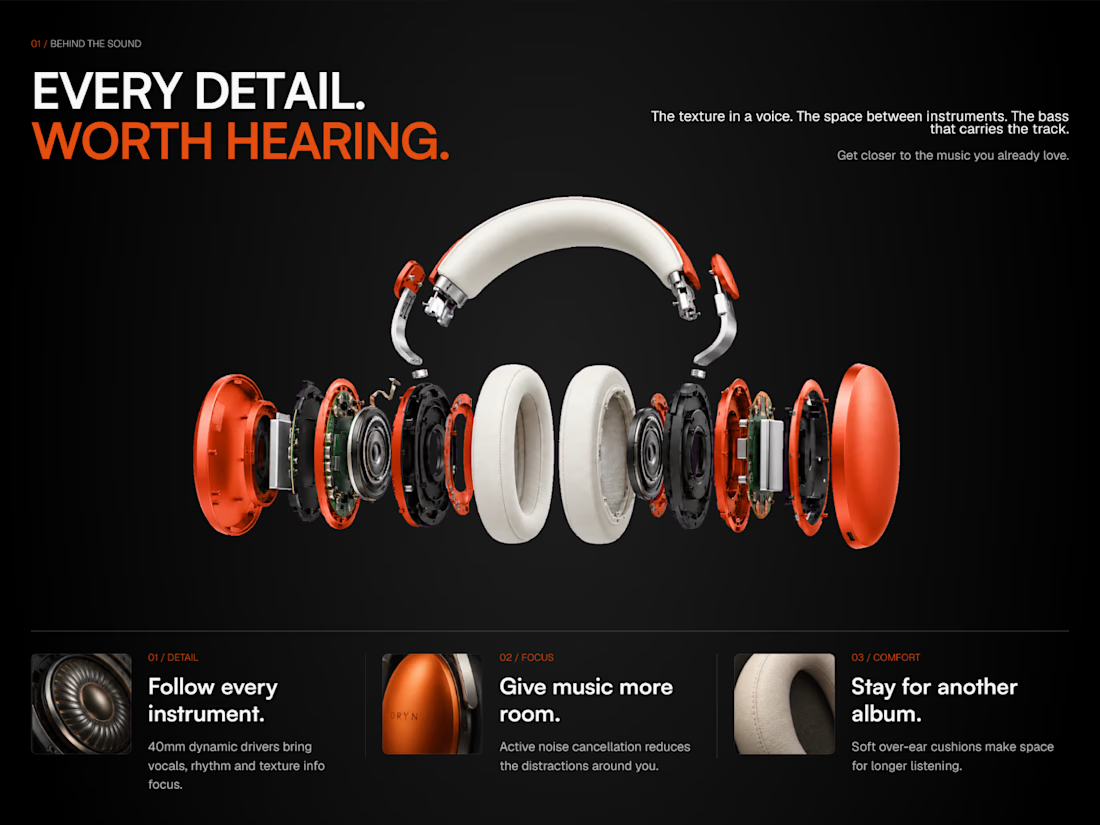
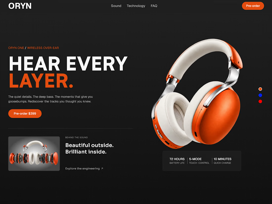
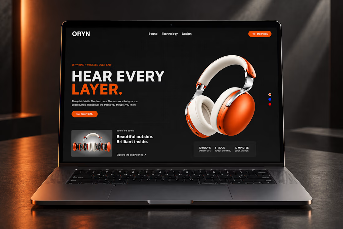
Just finished designing and building my newest Framer template, ORYN Audio 🎧
A bold product landing page with detailed product visuals, interactive color selection, and smooth scroll animations. Built to look sharp on every screen and be easy to make your own.
It’ll be available for free. Take a look and let me know what you think 👇



Fiverr Thumbnail Design — Visual Direction Exploration
Overview
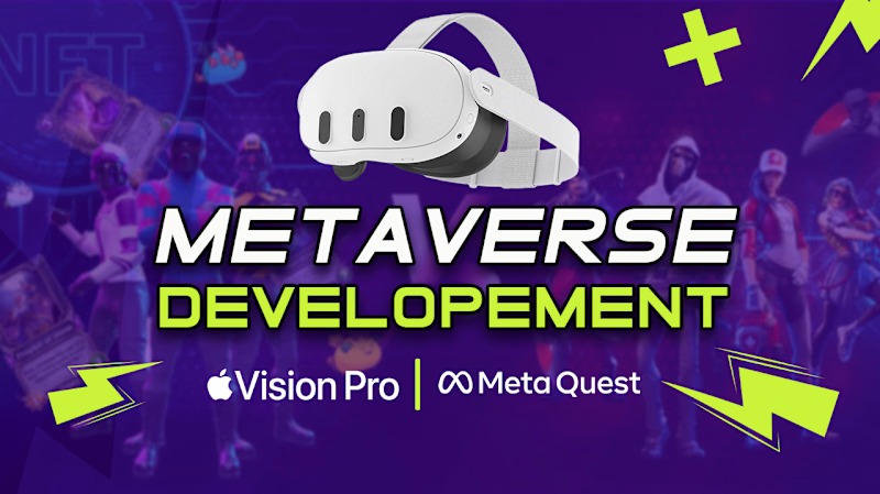
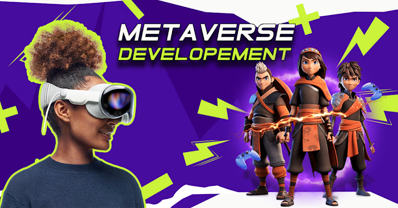
Designed two visual directions for a Fiverr thumbnail, exploring different approaches to composition, typography, imagery, and visual hierarchy.
Direction 01: Centered Impact: A bold, center-focused layout that places the main message at the visual focal point for immediate readability and impact.
Direction 02: Dynamic Balance: A more dynamic composition using side-positioned typography with supporting imagery to create visual movement and stronger balance.
Both variations were created from the same core concept to explore how different layouts can influence attention, readability, and overall engagement.


3 voted
75%
1 voted
25%
4 votes
Closed

centered for me

Orive — Interactive Site with a Custom Particle Engine
Orive is a self-initiated concept site for a fictional decision-intelligence company. I used it to build the kind of motion-led marketing site that normally ships on a heavy stack — and to build it with no framework, no build step, and no WebGL. Six pages, roughly 2,000 lines of hand-written code, deployed static.
The centrepiece: a particle engine written from scratch
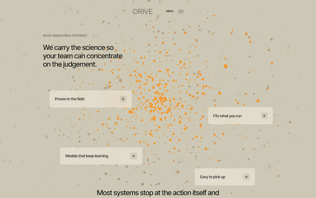
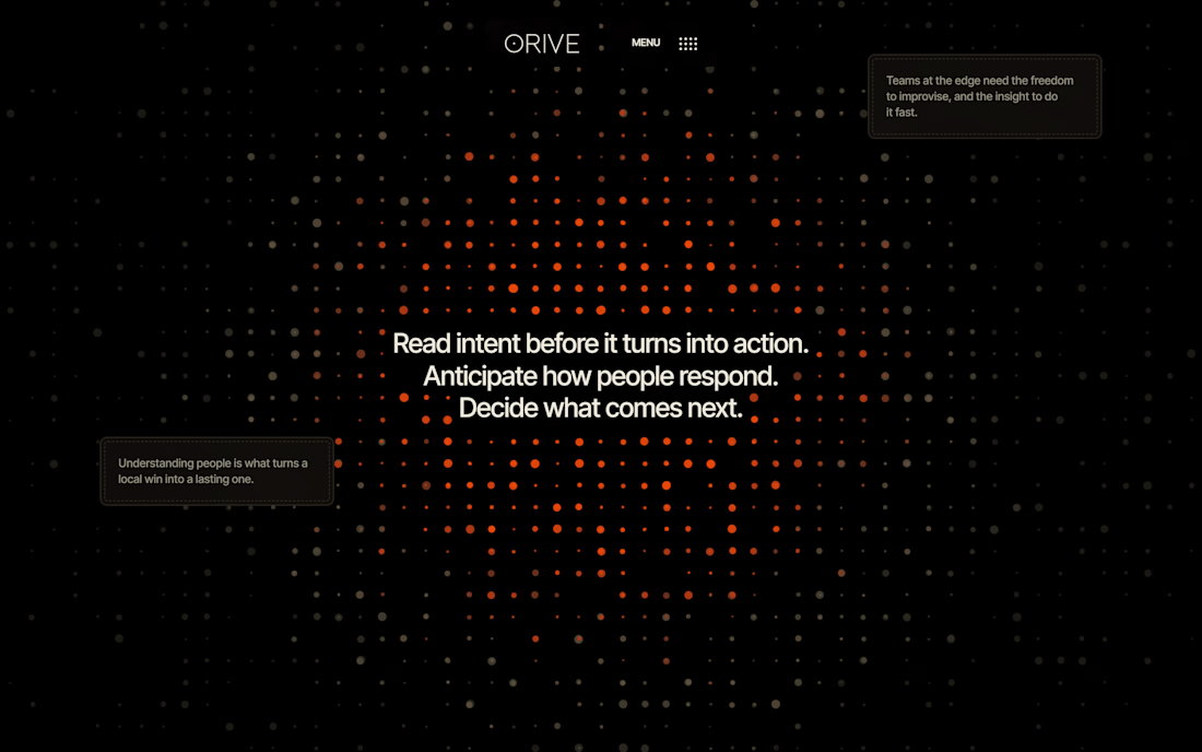
A fixed field of 2,800 particles sits behind every page and reacts to scroll position. It morphs between eight formations — a loose cloud, a snapped dot lattice, a tilted ring, a dense core, meridian rings, a hollow shell, concentric circles and a small ember — with each particle carrying its own delay so the shapes assemble organically instead of snapping.
Two decisions made it interesting:
Canvas2D, not WebGL. The target machine had no working WebGL, so the whole thing runs on the 2D context. To keep it smooth I project the 3D points by hand, sort particles into eight colour buckets per frame, and draw each bucket as a single batched path — rather than thousands of individual draw calls.
Choreography lives in the HTML. Each section declares its own motion with one attribute: data-shape="lattice:1.2:2.35" — shape name, where it forms, how long it holds, in viewport units. Adding a section to the site means adding one attribute, not editing the engine.
A theme that changes as you read
Sections can declare data-theme="light". Whichever section sits under the centre of the viewport wins, and the entire page — background, type, cards, borders and even the particle colour ramp — transitions between a near-black palette and a warm sand one. The particle field cross-fades its own background and colours in the same motion, so the switch reads as one continuous move rather than two things changing at once.
Interaction detail
Sticky statement sections that pin while the copy holds, with a line of text that cycles through six phrases as you scroll past.
A scattered accordion — cards positioned freely across the canvas that expand in place over the live particle field.
A stacked testimonial carousel where the top card lifts away and the incoming quote lights up word by word.
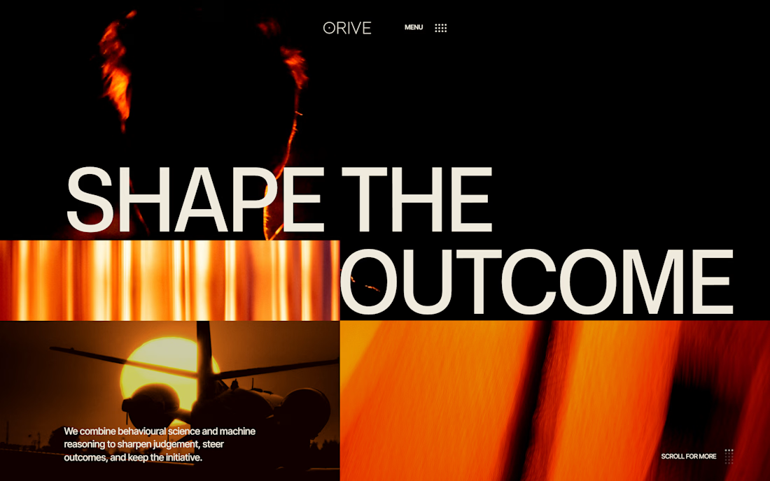
Images that resolve from coarse pixels into focus when they enter view, drawn through an offscreen canvas.
Reading highlight: long-form copy fills with colour word by word as it passes the top of the screen.
Custom dropdown menu whose dot-grid icon rearranges into a close glyph.
Buttons that fill from the bottom with a sliding double-arrow.
Smooth scrolling (Lenis), cursor-tracking glows, staggered card reveals and layered parallax throughout.
Built to be handed over
Fluid 16-column grid. Every width, gutter and type size is a clamp() expression, so the layout scales continuously between mobile and 1440px+ instead of jumping at breakpoints.
One content file. Every image and video slot is a single entry in content.js, with a per-slot colour grade. Swapping the art direction means editing one object, not hunting through markup.
Shared chrome. Header, navigation and footer are injected from one script, so six pages stay in sync.
Graceful fallbacks. Slots render generated Canvas2D artwork when no photograph is supplied, and prefers-reduced-motion is respected throughout.
Verification
I checked the build by driving headless Chrome: screenshotting every page at fixed scroll positions, measuring computed layout values against the design targets, and asserting zero console errors on all six pages, locally and again on the live deployment.
STACK / SKILLS (tags)
HTML5 CSS3 JavaScript (ES6) Canvas 2D Creative Coding Scroll Animation Lenis Responsive Design Design Engineering Motion Design Art Direction Vercel Accessibility Performance

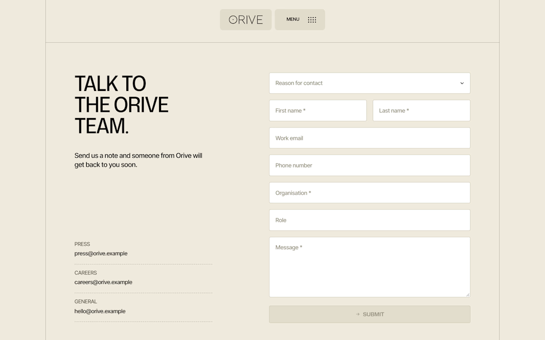

The custom particle engine gives the concept real personality.