The network for creativity
Join 1.25M professional creatives like you
Connect with clients, get discovered, and run your business 100% commission-free
Creatives on Contra have earned over $150M and we are just getting started
Back to feedPost

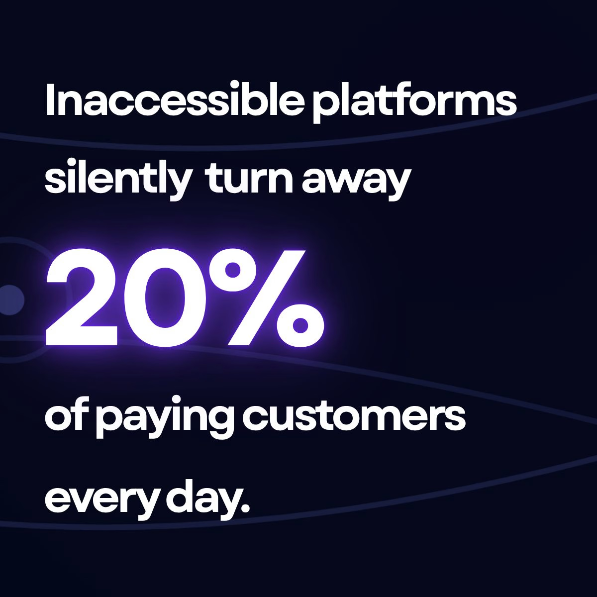
Most digital products and platforms are accidentally locking out up to 20% of their potential users.
Not because the product is bad—but because of a hidden barrier: digital accessibility.
When you’re running a lean setup or a solo project, accessibility usually gets pushed to the "we'll fix it later" pile. We assume it requires an army of QA testers or massive compliance budgets.
It doesn't. You can unlock this massive, hidden audience right now without spending a dime.
Here are 3 zero-dollar shifts you can make to your workflow today:
Move testing upstream: Stop checking for accessibility barriers after you deploy. Intercepting issues directly in your developer workflow (like using pre-deployment git checks) stops bugs before they ever hit production.
Focus on the high-impact 20%: You don't need a total redesign. Fixing keyboard navigation, clear form labels, and color contrast instantly solves the majority of critical user friction points.
Design for inclusive flexibility: Inclusive design isn’t a restriction; it’s a framework that makes your core product cleaner, more modular, and easier for everyone to use.
Accessibility isn't a checklist item to handle later—it's a massive, underserved market waiting for tools that actually work for them.
I just broke down the exact step-by-step strategy for unlocking this hidden audience without breaking your budget.
👇 I’ve dropped the link to the full article in the comments below. What’s the biggest hurdle you face when trying to make your digital tools more inclusive?


The network for creativity
Join 1.25M professional creatives like you
Connect with clients, get discovered, and run your business 100% commission-free
Creatives on Contra have earned over $150M and we are just getting started











Related posts

Accidentally made app navigation look more satisfying than the actual music!😍
16 seconds of spatial audio, smooth transitions, and tactile UI motion. Testing how far you can stretch digital minimalism✨
Feedback and love from the design community are always appreciated🙌
UI DesignmotiongraphicsmobileappdesignuiuxdesignMotion DesignUX DesignAdobe After EffectsCinema 4DFigma


This is so satisfying Raheel! 🔥 You nailed that tactile UI motion - 16 seconds but it feels so premium! The spatial audio card with that depth + smooth transition from Home to Made for Spatial Audio is chef's kiss. Minimalism stretched perfectly without losing the Apple Music...

Designing a fragrance website with 2 sections that feels as premium as the product.
Built a fragrance experience where the product takes center stage.
I wanted the website to feel as refined as the fragrances themselves minimal layout, strong typography, immersive product visuals, and subtle interactions that make exploring each scent feel premium.
The goal wasn’t to fill the page with elements, but to give every product enough space to create its own presence.
Built with Next.js, with a focus on responsive design, smooth interactions, and a polished browsing experience.


The product imagery is doing most of the work here. Did you use art-directed mobile crops, or keep one image with a different object position? That can preserve label detail without loading the full desktop asset.

Genuine update: I have immediate bandwidth and am actively looking for paid client projects right now 🤝
I am a frontend developer & UI designer obsessed with crafting fast, cinematic, and responsive web experiences (like this lunar concept built in React + Vite).
What I can build for you:
• High-converting landing pages & MVP frontend (React, Vite, CSS)
• Complete website redesigns & modern UI/UX
• Interactive micro-animations & smooth responsive layouts
Why work with me right now:
→ 100% dedicated attention (fast 24-48h updates)
→ Extremely flexible on budget & pricing (focused on delivering value & building strong testimonials)
→ Ready to start immediately
If you or anyone in your network needs a website built or revamped, please DM me or leave a comment below. I am ready to get to work! 📩
#webdesign #frontend #freelance #reactjs #uiux #buildinpublic
For the lunar concept, how are you handling motion on smaller screens—fewer parallax layers or shorter scroll travel? That choice affects both frame rate and readability.