The network for creativity
Join 1.25M professional creatives like you
Connect with clients, get discovered, and run your business 100% commission-free
Creatives on Contra have earned over $150M and we are just getting started
Back to feedPost

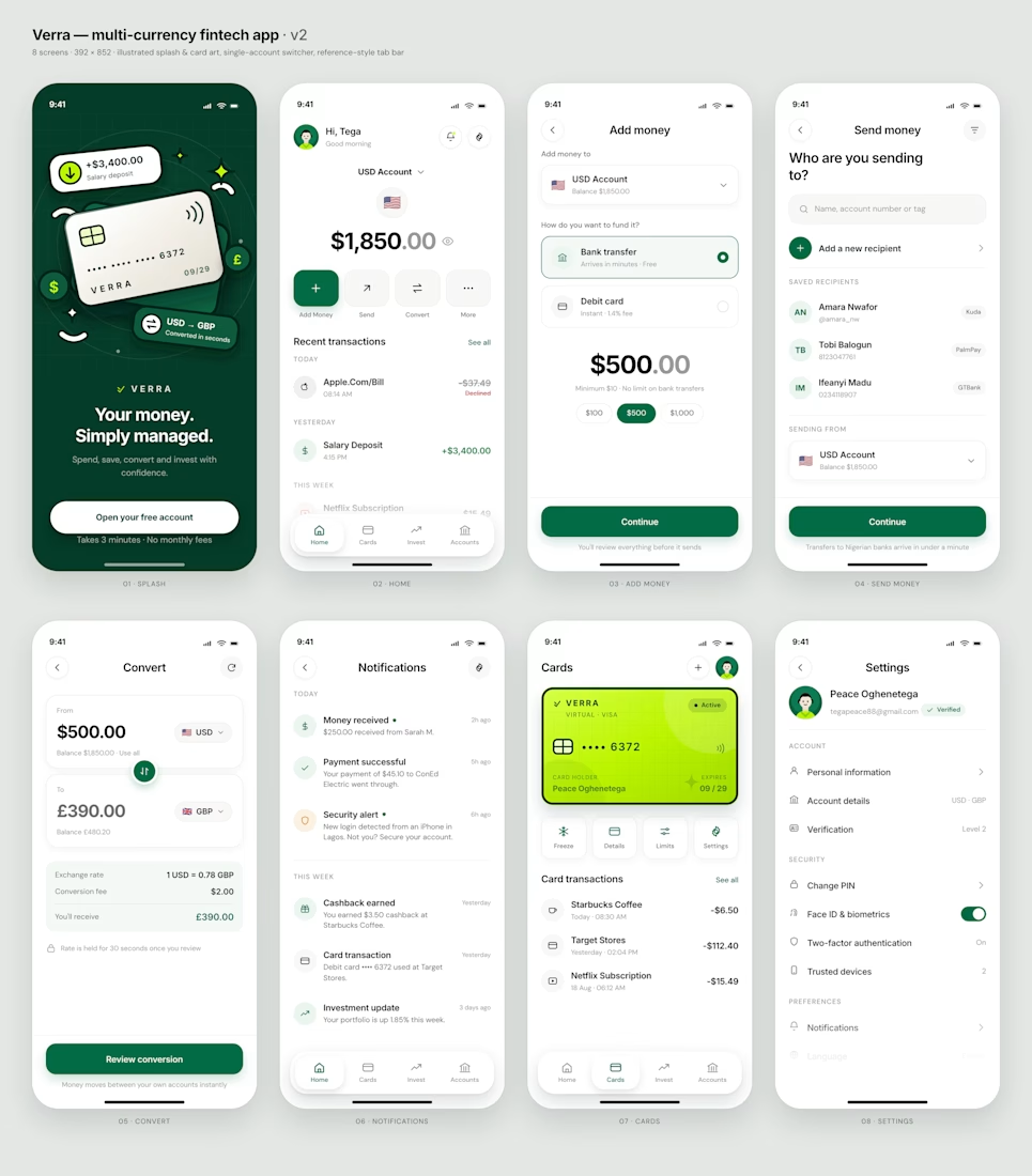
Good fintech design makes moving money feel simple.
That was the idea I had in mind when I started designing Verra.
I didn’t want it to feel like another fintech app packed with features, numbers, and endless options.
I wanted the experience to feel clear.
You should be able to open the app and immediately understand:
→ how much money you have
→ where it is
→ how to move it
→ who you’re sending it to
→ what happened to your money
No unnecessary complexity. No making users think harder than they need to.

Amazing work!
Thank you!

Nice💯
Thanks


Giving the hero section actual product focus and tighter hierarchy changes everything! Keeping the original brand soul while elevating the motion energy makes the redesign feel miles ahead
💯 agree, thank you


Simplicity is what makes fintech feel trustworthy. Strong direction.


Creative work !

So clean work 😍

nice one

This is Dope 🔥

This is clean, and great

One of the best designs I’ve seen today. Really solid work 👏 Stripping out fintech clutter to focus on clarity makes mobile interactions feel effortless.

This indeed is Good.

Amazing!
The network for creativity
Join 1.25M professional creatives like you
Connect with clients, get discovered, and run your business 100% commission-free
Creatives on Contra have earned over $150M and we are just getting started

Challenges
View all


Related posts

Fintech app home dashboard design
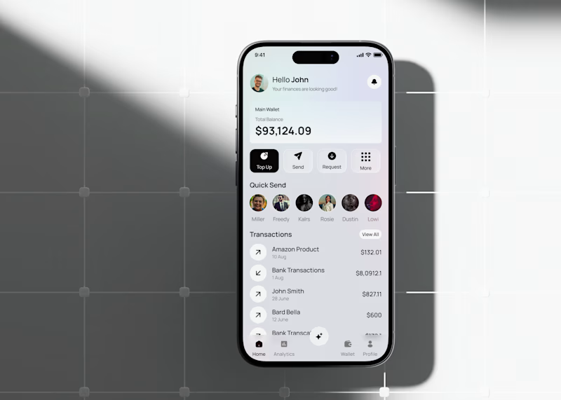
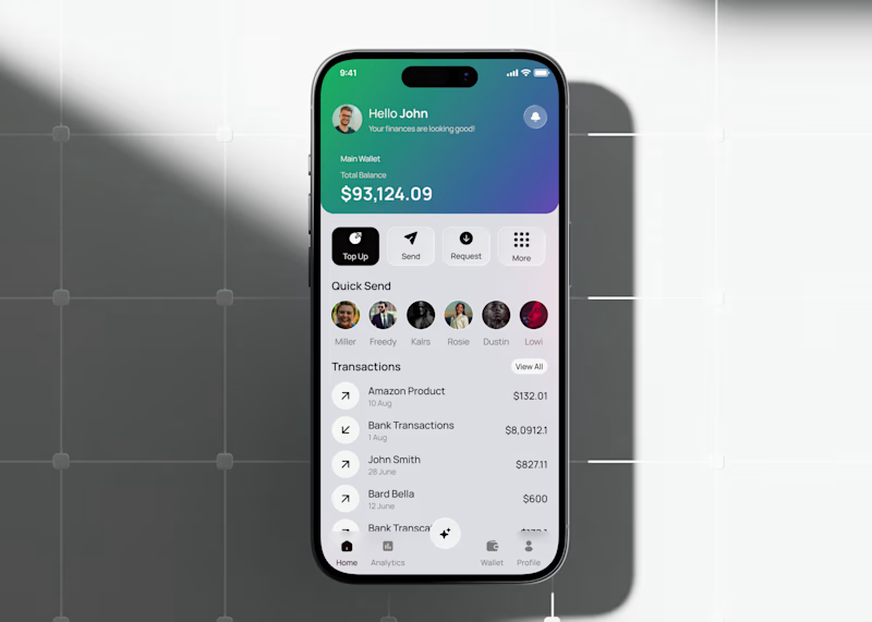
A mobile wallet app concept focused on everyday money management: checking your balance, sending money to people you pay often, and keeping an eye on recent transactions all from one home screen.
The layout keeps the essentials up top (balance, quick actions like Top Up, Send, Request) and moves frequent contacts and transaction history below, so the most-used actions stay within reach without extra taps.
This version tests a gradient treatment on the balance card to see if it helps the total stand out against the rest of the screen, versus a flatter, neutral card.
Would love to hear which balance card style feels more natural to use day to day.

3 voted
33%
6 voted
67%
9 votes
Closed

the gradient is cool

Just dropped a new healthcare web design project – Harbor Health! Focused on clean layouts, patient trust, and seamless booking flows. Would love to hear your feedback! 🌿
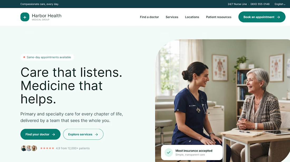
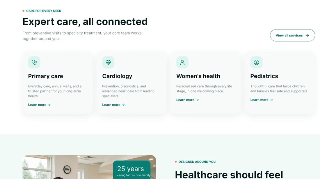
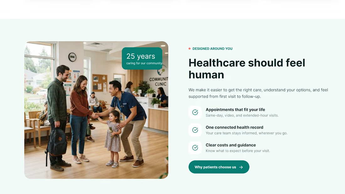
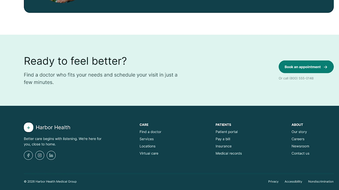

The restrained teal palette and generous spacing make the healthcare content feel calm and trustworthy. I especially like how the booking flow is surfaced without letting the clinical information overwhelm the primary action.

Sendit Finance client project
Your payment platform deserves a website that feels as trustworthy as the product itself.
A modern fintech payment platform focused on making complex payment infrastructure feel simple, secure, and easy to understand.
For this concept, I focused on:
→ Clear messaging that communicates value quickly
→ Strong visual hierarchy for better conversion
→ Trust-focused fintech UI
→ Clean product visualization
→ Strategic CTA placement
→ A premium, modern brand experience
Good web design isn’t just about making a website look good.
It should help visitors understand your product, trust your business, and take the next step.
If you're building a SaaS, fintech, startup, or digital product and your website isn't communicating your value clearly, I'd love to help redesign it.

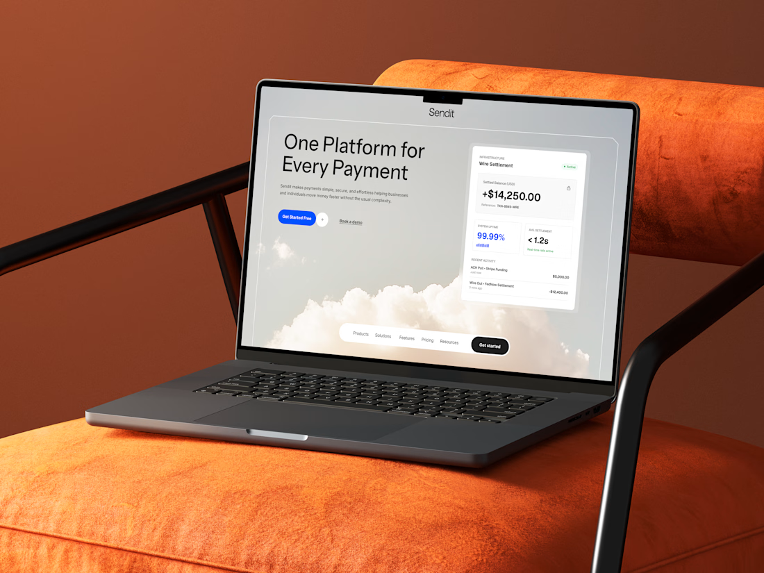

This is a really strong piece of design. I especially like how the typography, spacing, and visual hierarchy work together to make the whole interface feel clean and easy to understand.