The network for creativity
Join 1.25M professional creatives like you
Connect with clients, get discovered, and run your business 100% commission-free
Creatives on Contra have earned over $150M and we are just getting started
Back to feedPost
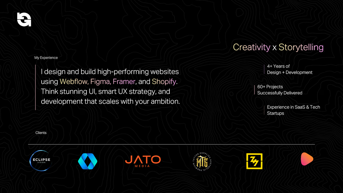
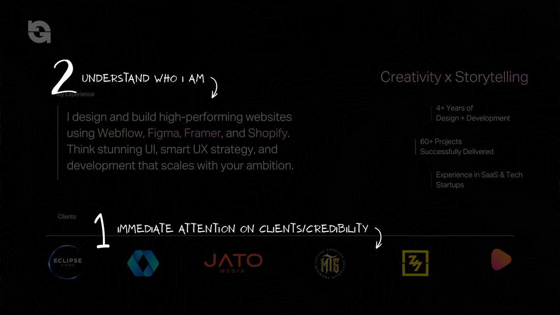
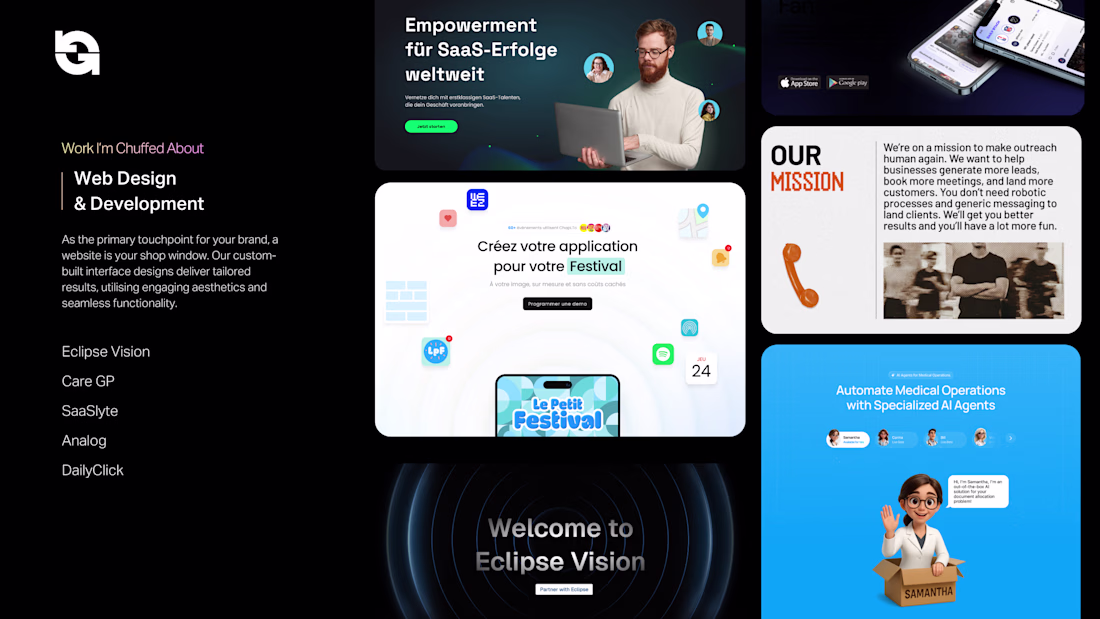
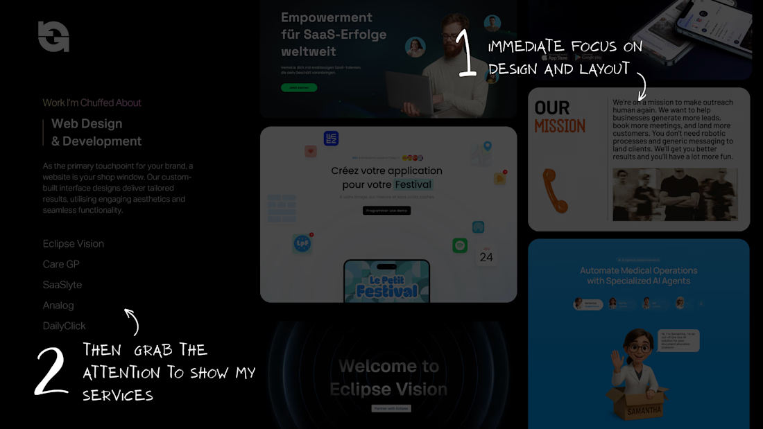
Why not approach a pitch deck… the way you approach a website? 🤔
Without realising it, I applied the same design logic behind websites to my pitch deck showing my services.
It helped me create a better flow with:
• Clear hierarchy
• 1-2 goals per page/section
• Structured journey
In this example, I focused on pulling attention quickly (credibility first), then guiding through services in a way that feels natural and easy to scan.
Using Figma to wireframe the slides is my approach with the grids and components.
Tip: If a slide is trying to say too much, it’s probably not doing its job.
What’s the hardest part of building a deck for you?
Love that, appreciate it 🙌
Thank you!
Pitch Deck is working out most of the time.
Yeah, it definitely works most of the time.
nice
Thank you!
Top notch execution 🙌💯
Thank you!
Super insightful! Definitley something I will incorporate into my work 🚀
Appreciate that 🙌 It’s one of those small mindset shifts that makes a big difference once you start applying it consistently.
Thats a good logic or approach to think of👍
Thank you 😊
This is such a great approach Amanuel!
🙌
Nice work
Really great approach! 🔥
Thank you 🙌
Great design
So interesting! I sometimes find telling the web story tricky so I also design pitch deck and translate it to web!
That’s actually a really good approach 👀
good job
🙌
Super insightful! Definitely going to apply
Yes please give it a shot
This makes a lot od sense
Great!!
Great idea, One thing that could really help adoption is cleaner documentation happy to help if you ever need it
Love this!
I agree with you
thank you for this Amanuel
Interesting thought, would be great to give it a try
I dig this approach. How often do you have to use pitch decks? I've had people who hire me without even looking at my videos - which shocks me! Shouldn't you like the work?
Great work!
loved this
Nice work!!
Love that!
impressive
The network for creativity
Join 1.25M professional creatives like you
Connect with clients, get discovered, and run your business 100% commission-free
Creatives on Contra have earned over $150M and we are just getting started
Related posts
Hello Everyone! 🚀
I've been working on this Framer Project since last week & now the project is officially complete and is live.
Please go check it out!
I have also uploaded the proper case study in my profile,
Thanks! 😊
Visual harmony.
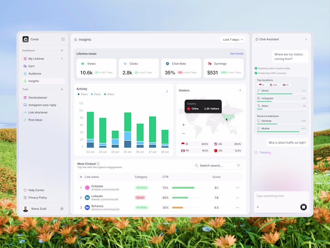
Hi Folks! Today I'm sharing my latest design exploration, an analytics dashboard for a link-in-bio tool called Cardo. The idea was simple: make your link performance data actually readable. So I broke it down into activity charts, a visitor map, and a chat assistant panel that answers your questions about your own data. Would love to hear what you think! 🙌
📩 Collaborate with Us? Contra Cansaas Agency
Trending
Claude
Claude has entered the design space. How are you using Claude Design?
Contra University
Learn from expert creatives how to earn more using next-gen AI tools.
fifaworldcup2026
The World Cup is here and the whole world's watching. How are you designing for the world stage?
creativeaiflow
Creative AI workflows are evolving. What tools do you use, and what are their strengths and weaknesses?
freelancerlife
Freelancer life is wins, pivots, and everything in between. What’s yours right now?