The network for creativity
Join 1.25M professional creatives like you
Connect with clients, get discovered, and run your business 100% commission-free
Creatives on Contra have earned over $150M and we are just getting started
Back to feedPost

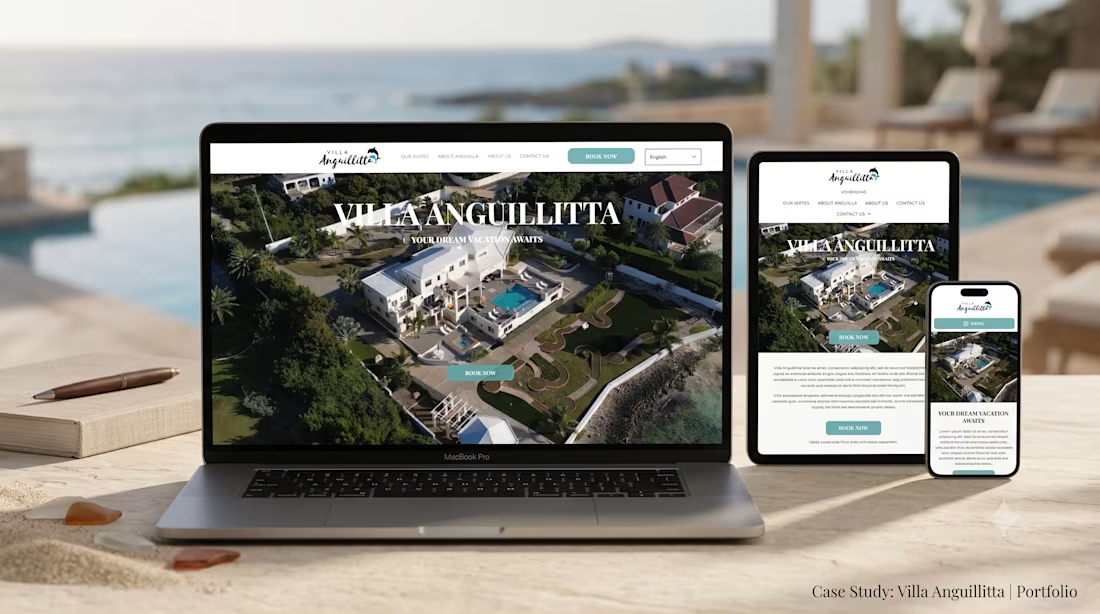
Designed and engineered a high-converting, luxury digital storefront for Villa Anguillitta, an exclusive oceanfront resort estate in Anguilla. The platform showcases high-end luxury suites, private resort amenities, and Caribbean island experiences while funneling high-net-worth travelers into direct, commission-free reservations.
Key Highlights:
Direct Booking & Inquiries Engine: Prominent sticky navigation with high-visibility "Book Now" funnels, allowing guests to submit dates, check suite availability, and reserve directly.
Luxury Suite & Estate Showcase: Interactive room modules detailing private suites, ocean-view balconies, infinity pool specifications, and estate grounds.
Destination & Experience Hub: Integrated "About Anguilla" travel guides and concierge experience breakdowns to engage luxury vacationers and event planners.
Mobile-First UX & High-Speed Media: Optimized aerial drone photography and high-resolution video assets for instant loading across mobile and desktop devices.
Brand Identity & Local SEO: Polished coastal luxury aesthetic paired with targeted metadata for Caribbean villa rentals and luxury vacation searches.
Tools & Technologies:
Figma, Next.js, React, Tailwind CSS, JavaScript, Responsive UI/UX, Local SEO, Booking Engine Integration.


The network for creativity
Join 1.25M professional creatives like you
Connect with clients, get discovered, and run your business 100% commission-free
Creatives on Contra have earned over $150M and we are just getting started

Challenges
View all


Related posts

I usually don't stop at 3 breakpoints when building a website.
Most people think about: Mobile, Tablet, Laptop
I like adding one more: Desktop
Because what looks great at 1440px can feel completely different at 1920px...
- The layout gets too wide.
- Spacing starts feeling off.
- Content loses its balance.
So I like testing the system across: Mobile → Tablet → Laptop → Desktop
Not because every website needs exactly 4 breakpoints. But because responsive design isn't about making a few screen sizes work.
It's about making the whole system work.
Follow Rushabh for more website fundamentals, experiments, and things I learn while building for the web.

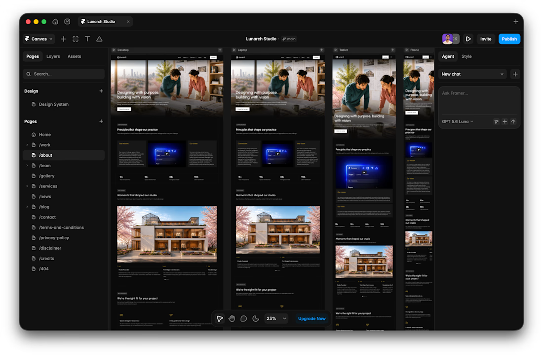

Wide screens expose spacing issues that laptop previews can hide.

Designed a clean, premium website concept for Arave — a modern digital watch brand. Focused on strong visuals, product storytelling, and a minimal, technical feel.
Would love to hear your thoughts — what do you think I could improve in this project?


"Built to be taken apart" reframes repairability as the premium feature, not a compromise - most watch sites hide the mechanism, this one leads with it.


Well crafted, the details make this feel premium.