The network for creativity
Join 1.25M professional creatives like you
Connect with clients, get discovered, and run your business 100% commission-free
Creatives on Contra have earned over $150M and we are just getting started
Back to feedPost

Koto just launched a type foundry.
Not a font pack. Not an AI font generator. An actual foundry, years in the making, with its own point of view.
In a world where you can prompt a typeface into existence in ten seconds, that's either mad or brilliant.
I think it's brilliant.
AI can give you infinite letterforms. It can't give you a reason those letterforms should exist. It can't tell you what a brand should feel like when someone reads it at 2am on their phone.
That's still a human call. It always will be.
Koto didn't build CCType because they had to. They built it because taste doesn't scale the way output does. In a market flooded with generated everything, a considered typeface is a competitive advantage, not a luxury.
Speed is table stakes now. Feeling is the differentiator.
Habit: build the thing only you could have made.
Source: Koto launches CCType type foundry, It's Nice That - https://www.itsnicethat.com/articles/koto-cctype-typography-project-080726
The network for creativity
Join 1.25M professional creatives like you
Connect with clients, get discovered, and run your business 100% commission-free
Creatives on Contra have earned over $150M and we are just getting started





Related posts

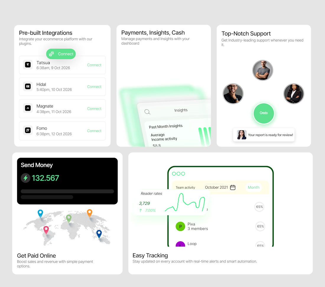
A bento system designed to make a SaaS product feel tangible.
I wanted each card to do more than display a feature — it needed to show the experience.
So I designed a collection of interactive-looking product cards around:
→ Integrations
→ Payments & insights
→ Customer support
→ Global payments
→ Real-time tracking
The visual direction combines minimal layouts, soft green accents, dashboard UI, subtle gradients and strong typography to create a modern fintech/SaaS feel.
The goal was simple:
Make the product feel useful before the user even clicks anything.
I'm currently open to UI/UX, Product Design and freelance opportunities.
If you're building a SaaS, fintech, Web3 or Web2 product and need a designer who can turn ideas into polished interfaces, let's work.
Available for new projects →
#UIDesign #ProductDesign #SaaS #Fintech #UXDesign #Figma #WebDesign #FreelanceDesigner


Love the vibe of this!


The thing I keep relearning: a design is never finished because someone ran out of ideas. It's finished because someone decided to stop. Knowing when to stop is the hardest part.


Damn.... Crazy colors 👏😍


Only one will win, and you get to decide which.
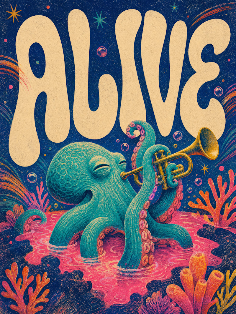
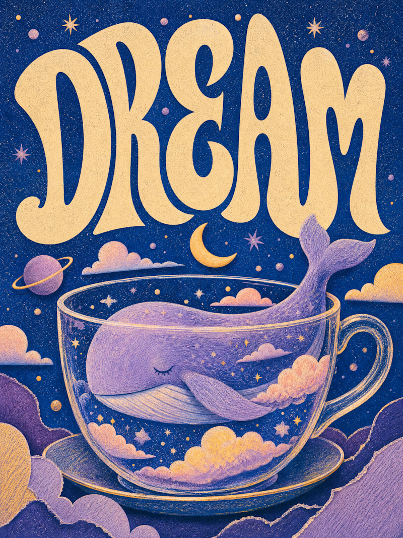
Two AI-generated images. Same creative intent. Different visual outcomes.
The images were generated with AI, but the art direction, visual decisions, composition, styling, and overall creative direction came from me as the human behind the work.
Now comes the real taste test.
Which one has the stronger visual language? Which one feels more intentional, more refined, and more memorable?
14 votes
Ends in 18h
