The network for creativity
Join 1.25M professional creatives like you
Connect with clients, get discovered, and run your business 100% commission-free
Creatives on Contra have earned over $150M and we are just getting started


The network for creativity
Join 1.25M professional creatives like you
Connect with clients, get discovered, and run your business 100% commission-free
Creatives on Contra have earned over $150M and we are just getting started



Related posts

Amazing!

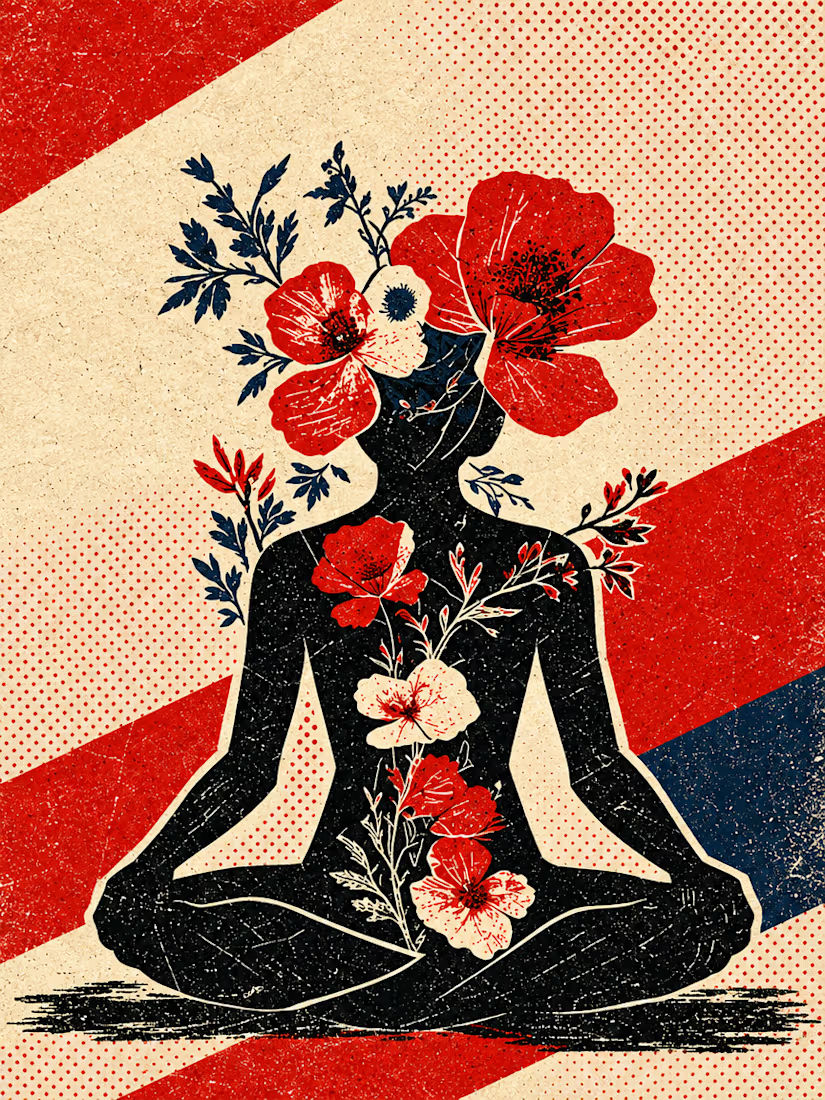
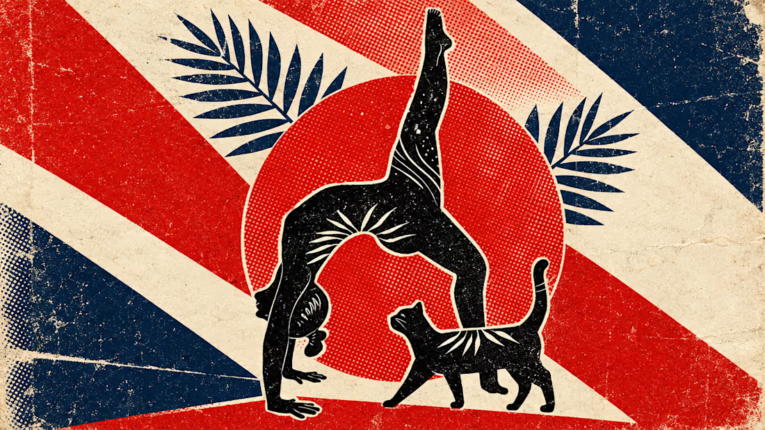
What happens when propaganda designed to erase the self gets pointed at the self instead?
Soviet propaganda spent 70 years trying to erase the individual soul in favour of the collective machine. I pointed that exact visual language at the thing it was built to suppress.
I kept...



Social posts we designed for Fulcrum, a physical therapy clinic in Boulder.
Each post comes from the clinic itself: the booking flow, the rates, the therapists, patient reviews and a map to the clinic. Labels sit small above the text, and the photos stay clean.
They use the same fonts, colors and photos as the Fulcrum website template.
Get Fulcrum: https://contra.com/products/x6wj97P2-fulcrum
Live preview: https://fulcrumphysio.framer.website/?utm_source=contra


Taste Test: Bounce vs. Blueprint
Two 30-second motion pieces in two very different design languages, randomly drawn from a list of 60 styles.
Sprout: Flat Design
A houseplant-care app told with bright, shadowless shapes and springy bounce-in motion. Friendly icons, a weekly watering chart, a testimonial bubble and a “Pick your pal” shop all pop in with a circle wipe between scenes.
Atelier Nord: Modernism
An architecture studio told with restraint. Line drawings build themselves, from a house elevation to a floor plan, in a warm grey, black and off-white palette with a single orange accent. Clean type and sliding wipes keep it calm and precise.
One format, two moods: playful and rounded vs. quiet and exact.
2 videos · 30s each · 1080×1080 · 30 fps
Styles: Flat Design · Modernism


3 voted
43%
4 voted
57%
7 votes
Closed

Flat design, colors are eye catchy😊