The network for creativity
Join 1.25M professional creatives like you
Connect with clients, get discovered, and run your business 100% commission-free
Creatives on Contra have earned over $150M and we are just getting started
Back to feedPost

New here. My visibility score is 59 and I want to understand how this actually works.
If you've built up a profile on Contra what moved the needle? Projects, services, posting consistently, something else? I'd rather learn from people who've done it than guess.
Some context on where I'm coming from. I spent the last year on Upwork and hit Top Rated Plus with just over $100k earned. But I remember the start clearly: empty profile, no clients, no reviews, applying into silence. That part was not fun and it took a while.
So I know what this phase looks like. Empty profile again, score at 59, starting over. The difference is I've done it once, and I know it comes down to staying consistent when nothing's happening yet.
Here's my plan, and I'm posting it publicly so I actually stick to it: I'll ship work, publish every project, share what I'm building, and post updates as the profile grows including the parts that don't work.
I build AI agent systems and automation. Recent work: a multi-agent platform with 12 role-scoped specialists, a grant intelligence tool for nonprofits, and an n8n pipeline running unattended for a healthcare SaaS.
Follow along if you want to watch someone build a profile from zero. And if you've got advice on the discovery score, I'm listening.




Basically, when you hit certain milestones, the number goes up. Profile quality, number of likes, payment goals (1k, 5k, 10k...), client reviews... The higher the number, the better your visibility on the platform
The network for creativity
Join 1.25M professional creatives like you
Connect with clients, get discovered, and run your business 100% commission-free
Creatives on Contra have earned over $150M and we are just getting started











Related posts

This is wild to me!
I have worked so hard to build this profile and it just goes to show that you really do get out what you put in. Work has really picked up since I worked on my discovery score and the right clients seem to be finding their way to me. Couldn't be happier.

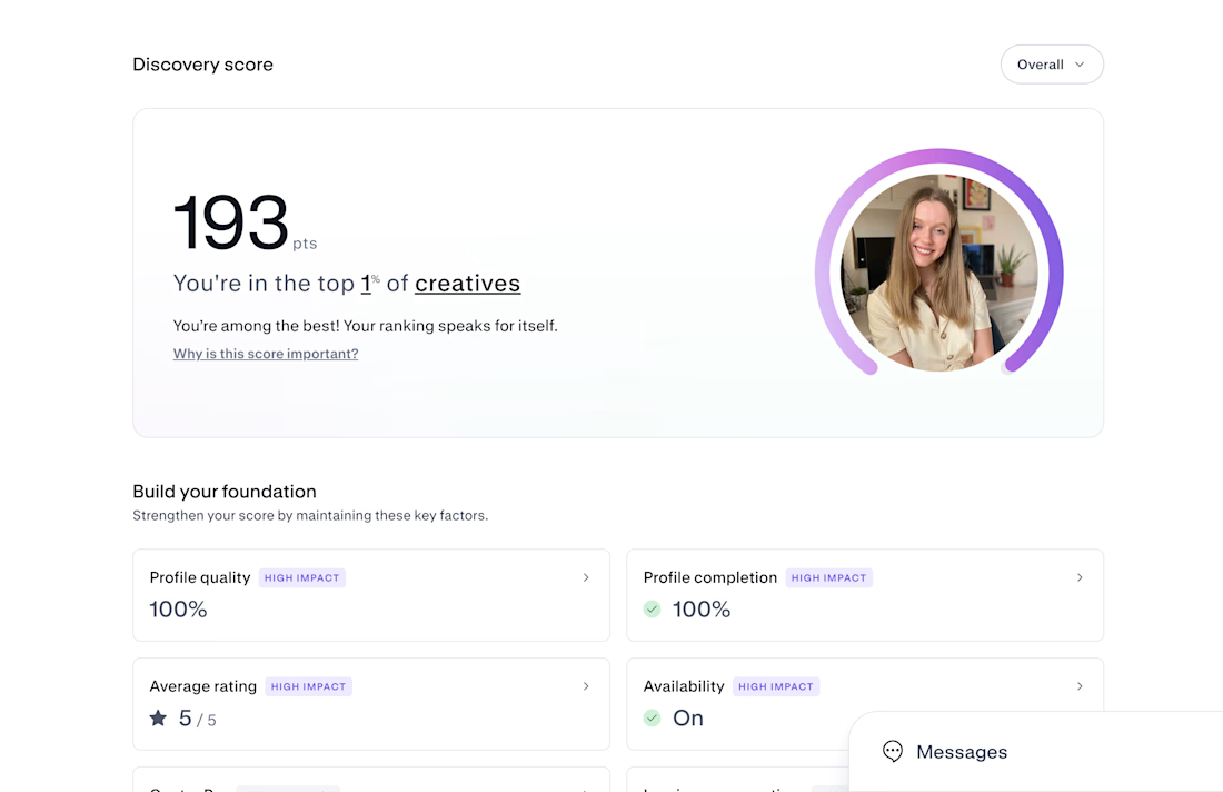

Congrats on Top 1% — that's huge! 193 is wild. If you don't mind sharing, what moved the needle most for your discovery score? Was it profile completion, case studies, or just consistent posting? Trying to build mine from scratch right now.

A little peek at the brand work we did for Elio Mortgage.
A warm, approachable identity full of warm vibrant colors paired with soft sun rising inspired gradients, inner glows and custom illustrations & more. Loved this direction!
Full case study coming soon, from process to final identity.
Plenty of logo explorations to share too!


That color palette takes the whole identity to a different level!! I loove it.

