The network for creativity
Join 1.25M professional creatives like you
Connect with clients, get discovered, and run your business 100% commission-free
Creatives on Contra have earned over $150M and we are just getting started
Back to feedPost

Some websites make you want to click.
Others make you want to pack a bag.
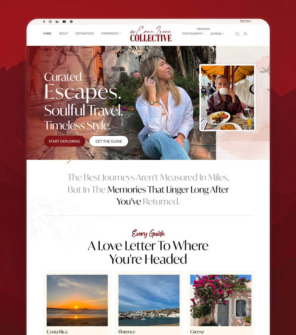
That was the feeling I wanted to create with this travel website concept for The Emma Irene Collective.
The direction is intentionally editorial and personal — destination stories, curated guides, photography, and experiences all working together without making the interface feel crowded.
Soft visuals.
Strong typography.
Room to breathe.
A travel brand doesn’t always need to shout to feel premium.
Sometimes, the design just needs to make you want to stay a little longer.
What kind of website makes you stop scrolling?

Top work bro
The network for creativity
Join 1.25M professional creatives like you
Connect with clients, get discovered, and run your business 100% commission-free
Creatives on Contra have earned over $150M and we are just getting started



Related posts


A great website should make the right first impression before the journey even begins.
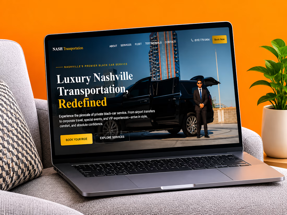
Just completed a website project for Nash Transportation, a luxury transportation service offering professional chauffeur experiences in Nashville.
The focus was on creating a clean, premium digital experience that communicates comfort, reliability, and professionalism while making it easy for customers to book their next ride.
I'd love to hear your thoughts:
What makes you choose a private transportation service, comfort, reliability, pricing, or the overall experience?
Let's discuss in the comments!
#WebDesign #Webflow #UXDesign #WebsiteDevelopment #LuxuryTransportation #WebDesigner



Amazing work!

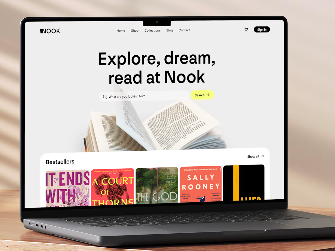
Really like this concept! The clean layout and typography look great, and the bestseller section is a nice touch. Genre filters could make browsing even better. Great work! 👏


New concept for bookstore 📚
What do you think?

A fashion storefront needs to show the outfit and make its individual pieces easy to find.
For FORM, I paired a warm, editorial lookbook with clearly grouped product names, prices, and size choices.
Cream surfaces, charcoal typography, and consistent product cards connect the homepage with the desktop and mobile screen concepts.
One useful design principle from this project: give campaign imagery and shopping details their own readable zones. The collection can have a strong visual presence while the next product decision stays clear.
Explore the complete design case study:
https://contra.com/p/rNPRqooQ-form-fashion-e-commerce-website-design
When exploring a clothing collection, what helps you most: a styled outfit or an individual product grid?
Adorable