The network for creativity
Join 1.25M professional creatives like you
Connect with clients, get discovered, and run your business 100% commission-free
Creatives on Contra have earned over $150M and we are just getting started
Back to feedPost

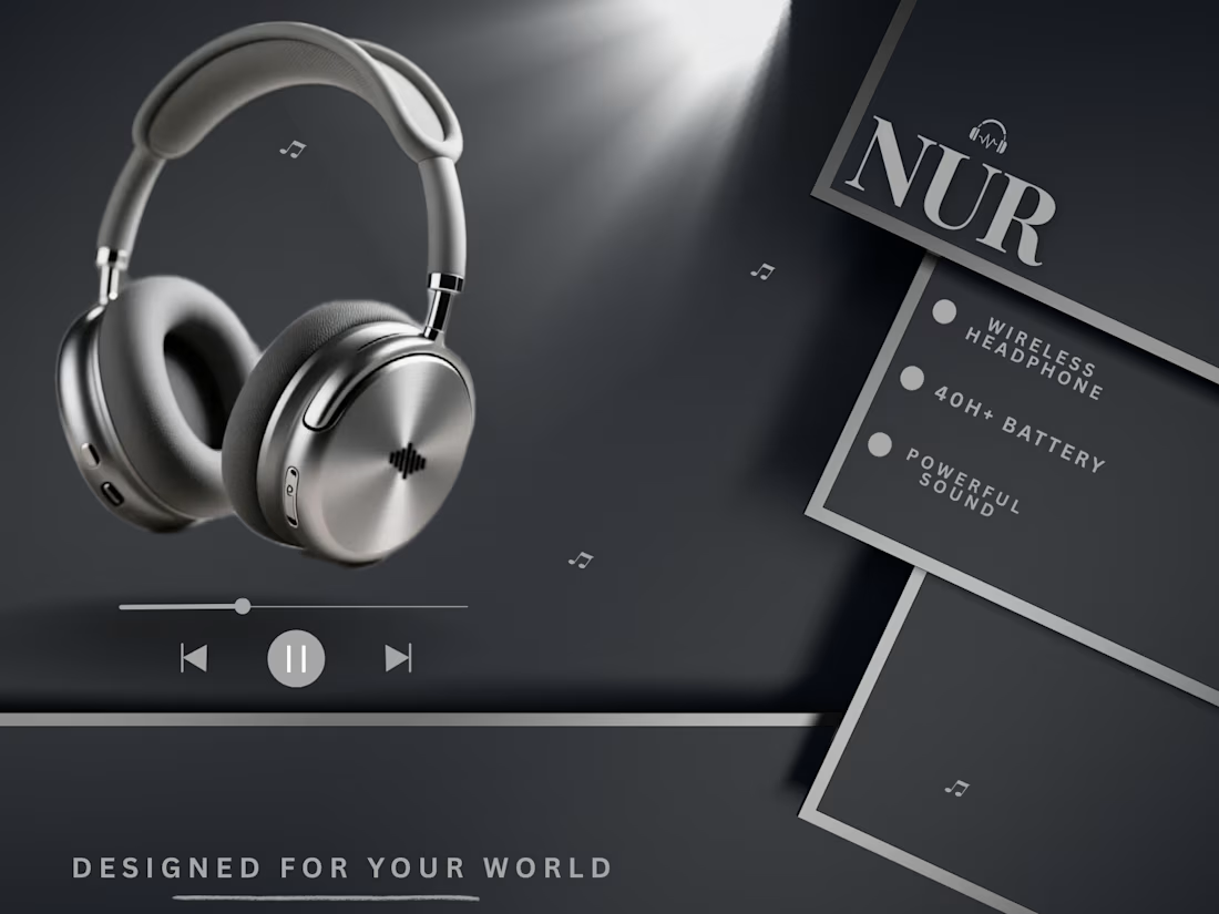
🎧 Sleek design. Powerful sound.
Want eye-catching product ads for your brand? Let’s work together! 🚀
#ProductDesign #Headphones #GraphicDesign #ProductAds

The network for creativity
Join 1.25M professional creatives like you
Connect with clients, get discovered, and run your business 100% commission-free
Creatives on Contra have earned over $150M and we are just getting started



Related posts

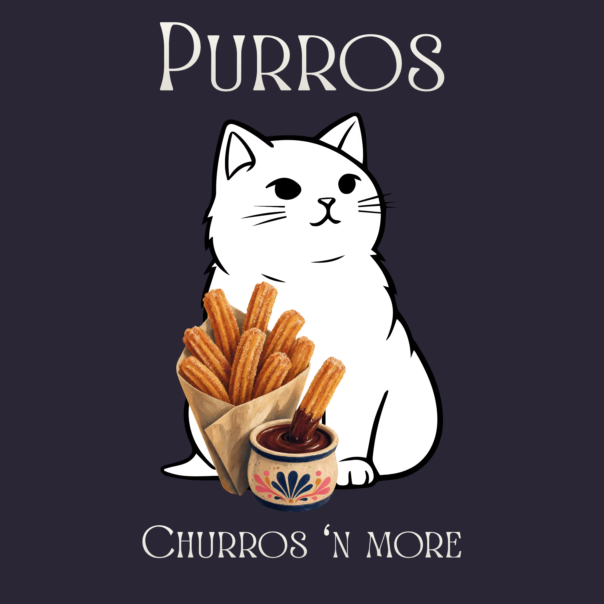
Purros is where you can live among endless churros, whenever and wherever you like. It offers a variety of unique churro flavors and unconventional donut fillings.
What makes Purros unique:
We specialize in crafting effortless, cat-shaped churros and donuts.
Where did the idea come from?
When I first opened Canva to design a stunning logo, churros were on my mind. I needed a name that fit, and Purros was the only natural choice, because a cat habitually purrs!


Unmatched speed, total immersion 🎧⚡ Custom product advertisement concept designed for the Razer Hammerhead V3 HyperSpeed earbuds! How do you like this dark neon lighting aesthetic? 💬👇
#GraphicDesign #ProductDesign #AdvertisingDesign #GamingDesign #PosterDesign


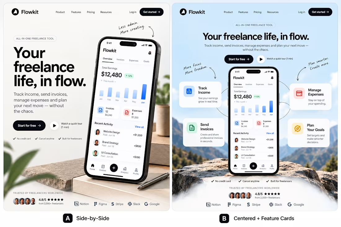
One product. Two directions. Which would you ship?
I explored two different approaches to the same landing page for Flowkit, a concept for freelancers who want to manage their finances without the extra complexity.
A — Side-by-Side: Clear hierarchy, direct messaging, and the product takes center stage.
B — Centered + Feature Cards: A more visual composition, with key features built around the product.
Both communicate the same value. The difference is how they guide attention.
My preference is A for its clarity, but B has a stronger visual presence.
Which direction would you choose, and what would make you change your mind?
I'm interested in the reasoning behind the choice, not just the vote.
If you're building a SaaS product and exploring how design can communicate value more effectively, I'd be happy to connect.
#ProductDesign #UIDesign #SaaSDesign #WebDesign #AI Agent



I’d choose A for its clarity and simplicity. For a finance product, making the value easy to understand at a glance is so important!