The network for creativity
Join 1.25M professional creatives like you
Connect with clients, get discovered, and run your business 100% commission-free
Creatives on Contra have earned over $150M and we are just getting started
Back to feedPost
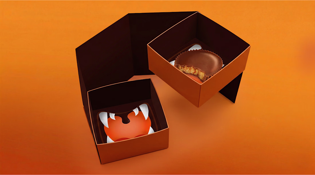
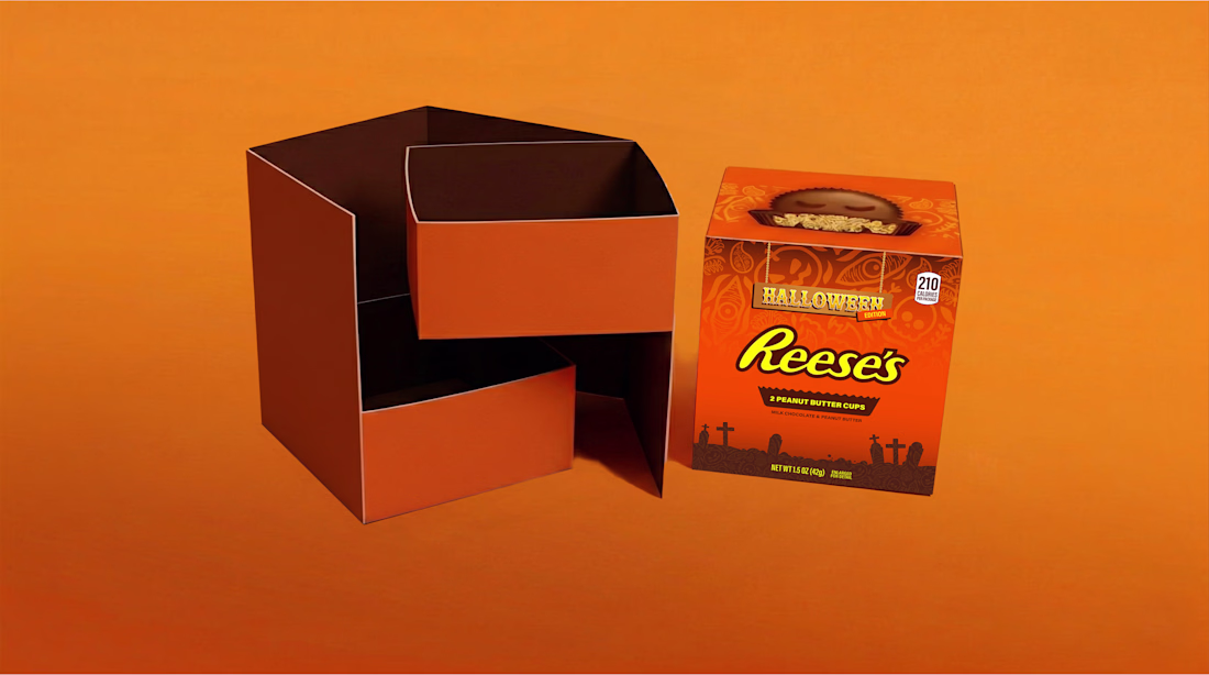
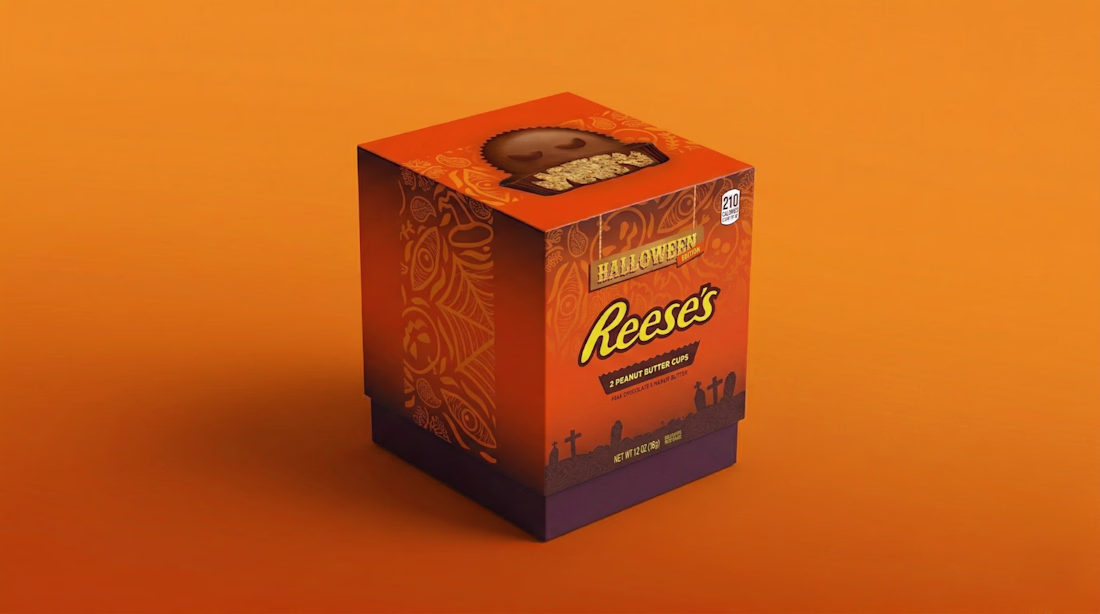
A Halloween-themed Redesign for Reese's 🎃🕯️🕸️
The idea was to take Reese's already bold visual identity and push it into a more playful spooky direction using graveyard silhouettes, brown gradients, illustrated pattern and retro horror inspired typography.
I wanted to carry the Halloween experience beyond just the outer packaging and make the entire unboxing feel immersive till the butter cups itself.
https://www.instagram.com/p/DYl2iqBDHcS/?hl=en&img_index=1
The network for creativity
Join 1.25M professional creatives like you
Connect with clients, get discovered, and run your business 100% commission-free
Creatives on Contra have earned over $150M and we are just getting started
Related posts
First post on Contra 🎉
Happy to share a project I worked on for Leanios 🚀
I handled the complete rebranding of the company, including the website design and Framer development, creating a modern and scalable digital experience.
Alongside the website, I also designed the SaaS product experience with a strong focus on usability, clarity, and conversion.
This project was all about building a cohesive brand and product ecosystem that feels both intuitive and impactful.
Here’s the link for more details 👇
https://irrenium.com/works/leanios
#Framer #WebDesign #ProductDesign #SaaS #Branding #Rebranding #UIDesign #UXDesign #FramerDeveloper #StartupDesign #DigitalDesign #CreativeDirection

Welcome!
Hard work always pays off, My recent work Branding & Packaging design project "Quinch" Got Featured on "Packaging Of the world"
Here is the link: https://packagingoftheworld.com/2026/05/vegan-meat-packaging-design.html
See Complete Project Here: https://www.behance.net/gallery/248176953/Quinch-Vegan-Meat-Brand-Identity-Packaging-Design
cute and minimalist girl logo featuring a simple character with soft shapes and charming facial details, creating a friendly and playful look
Trending
Claude
Claude has entered the design space. How are you using Claude Design?
Contra University
Learn from expert creatives how to earn more using next-gen AI tools.
creativeaiflow
Creative AI workflows are evolving. What tools do you use, and what are their strengths and weaknesses?
portfolioreview
The best portfolios tell a story, not just show a grid. Share yours for feedback.
freelancerlife
Freelancer life is wins, pivots, and everything in between. What’s yours right now?