The network for creativity
Join 1.25M professional creatives like you
Connect with clients, get discovered, and run your business 100% commission-free
Creatives on Contra have earned over $150M and we are just getting started
Back to feedPost

Let’s build the logo for a skincare brand that refuses to look like every other skincare brand. 🍋🍊🍉
For ZYVRA, the logo needed to feel bold, energetic, expressive, and instantly recognisable while still being flexible enough to work across packaging, social content and the wider visual identity.
I started with the brand strategy and moodboard, explored different lettering styles and directions, and then refined the forms until I found something that felt like ZYVRA confident, playful and full of energy.
The final logo direction became the foundation for the rest of the identity, from bold typography and vibrant colours to the expressive packaging system.
Brand personality:
Bold • Energetic • Expressive • Modern
This is why I believe a logo should be more than just a visual mark. It should come from the strategy and personality of the brand and give the rest of the identity a clear direction.


The network for creativity
Join 1.25M professional creatives like you
Connect with clients, get discovered, and run your business 100% commission-free
Creatives on Contra have earned over $150M and we are just getting started
Challenges
View all


Related posts


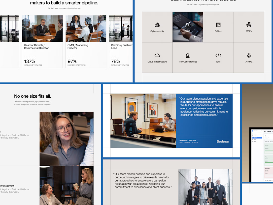
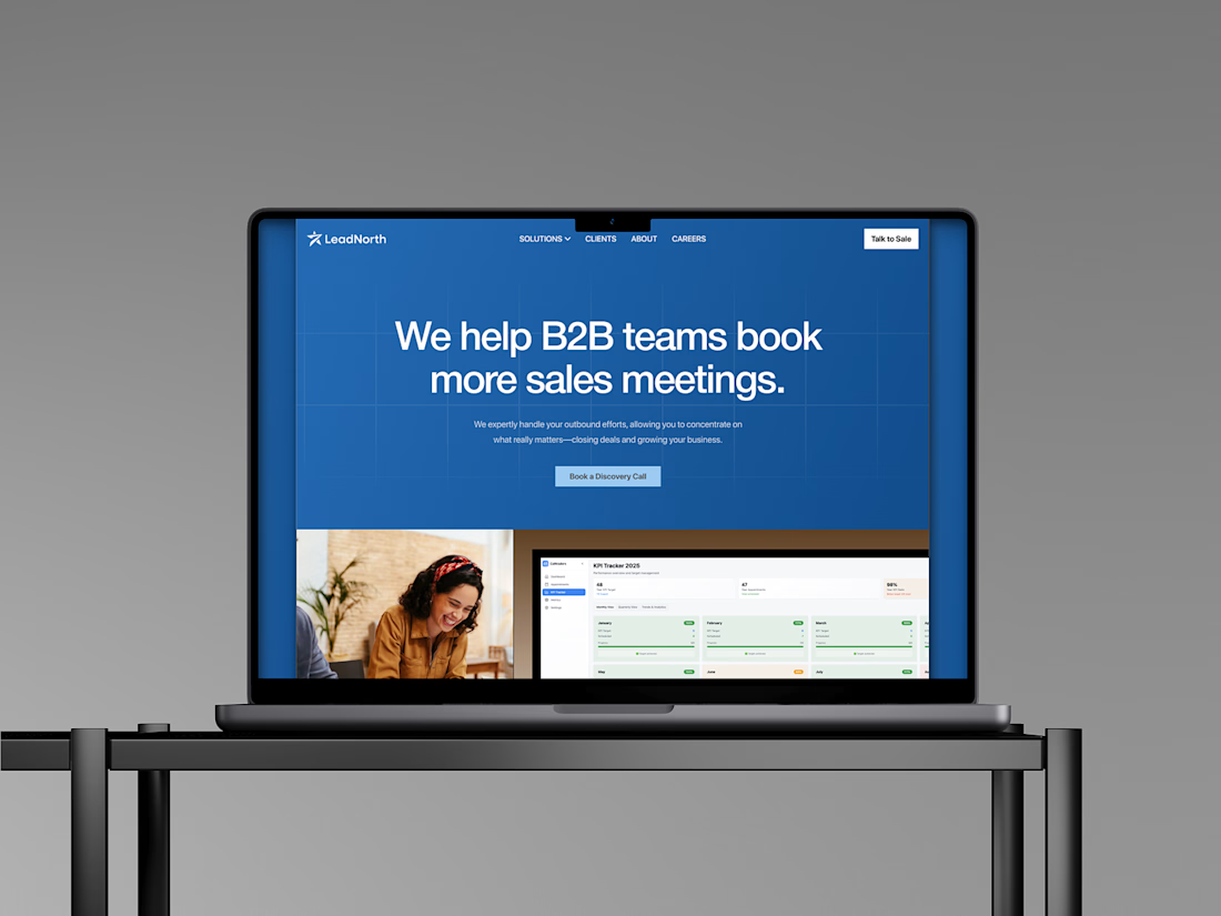
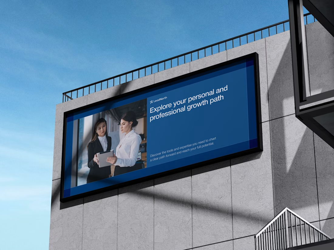
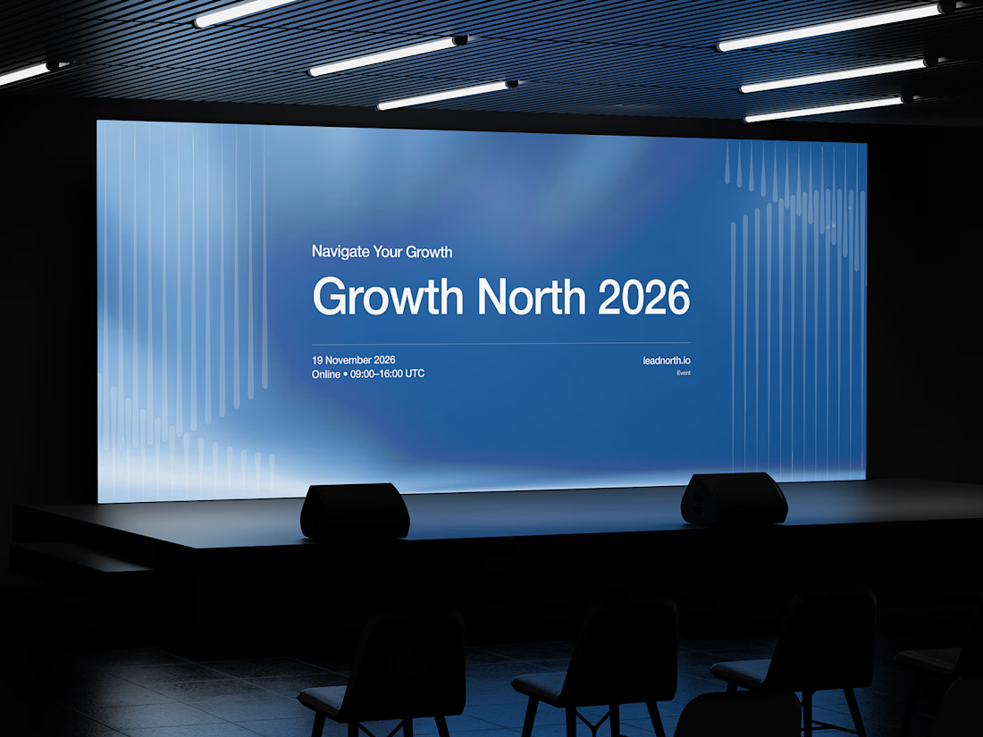


That saturated cobalt blue carries cleanly from the laptop hero onto the outdoor billboard and the Growth North 2026 stage screen.

Which brand style fits Yicora?
I'm crafting a brand book for an AI platform targeting for creators.
16 voted
53%
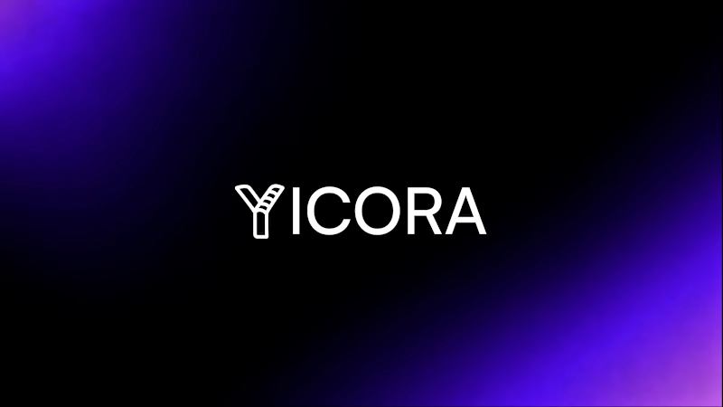
14 voted
47%
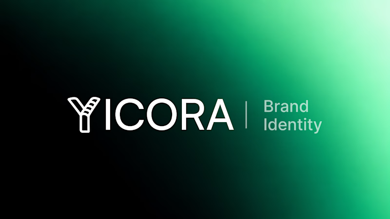
30 votes
Closed

A feels more professional great job 🎉🎉

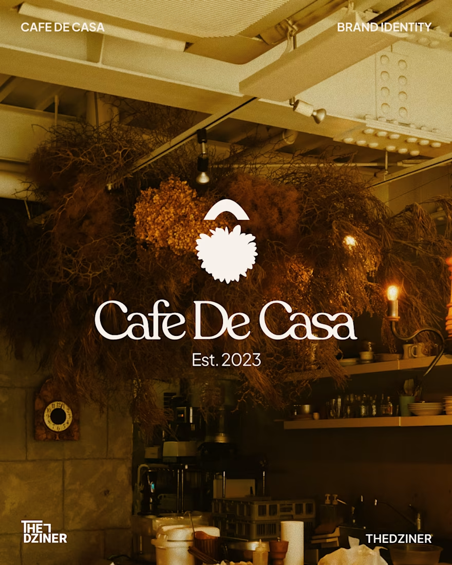
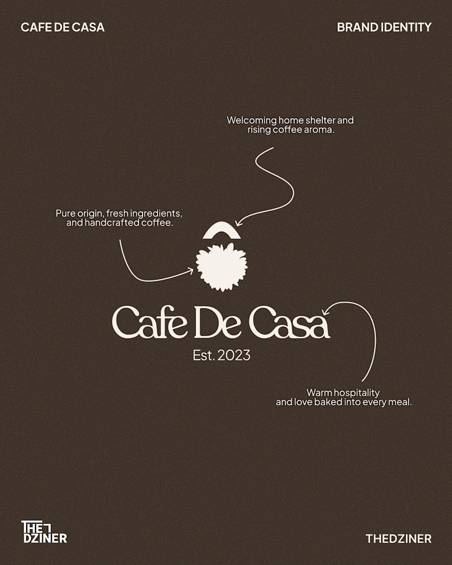
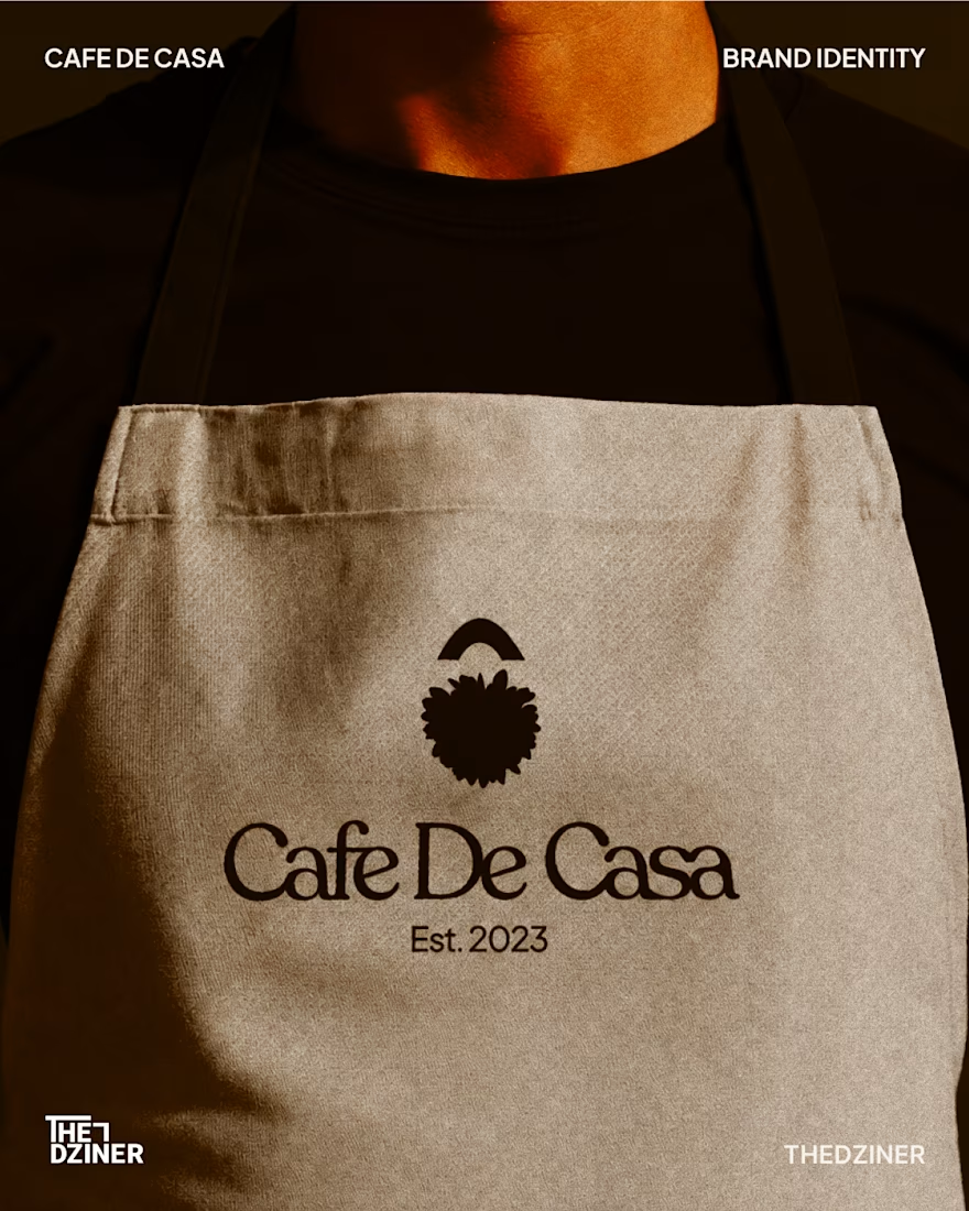
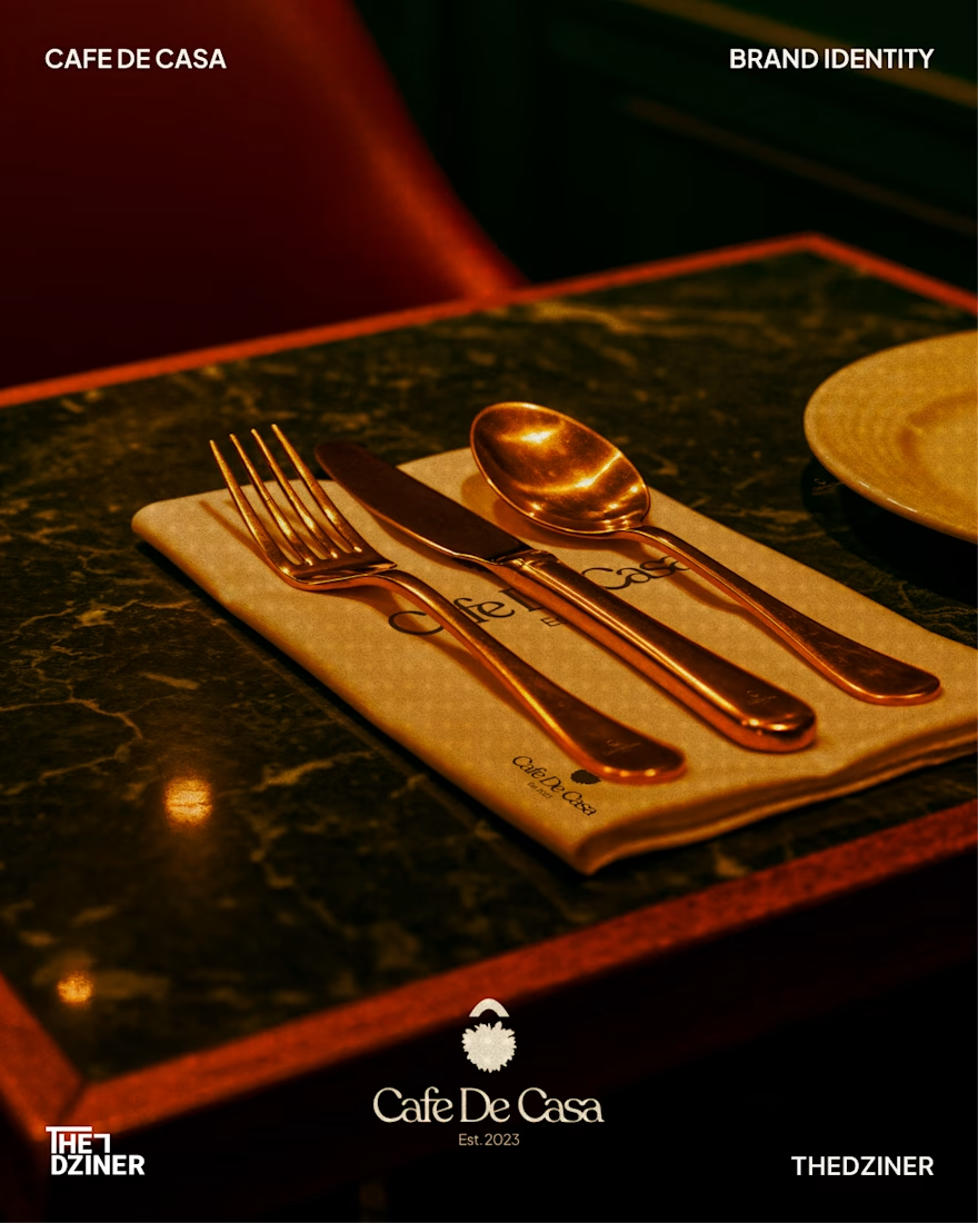
Cafe De Casa — Visual Identity System
The Problem: Beautiful physical café spaces often lose their premium feel online when their digital grid and generic brand marks don't match the in-store hospitality experience.
The Solution: A cohesive, custom word mark and unified visual system that bridges the gap between their physical storefront and digital presence. The goal was to build a mark that feels welcoming, premium, and instantly recognisable at a glance.
Deliverables:
• Custom word mark & responsive brand icon
• Unified typographic and colour system
• Digital touchpoint strategy (Instagram grid)
• Physical brand applications (Menu, signage, and apparel)
(Concept redesign for Cafe De Casa — Unsolicited / Not affiliated)
Available for new brand identity projects

Great visuals man