The network for creativity
Join 1.25M professional creatives like you
Connect with clients, get discovered, and run your business 100% commission-free
Creatives on Contra have earned over $150M and we are just getting started
Back to feedPost

Last week I shared the process behind this build. Here's the final result.
The UMAMI Agency needed one page to convert restaurant owners into leads. Every section was intentional, from the pain-focused hero to the 3-plan CTA.
Built with Claude and Framer.
Live at umamiassessoria.com.br


The network for creativity
Join 1.25M professional creatives like you
Connect with clients, get discovered, and run your business 100% commission-free
Creatives on Contra have earned over $150M and we are just getting started







Related posts


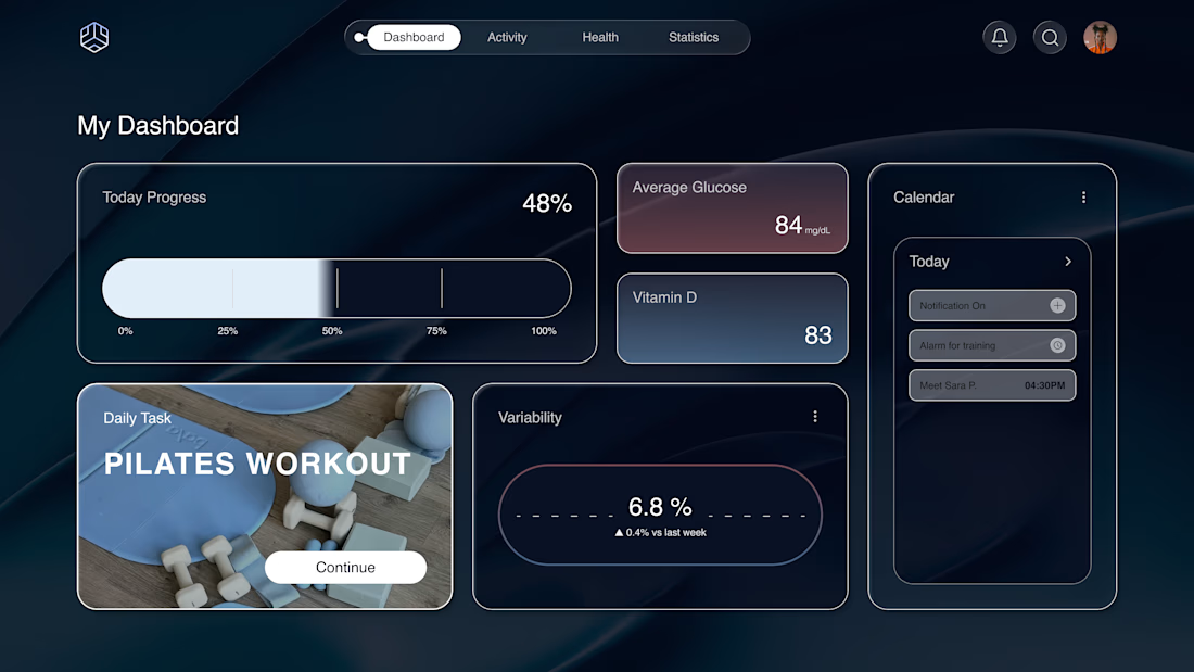
Why does a dashboard full of numbers still feel calm?
Bento grids are everywhere, and done right it's not a trend, it's information design. Each cell = one number, one meaning. The grid does the hierarchy for you.
Our three rules for a bento that works:
One idea per cell. Progress, glucose, one task. If a card needs two sentences, it needs two cards.
Mix the scale. One hero cell, a few mediums, one tiny stat, same gap everywhere.
One warm cell. A single card runs warm against the cool, dark screen; it carries the eye, and the rest stay quiet. No neon needed. Grids are calm. Content is loud. That's the whole trick.

Love the three rules. How do you handle this grid when it collapses to mobile without losing the hierarchy?

: One of my favorite recent builds ✦
Theory was designed for a creative studio that needed something bold and editorial without losing clarity or usability.
The part I loved most was figuring out how to make the site feel visually expressive while still giving the portfolio work room to breathe. Lots of strong type, intentional movement, and little custom details throughout.
Designed + developed in Squarespace 7.1 with custom CSS and JavaScript.


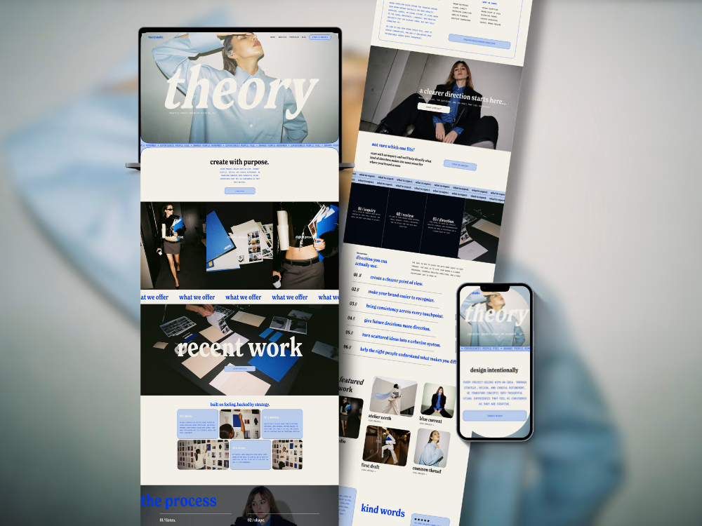
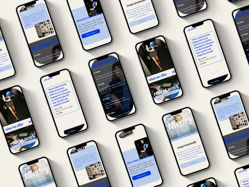

The oversized “recent work” type over the project imagery is a lovely touch. Gives the portfolio a real editorial feel.

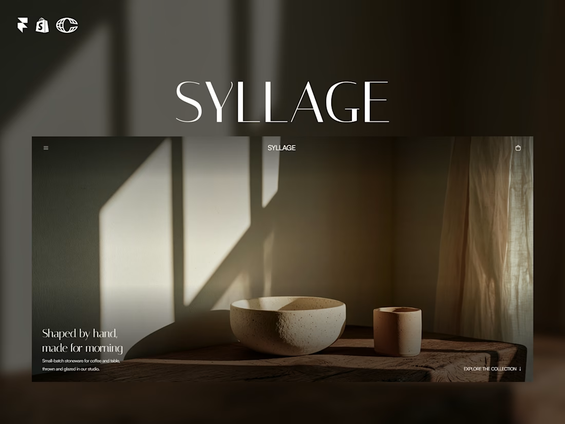
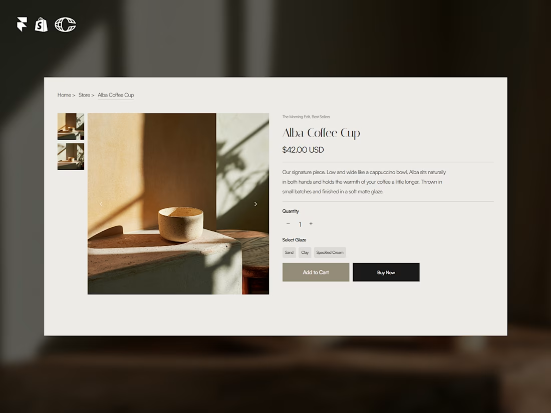
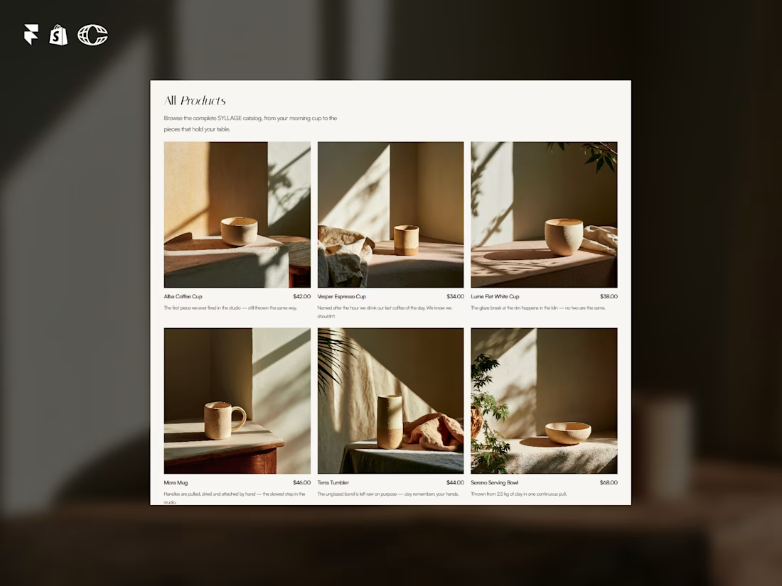
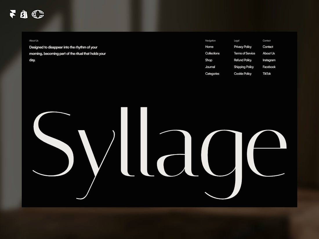
SYLLAGE is live.
A complete ecommerce template for ceramic and small-batch product brands, built in Framer with full Shopify integration.
15 pages. 4 CMS collections. Journal, collections, product categories, legal pages, all done.
Minimal, editorial, built to sell, not just look good.
Check it out and let me know what you think ↓
https://contra.com/products/Rzd5vtXw-syllage-ceramic-ecommerce