The network for creativity
Join 1.25M professional creatives like you
Connect with clients, get discovered, and run your business 100% commission-free
Creatives on Contra have earned over $150M and we are just getting started
Back to feedPost
Taste Test

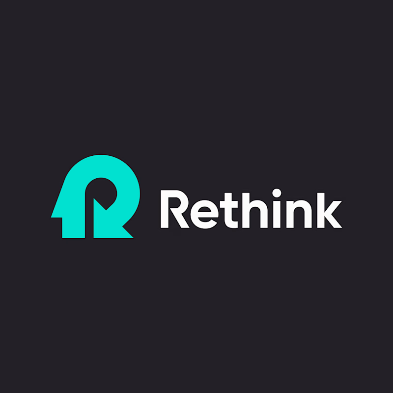
Which logo direction do you prefer — A or B?
For this concept, I combined a human head with a “re” arrow, symbolizing rethinking, transformation, and moving forward.

5 votes
Ends in 17h

A. The R and arrow read instantly. B's head shape is clever but I had to look twice to see the R.

Clear Winner is "A".

Voted A. The R and the rethink arrow share one bold shape, so it reads as a mark first and a concept second, and it will hold up at favicon size. B is more literal with the head, but the detail gets busy when it shrinks.
The network for creativity
Join 1.25M professional creatives like you
Connect with clients, get discovered, and run your business 100% commission-free
Creatives on Contra have earned over $150M and we are just getting started





Related posts

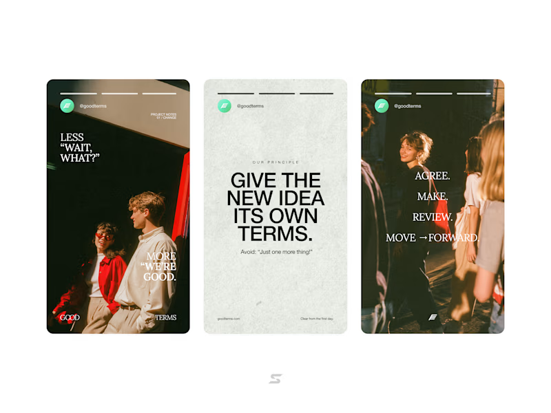
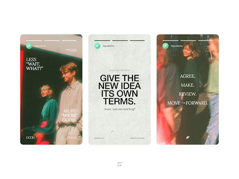
More casual or stylized photography?
20 voted
42%
28 voted
58%
48 votes
Closed

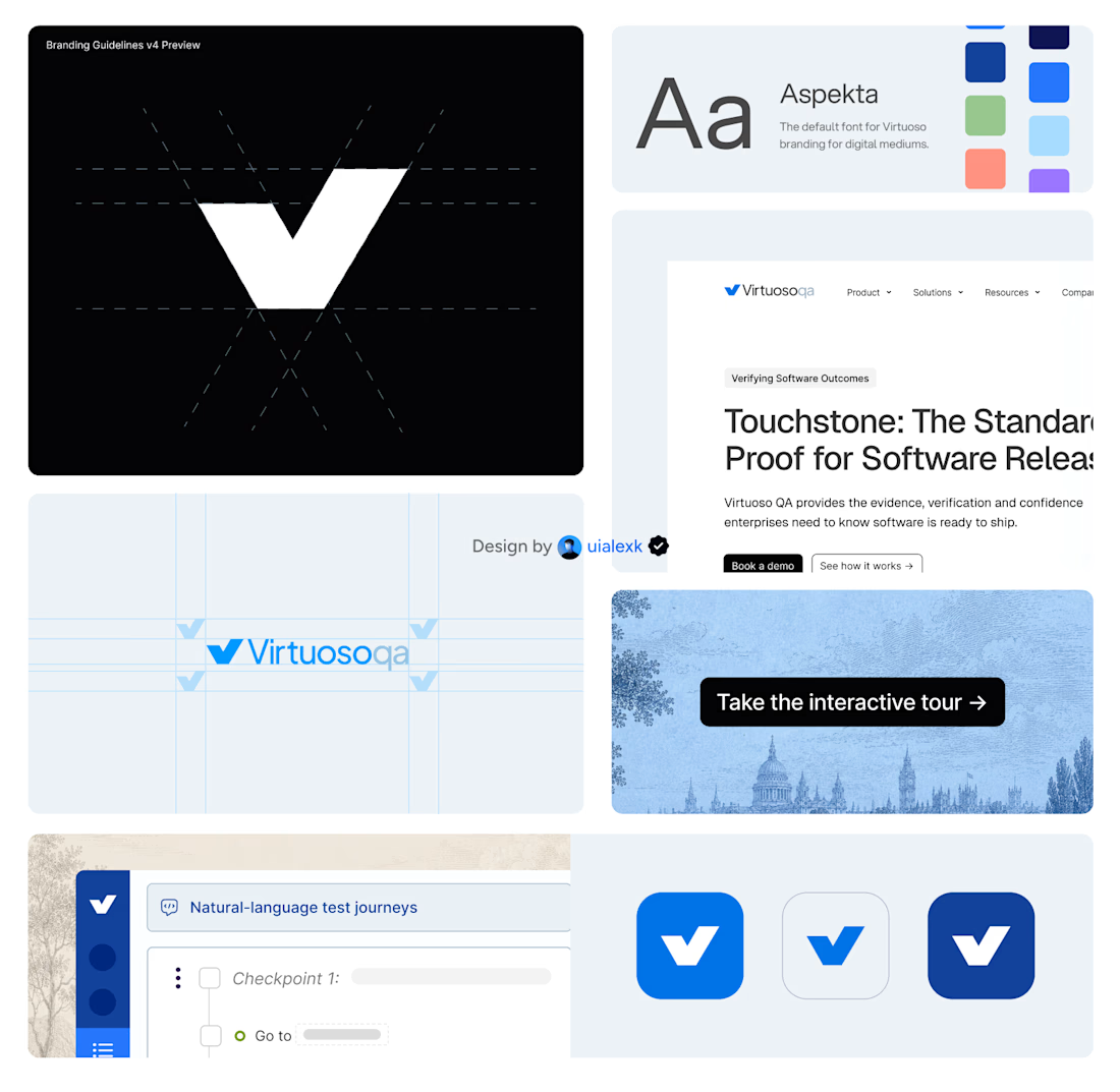
Branding v4 for Virtuoso
This design evolution, made an impact to the brand growth's by:
- Webflow to Framer migration of 150+ static pages and 500+ CMS
- Increasing website conversions
- Having consistent brand presence across digital mediums
- Increase brand awareness


Amazing!


Booking Calendar: Compact or Expanded?
I’m testing two calendar layouts for booking a spa hotel stay.
Version A - Compact. The calendar, selected dates, number of nights, and button remain inside one card.
Version B - Expanded. After the check-in date is selected, a separate booking summary card appears below the calendar.
The functionality is the same - only the presentation and visual hierarchy are different.
Which version feels clearer and easier to use?
17 voted
49%
18 voted
51%
35 votes
Closed

How do you create videos like these?