The network for creativity
Join 1.25M professional creatives like you
Connect with clients, get discovered, and run your business 100% commission-free
Creatives on Contra have earned over $150M and we are just getting started
Back to feedPost
Taste Test

Which website do you use for inspiration?
5 voted
42%

7 voted
58%

12 votes
Closed


The network for creativity
Join 1.25M professional creatives like you
Connect with clients, get discovered, and run your business 100% commission-free
Creatives on Contra have earned over $150M and we are just getting started



Related posts

Which one do you think i should put as a FEATURED SECTION cover on linkedin? Help me decide!
1 voted
33%

2 voted
67%

3 votes
Closed


which one matches your headline better? thats usually the tiebreaker for featured covers


Which homepage would make you more likely to explore the platform?
HackStack features bold typography, teal gradients, and a centered layout focused on AI tools and automation. DataVistaHQ uses purple accents, a split layout, and a prominent dashboard preview to introduce its business intelligence platform.
I would like your perspective on the visual design, clarity, and first impression. Which approach communicates its value more effectively and makes you want to take the next step?
Vote for your preferred design and share what influenced your choice: the colors, headline, layout, dashboard preview, or overall presentation.
#WebDesign #AIWebsites #UIUXDesign #SaaSDesign #TransformedDesign


2 voted
17%

10 voted
83%

12 votes
Closed

Visually, I lean toward DataVistaHQ, but the cognitive load is really high. The value proposition and the stats feel like they're competing for attention.
On the other hand, HackStack has a much better visual hierarchy. The value proposition and CTA group immediately give me a...
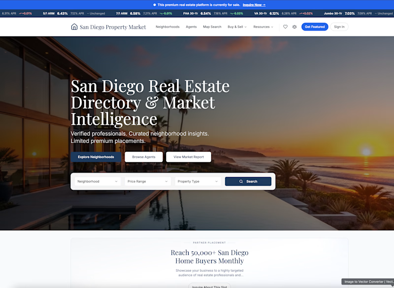
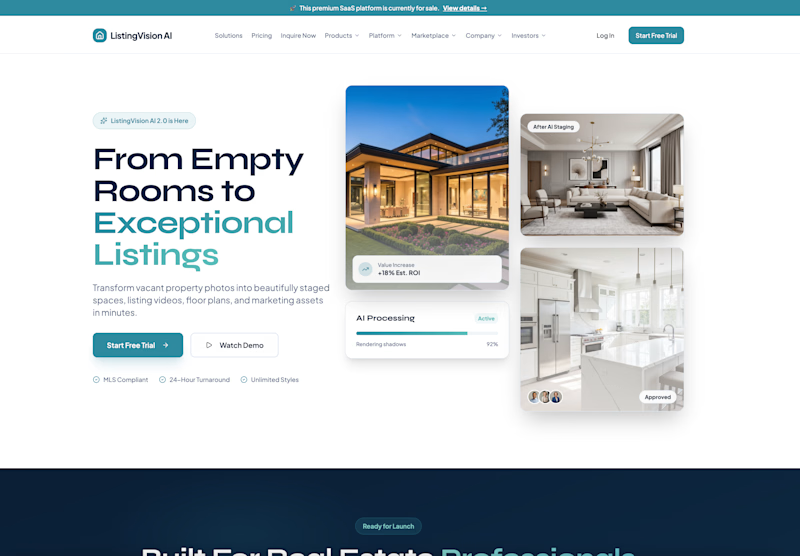
Which real estate homepage makes the stronger first impression?
ListingVision AI features a bright layout, teal accents, and property imagery to introduce its AI staging and listing tools.
San Diego Property Market pairs coastal photography with classic typography, neighborhood search, and market resources.
Which design feels more inviting and makes you want to explore further? Does the clean presentation of ListingVision AI catch your attention, or do you prefer the location-focused experience of San Diego Property Market?
Vote for your favorite and share what influenced your choice: imagery, colors, typography, layout, or calls to action.
#WebDesign #RealEstateMarketing #AIWebsites #UIUXDesign #TransformedDesign
3 voted
43%
4 voted
57%
7 votes
Closed

ListingVision AI. One clear primary button and the staged before/after right in the hero, while San Diego asks you to choose between three equal buttons and a search bar before you know why.