The network for creativity
Join 1.25M professional creatives like you
Connect with clients, get discovered, and run your business 100% commission-free
Creatives on Contra have earned over $150M and we are just getting started
Back to feedPost

Rather than simply saying I'm available for work, I wanted to communicate it through design.
This concept reimagines a traditional application form as a visual identity statement—one that reflects not only what I do, but how I think as a designer. It presents my skills, focus areas, and creative direction in a structured yet engaging format.
My work is centered around brand identity, social media design, and UI design. Across these disciplines, I aim to create solutions that are not only visually compelling but also purposeful, clear, and strategically driven.
I believe design is most effective when it goes beyond aesthetics and becomes a tool for communication, storytelling, and problem-solving. Every project is an opportunity to simplify complexity, create meaningful experiences, and build stronger connections between brands and their audiences.
Currently, I am open to freelance projects, collaborations, and creative opportunities with individuals, startups, and organizations that value thoughtful design and intentional execution.
Let's create work that makes an impact.
Services:
• Brand Identity Design
• Social Media Design
• UI Design
• Creative Visual Systems
Tools:
Adobe Illustrator • Adobe Photoshop • Figma

The network for creativity
Join 1.25M professional creatives like you
Connect with clients, get discovered, and run your business 100% commission-free
Creatives on Contra have earned over $150M and we are just getting started
Related posts


Great stuff! Would love to know what the brief looked like. You clearly took it somewhere special.

AREA — Minimal Brand Identity
AREA’s identity began with a simple idea: structure can make a brand more distinctive.
We explored it through bold typography, geometric forms, and a restrained monochromatic palette, bringing clarity and consistency to every touchpoint.

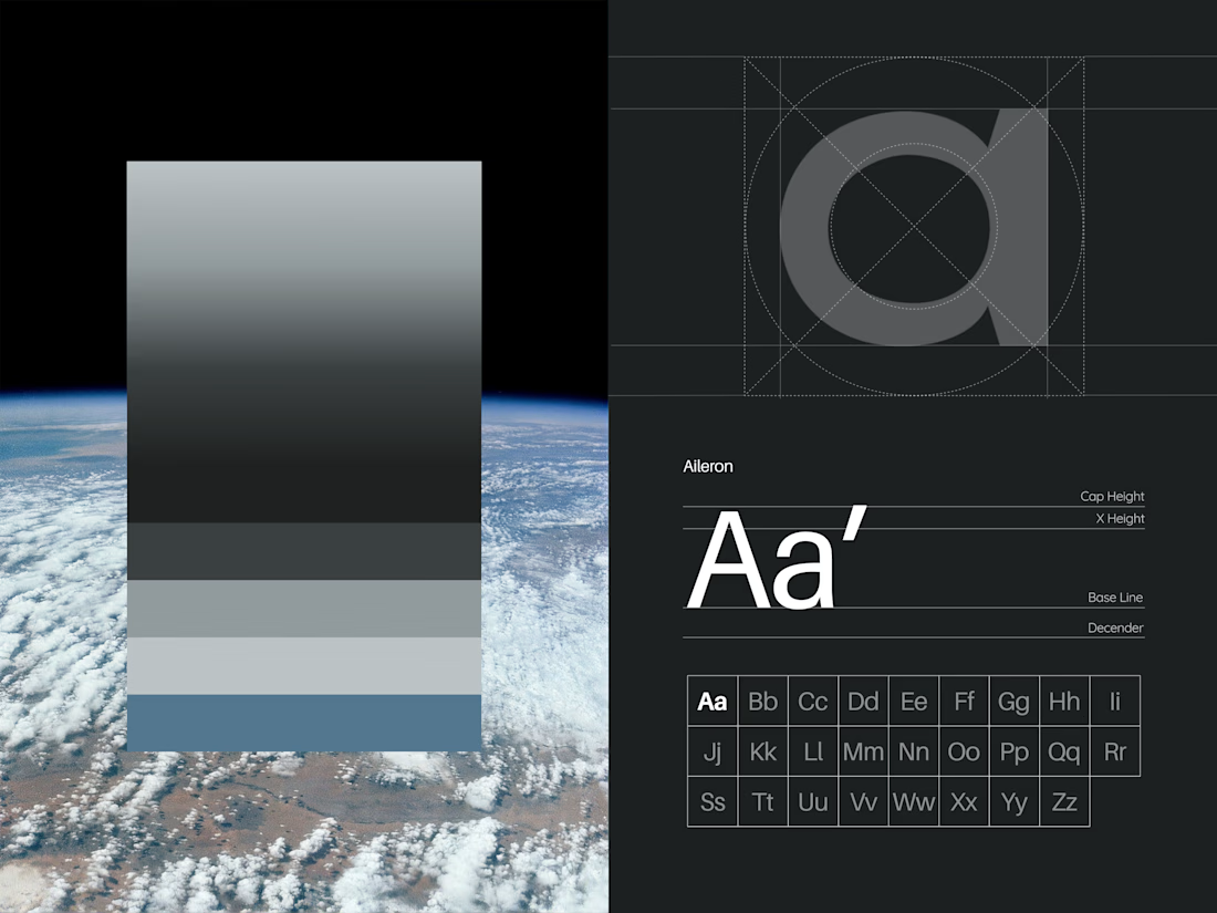
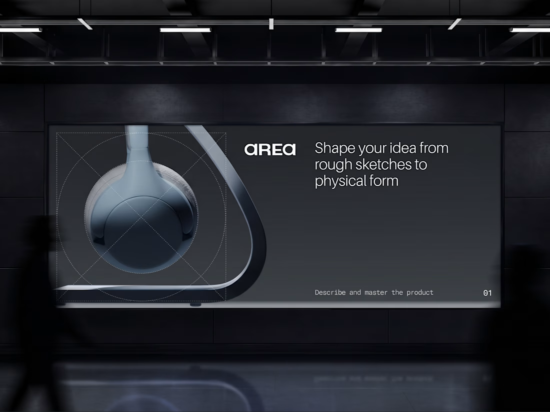

Monochrome can feel cold, but the big type keeps this sharp. Did you start with the type or the shapes?

Human Design vs. AI: CloudBean Logo Concept ☁️☕️
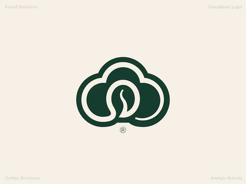
When building a brand identity, execution and detail make all the difference. I put together two concepts for CloudBean—one crafted by hand (forest green) and another generated with AI.
The Handcrafted Version (Forest Green): Features a refined, balanced monogram seamlessly integrating the cloud shape with a coffee bean, complete with thoughtful typography styling and a polished mark.
The AI Version (Brown Gradient): Offers a quick interpretation, placing a tilted bean inside an open cloud outline with a standard gradient.
Which direction feels stronger for the brand? Let me know your thoughts in the comments! 👇
#Branding #LogoDesign #DesignProcess #VisualIdentity #Contra
3 voted
100%
0 voted
0%

3 votes
Closed

love this branding design