The network for creativity
Join 1.25M professional creatives like you
Connect with clients, get discovered, and run your business 100% commission-free
Creatives on Contra have earned over $150M and we are just getting started
Back to feedPost

Sharing our latest Fashion Social Media Design project!
We created eye-catching visuals that blend style, creativity, and a cohesive aesthetic to help fashion brands stand out and make a lasting impression.
Which style catches your eye more: minimalist elegance or bold and trendy designs?
Explore the full project: https://www.behance.net/gallery/246078899/Fashion-Social-Media-graphics
#FashionDesign #SocialMediaDesign #GraphicDesign #FashionBranding #CreativePortfolio #Contra


I'd pick minimalist elegance: the cream cards and the serif "nina" wordmark let the floral prints do the shouting. Was the phone grid planned as one patchwork feed?
The network for creativity
Join 1.25M professional creatives like you
Connect with clients, get discovered, and run your business 100% commission-free
Creatives on Contra have earned over $150M and we are just getting started



Related posts

If your members pay premium. Your website should look like it.
Animation really changes the way you look at a website.
The premium is in the details. 🤌
Hero section with animation for a Tennis Sports Club Membership Platform.
Full landing page WIP; gonna share it very soon.


The animation adds a lot to the premium feel for a tennis club membership platform. Looking forward to seeing the full landing page.



Great job Fairs 🎉🎉🔥🔥

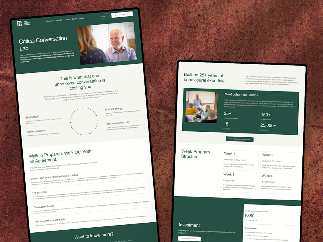
I’ve just wrapped up a new project with The Hidden Transit! 😊
I designed and developed a conversion-focused landing page for their Critical Conversation Lab programme, along with a few improvements to their existing website.
I’m happy to share the case study and give you a look at the work behind it!
Nice work on the Critical Conversation Lab landing page, Julia. Pairing a focused programme page with fixes to the existing site is often where the real conversion gains come from.